
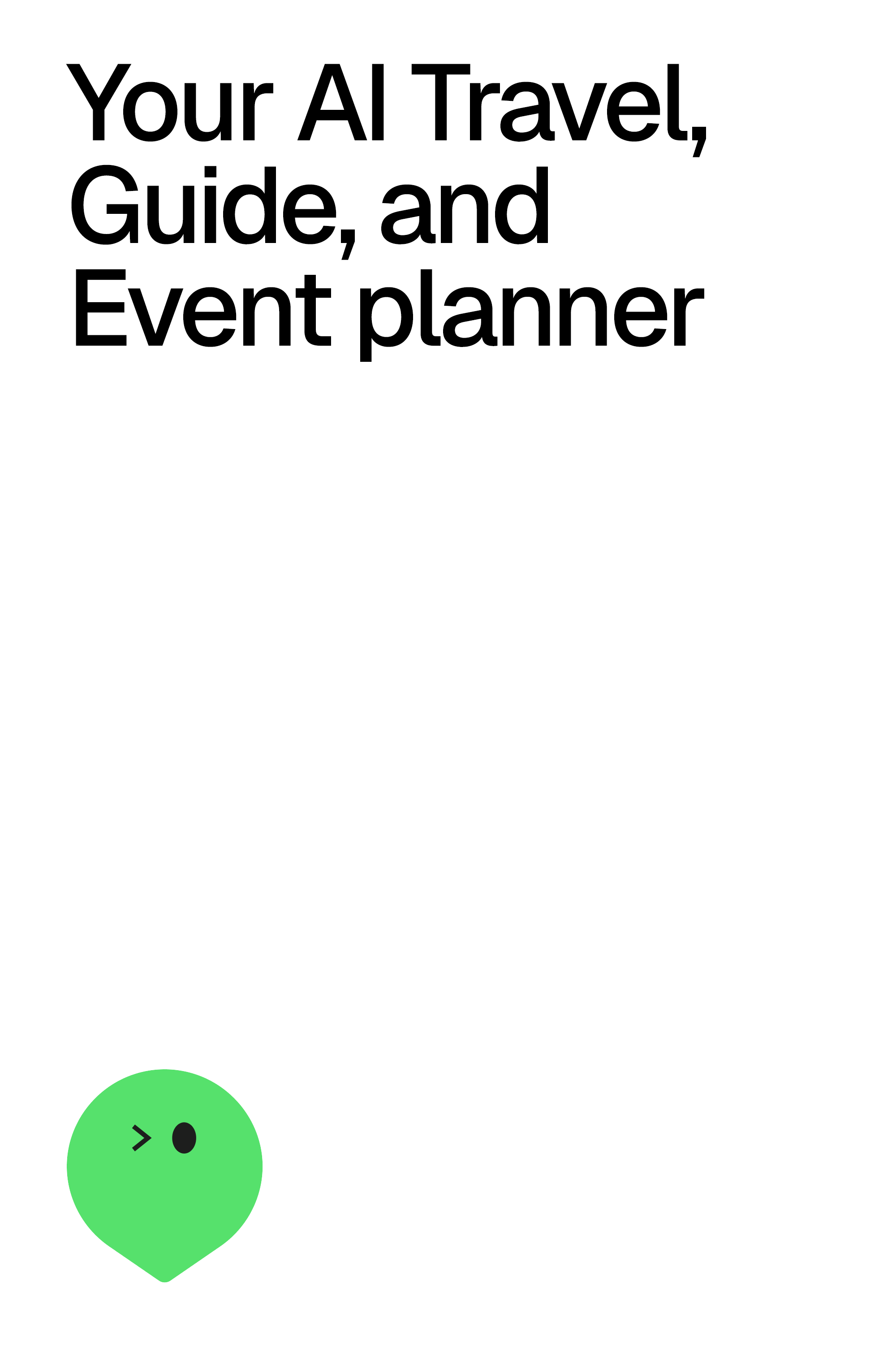
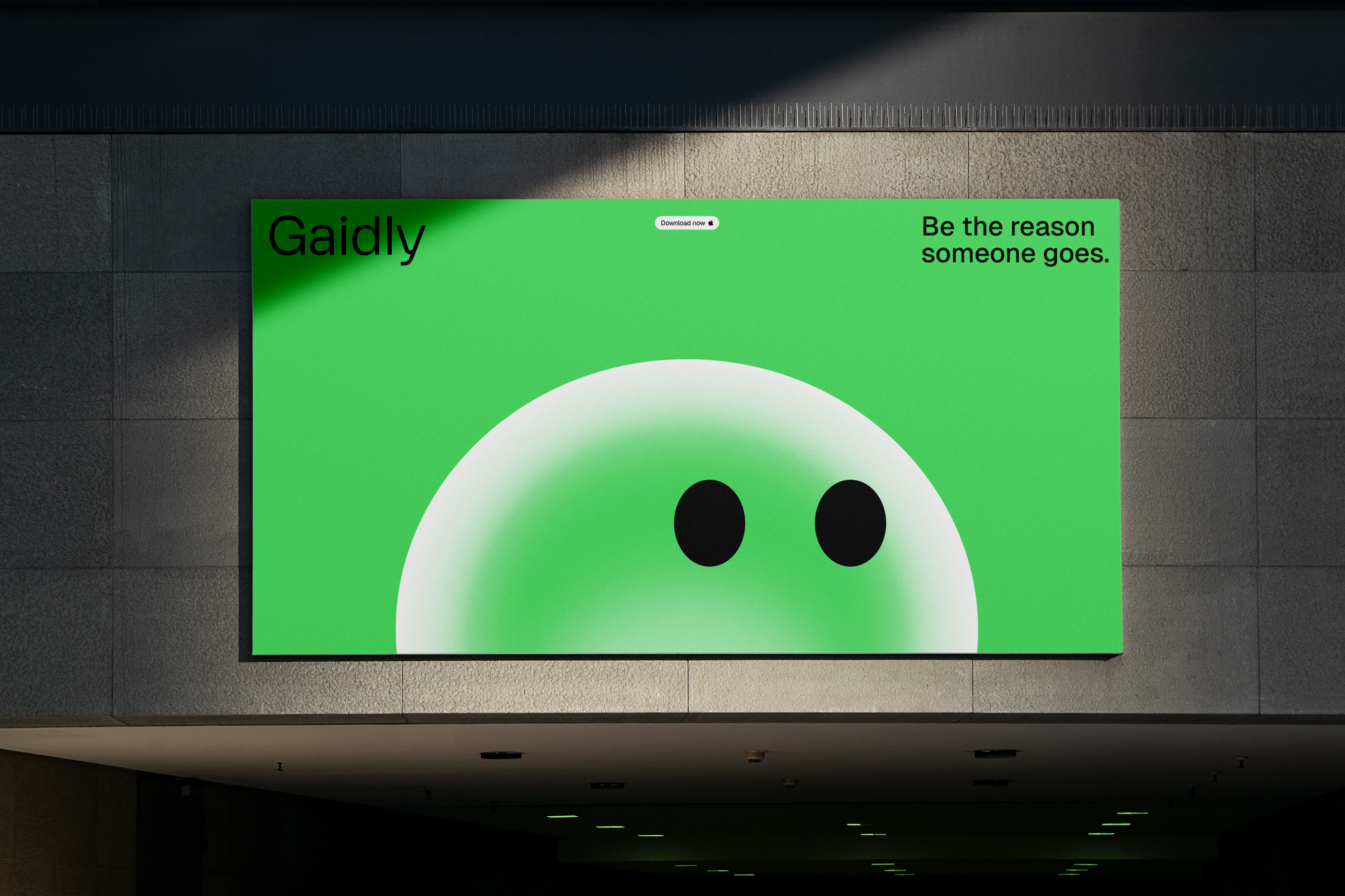
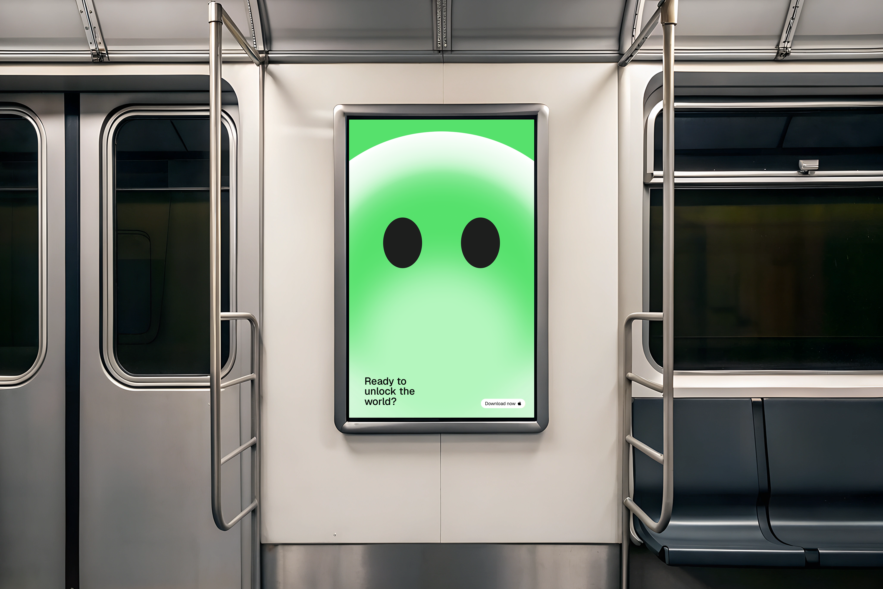
The Gaidly icon represents possibilities, friendly conversation, the extraordinary. An anthropomorphic version of the pin, which can also be other things, such as an airplane or a notebook, it is a close companion who has all the answers. Here we will find its versions and variations, within the safe visual dynamism.
As part of the brand architecture framework, Gaidly's icon shape variations are developed based on its products and deliverables, serving as support for communications and message clarification.
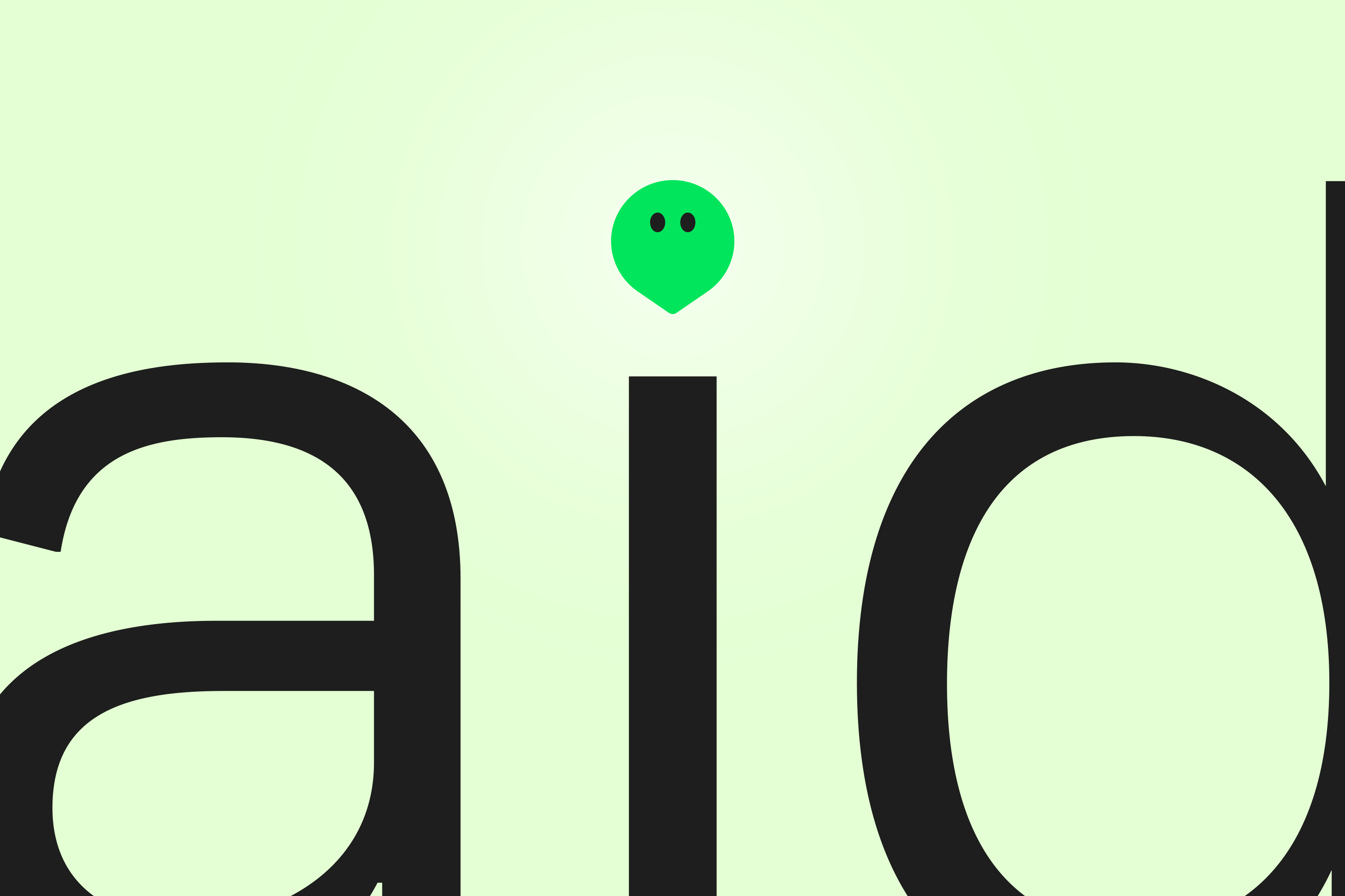
Dynamic
Flexible to every situation. Providing you incredible possibilities. Expansive. Funny. Close.Universal
Shared by all, everywhere. Everlasting. Timeless. Essential. Enduring.Friendly
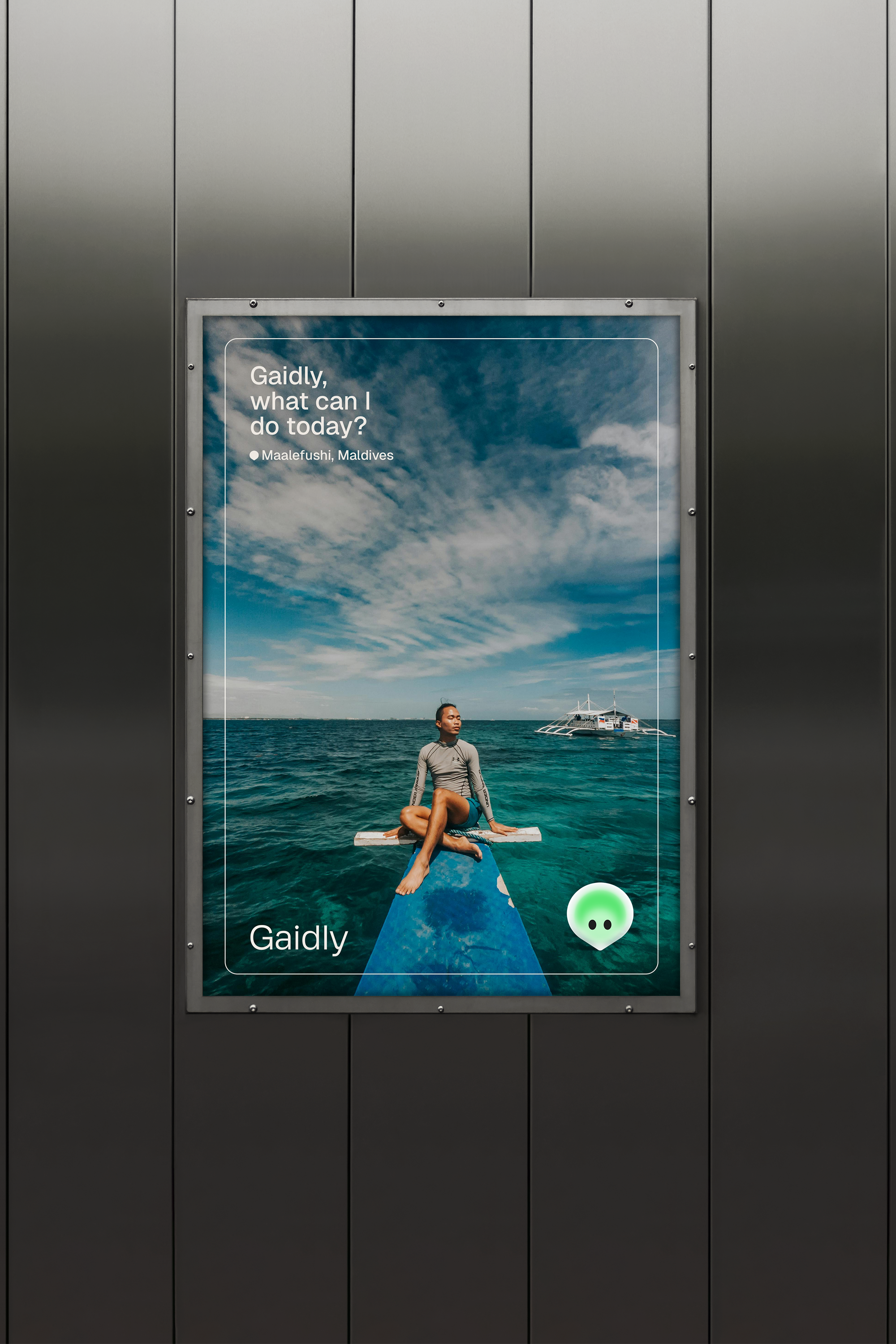
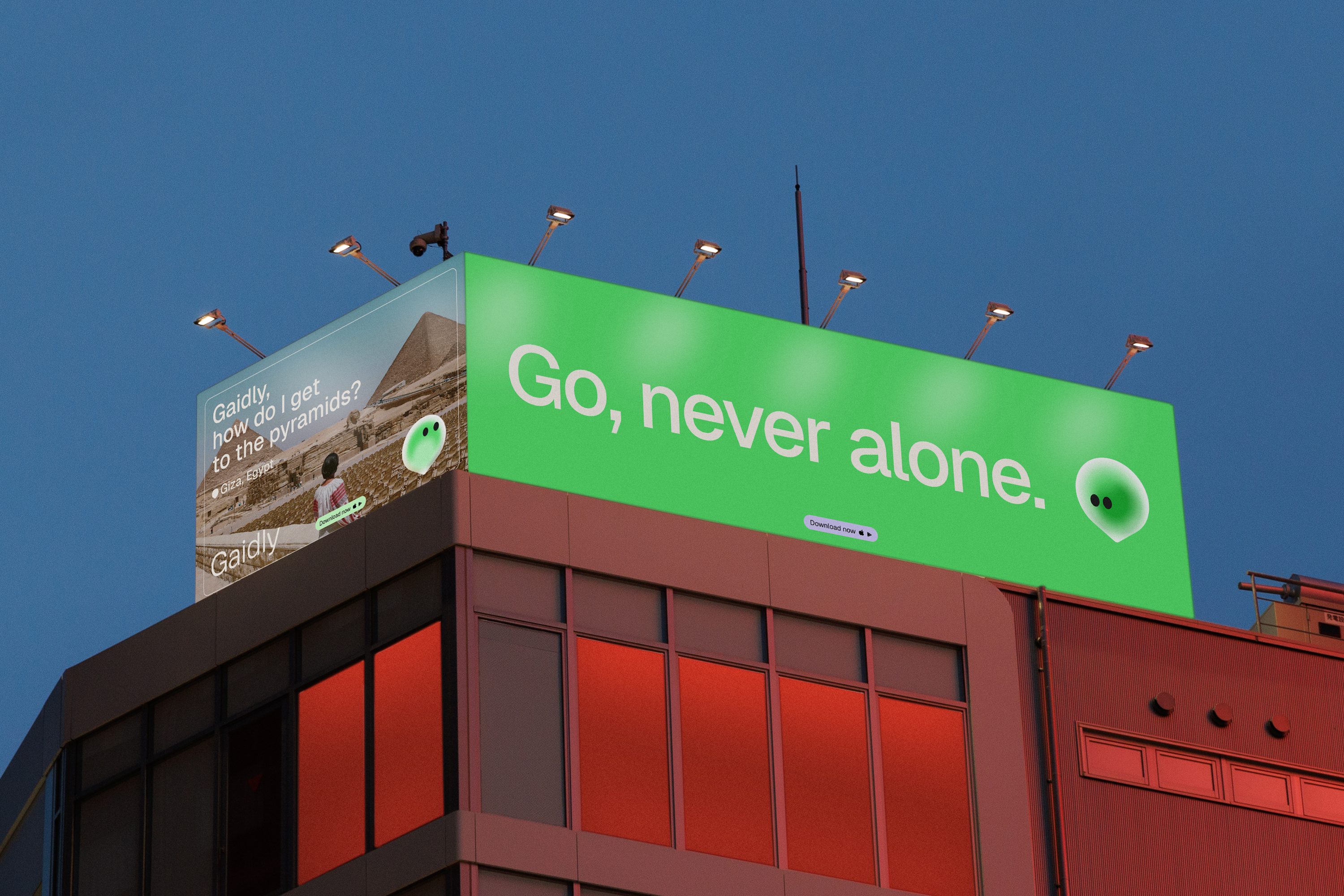
Based on conversation, for a personal trip guidance. Bringing the world together. Uniting people through empathy, celebrating life and how it can be extraordinary.


Project information
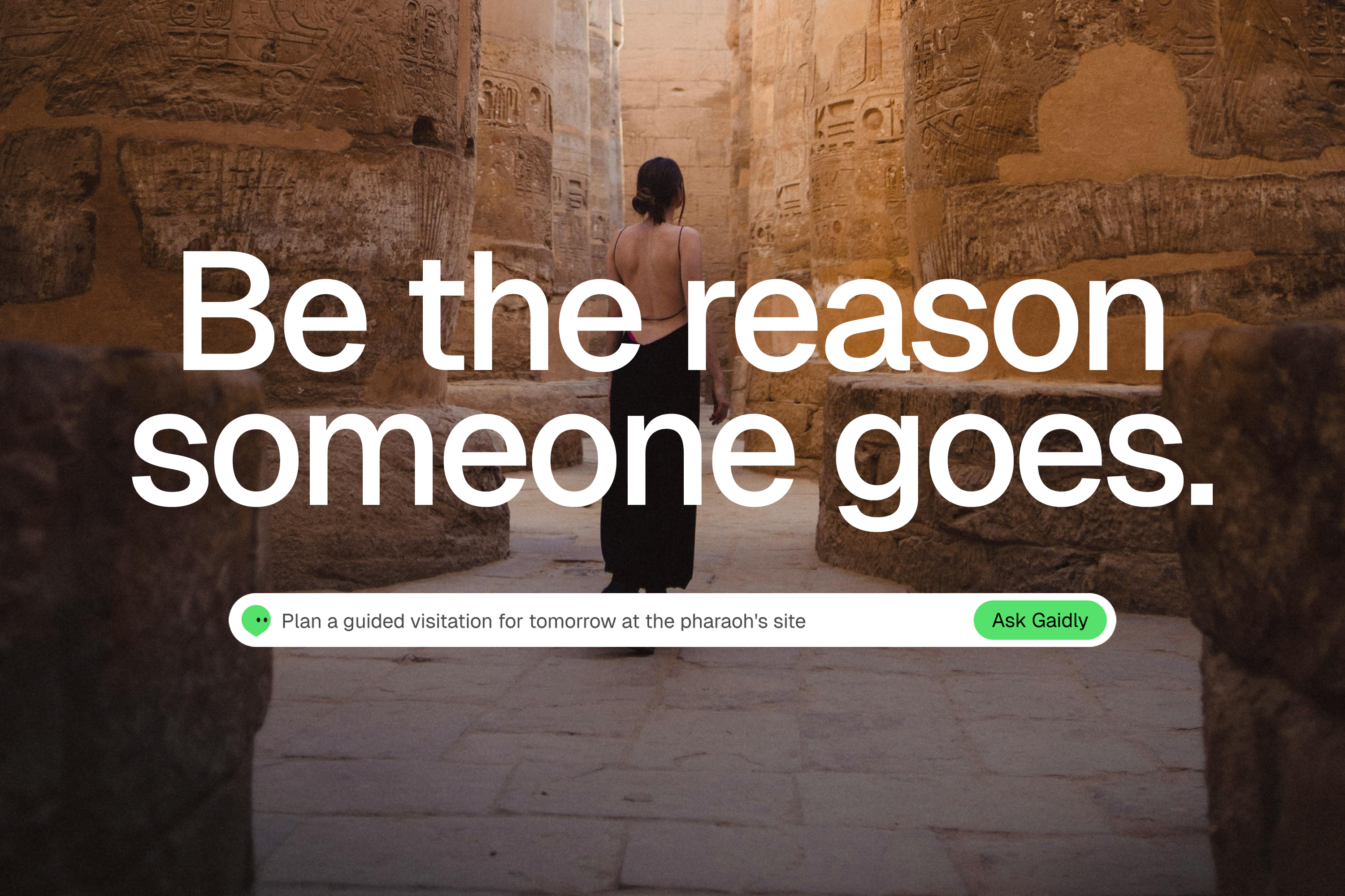
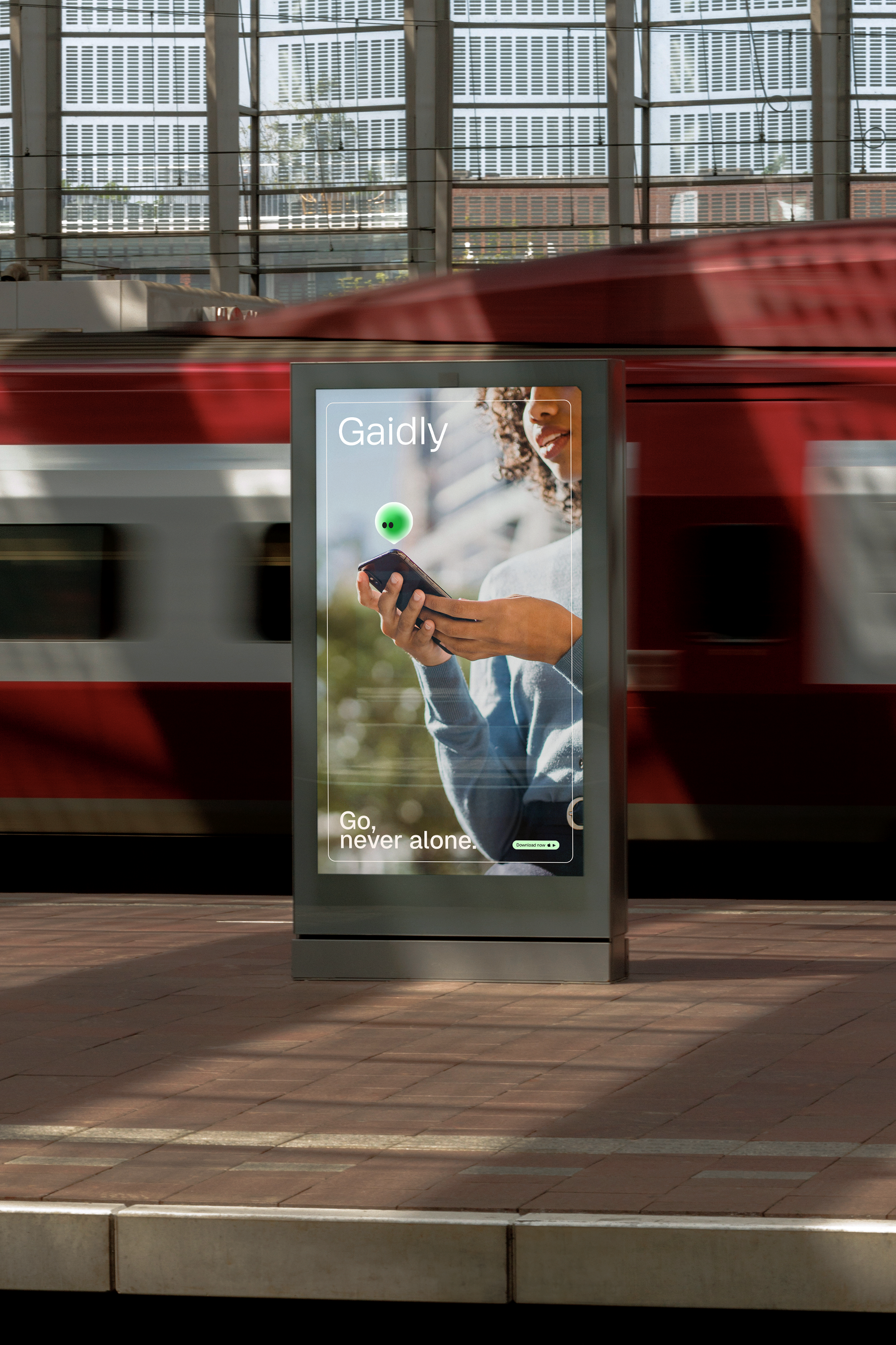
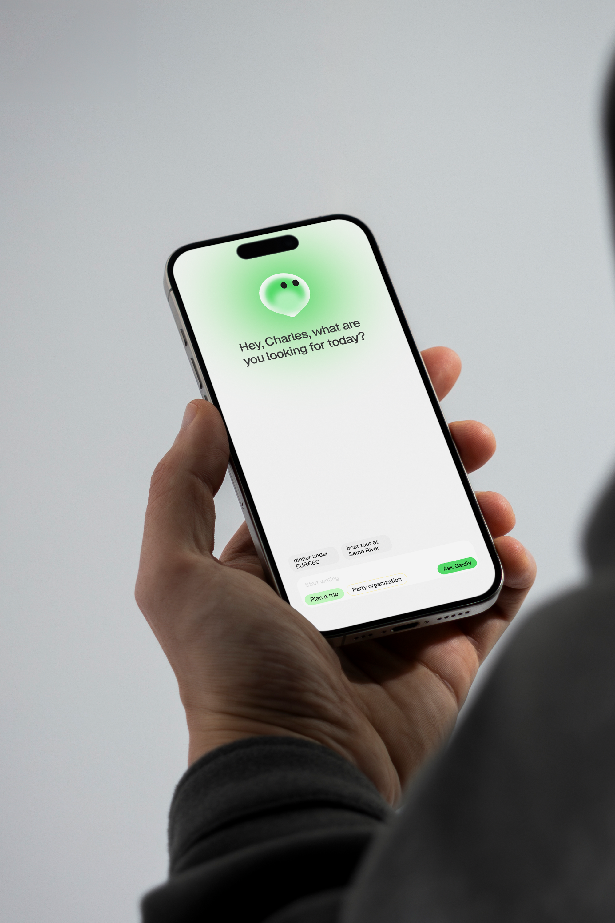
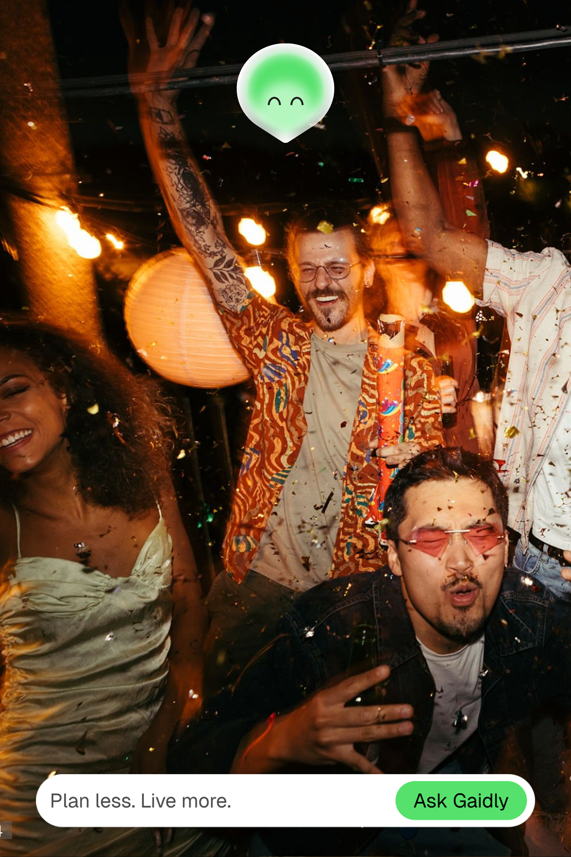
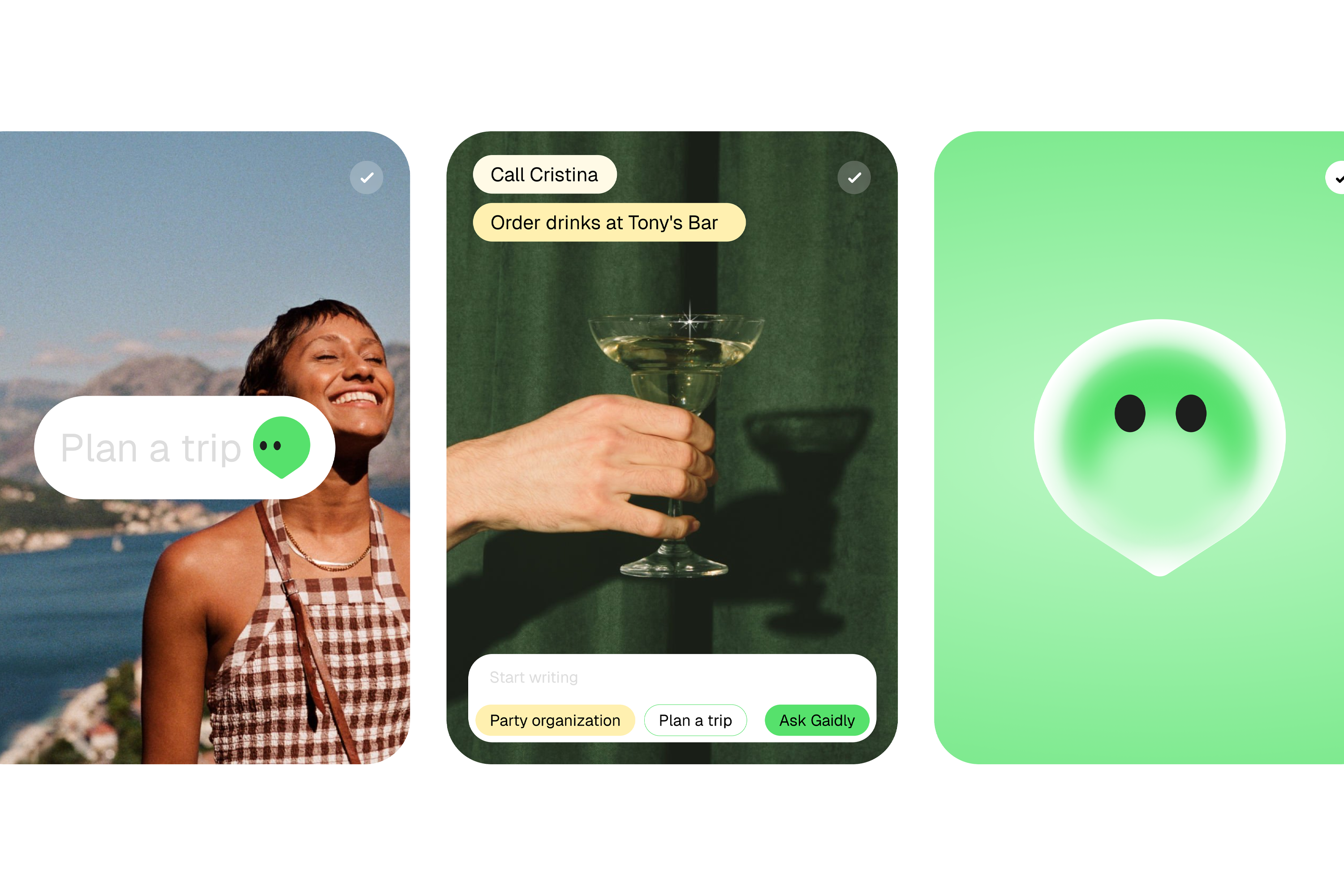
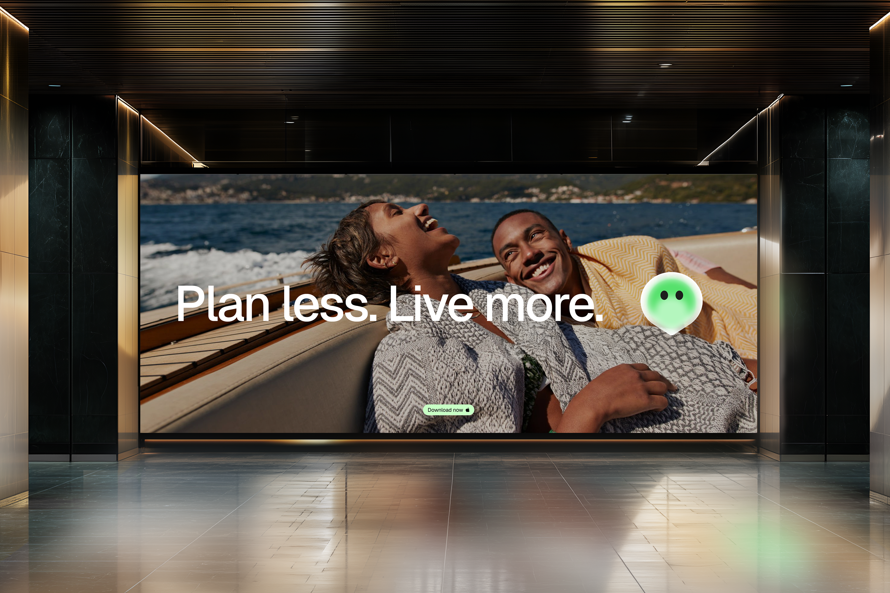
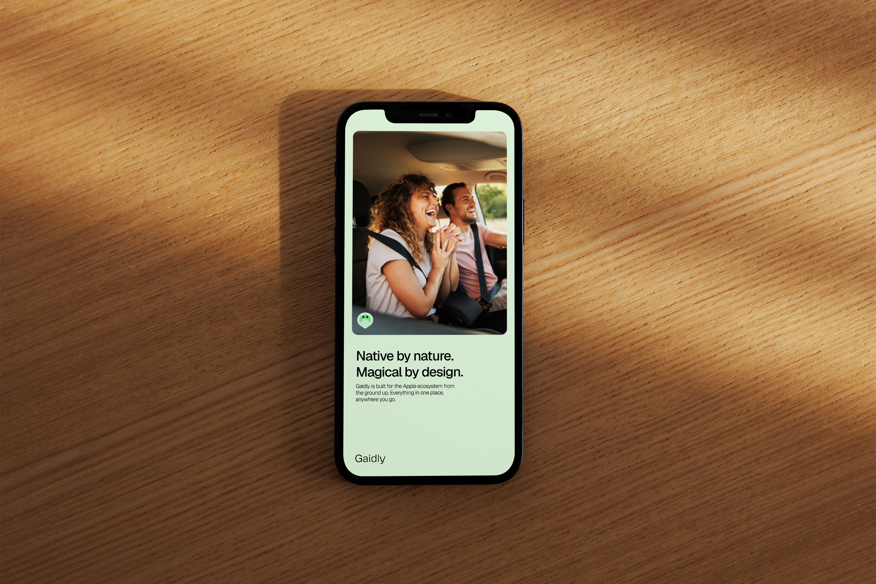
Plan less. Live more.
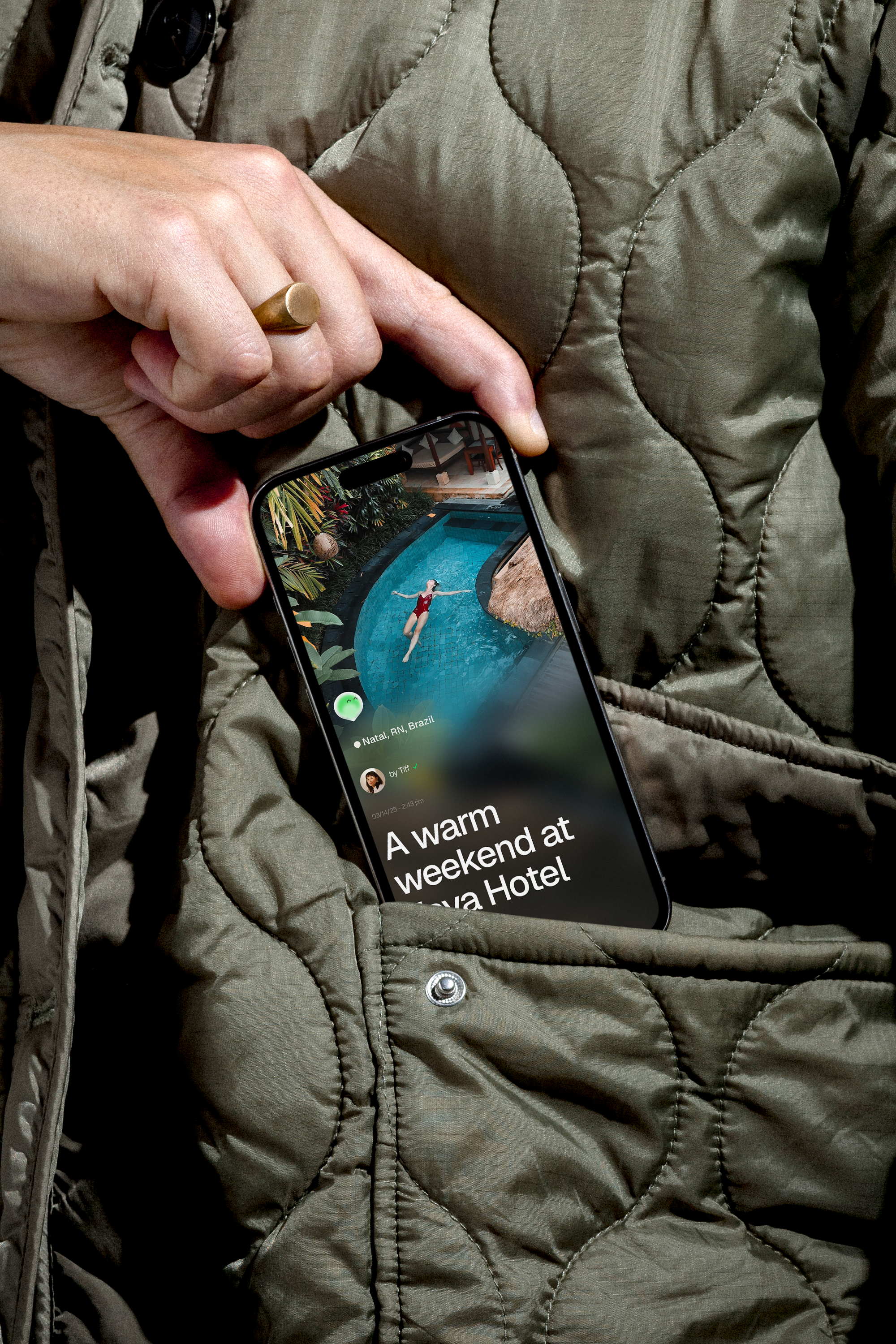
Gaidly is an application that generates and organizes travel itineraries and small events, serving as a personal guide to facilitate everything from planning to executing unforgettable experiences. Using human-like AI to plan personalized itineraries and offer practical, unique recommendations, they inspire people to create unique and meaningful moments, providing personalized and memorable experiences.
This brand believes every journey and celebration is unique, and their AI is dedicated to tailoring experiences that reflect individual needs, tastes, and dreams. They are passionate about fostering meaningful moments, whether it’s bringing people together for celebrations or helping them explore the world with ease and excitement.
The mascot are witty, charming and irreverent character that always looks friendly. Driven by a passion for discovery and new experiences. He give great advices, tell a tale or two and live the moment. He want to become the go-to AI companion to inspiring connection, joy, and exploration by transforming every journey and celebration into a memorable, stress-free experience.
I led the project from the strategic foundation to final delivery, defining the brand’s positioning, purpose, and core narrative through tools such as the Golden Circle and concept development workshops. From these insights, I directed the creative vision and built the complete identity system — including logotype, mascot, visual language, and brand guidelines.
The result is a flexible and human-centered brand system that balances technological intelligence with warmth and approachability, helping Gaidly stand out in a competitive travel tech landscape while creating emotional connection with its users.
Outcomes
Strategic Brand Identity to Support AI-Driven PositioningSymbol System to Reflect Trust, Exploration & Personalization
Experience-Driven Palette for Emotional Connection
Plan less. Live more.
Gaidly is an application that generates and organizes travel itineraries and small events, serving as a personal guide to facilitate everything from planning to executing unforgettable experiences. Using human-like AI to plan personalized itineraries and offer practical, unique recommendations, they inspire people to create unique and meaningful moments, providing personalized and memorable experiences.
This brand believes every journey and celebration is unique, and their AI is dedicated to tailoring experiences that reflect individual needs, tastes, and dreams. They are passionate about fostering meaningful moments, whether it’s bringing people together for celebrations or helping them explore the world with ease and excitement.
The mascot are witty, charming and irreverent character that always looks friendly. Driven by a passion for discovery and new experiences. He give great advices, tell a tale or two and live the moment. He want to become the go-to AI companion to inspiring connection, joy, and exploration by transforming every journey and celebration into a memorable, stress-free experience.
I led the project from the strategic foundation to final delivery, defining the brand’s positioning, purpose, and core narrative through tools such as the Golden Circle and concept development workshops. From these insights, I directed the creative vision and built the complete identity system — including logotype, mascot, visual language, and brand guidelines.
The result is a flexible and human-centered brand system that balances technological intelligence with warmth and approachability, helping Gaidly stand out in a competitive travel tech landscape while creating emotional connection with its users.
Outcomes
Strategic Brand Identity to Support AI-Driven PositioningSymbol System to Reflect Trust, Exploration & Personalization
Experience-Driven Palette for Emotional Connection
Madrid
Spain
2025
Spain
2025


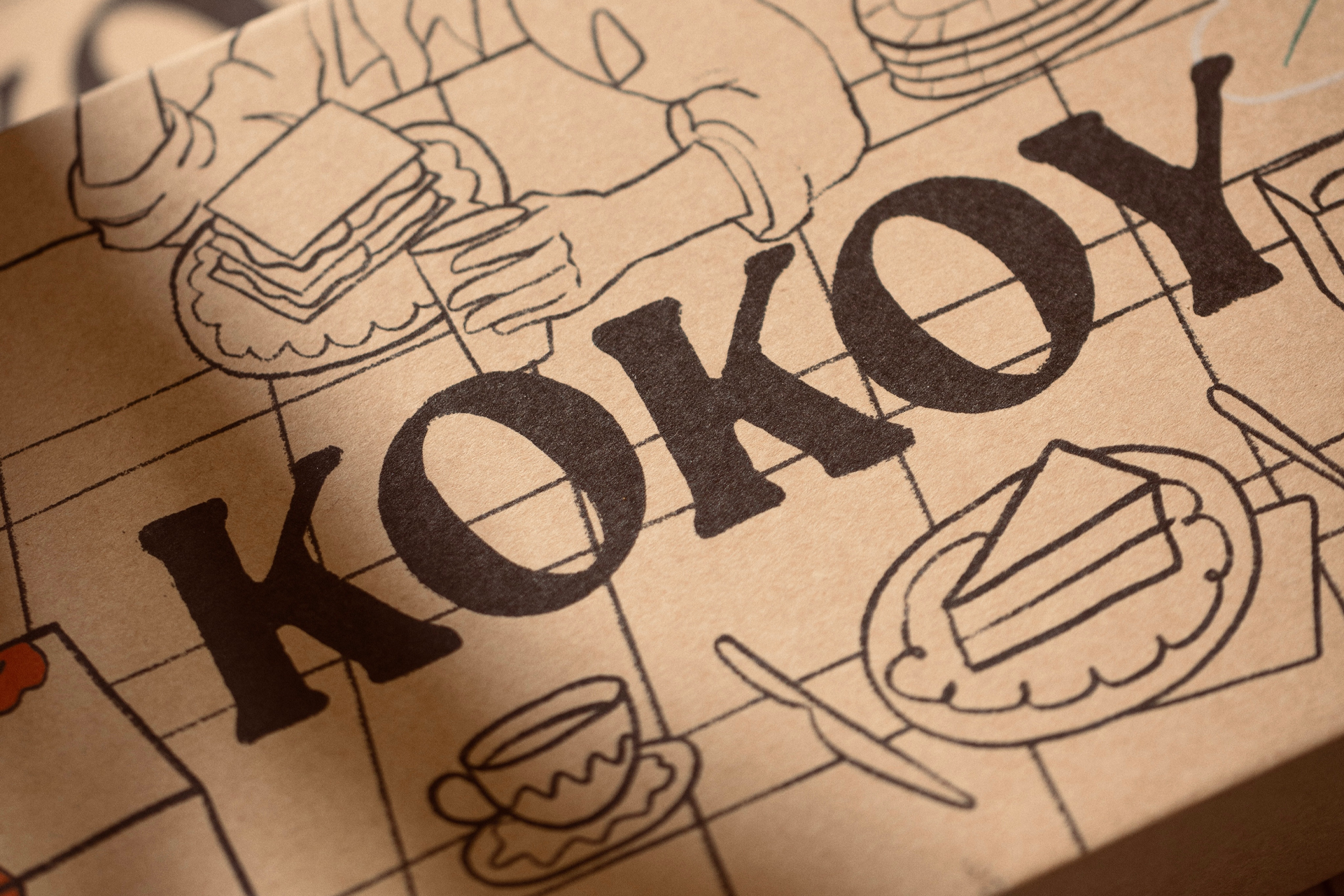


As Kokoy is rooted in Kuwait, a country where Arabic is both language and identity — it was essential to honor this cultural foundation in the visual expression of the brand. Translating the name into Arabic wasn’t just a linguistic decision; it was a gesture of cultural authenticity and local pride.
To deepen this connection, the logotype was redesigned drawing from traditional Arabic calligraphy, blending its rich, flowing heritage with Kokoy’s playful and bold personality. This allowed the brand to speak in a visual dialect that feels both familiar and fresh to its audience, celebrating Kuwait’s aesthetic traditions while inviting a new generation into a colorful, contemporary dessert experience.
Through this design choice, Kokoy becomes more than a brand, it becomes a bridge between tradition and modernity, between local roots and global reach.
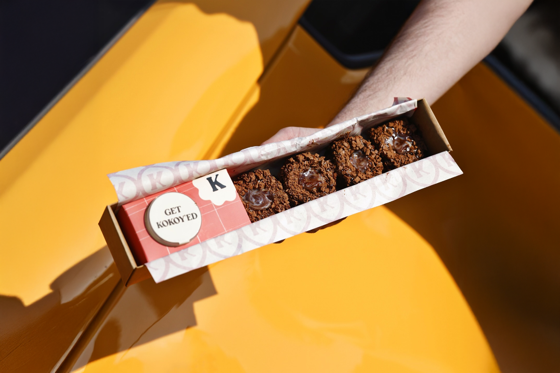
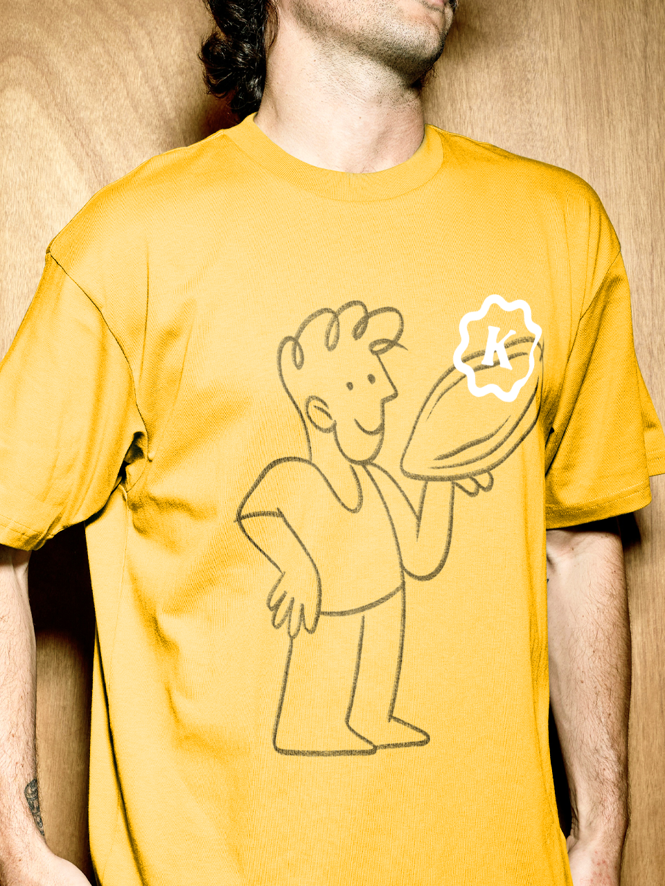
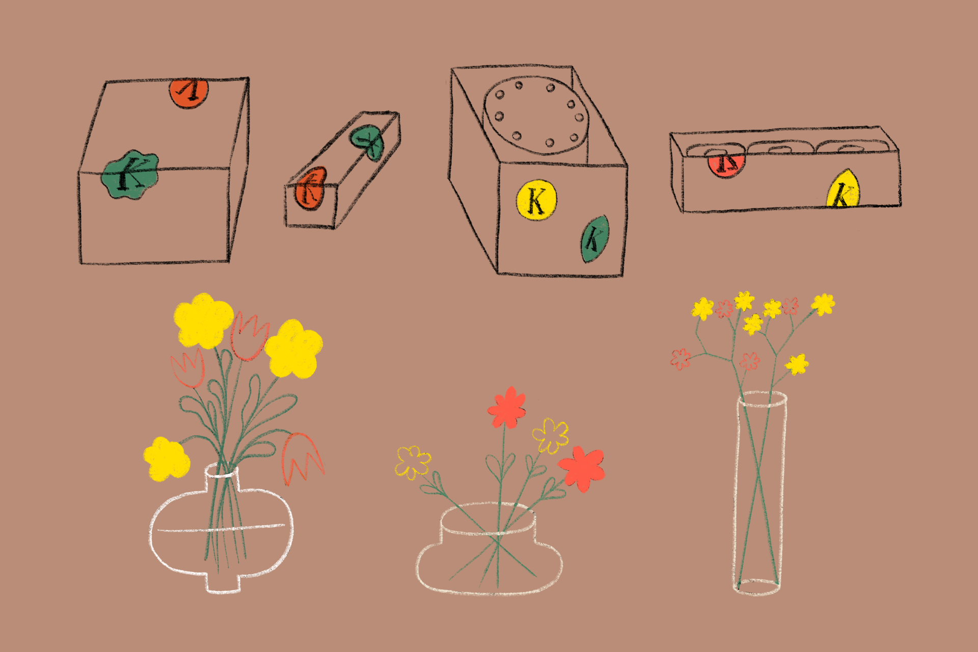
To complement Kokoy’s expressive logotype, a reduced brand icon was developed, a simplified yet distinctive variation that brings dynamism and flexibility to the identity system.
In fast-paced digital environments and small-scale applications, the full logotype may not always be practical. The reduced icon ensures Kokoy remains recognizable across all contexts, from social media avatars to packaging stamps and merchandise. More than a functional asset, it captures the essence of the brand in its purest form, allowing it to move with ease and spontaneity, just like the organic illustrations and playful personality that define it.
This strategic reduction doesn’t dilute Kokoy, it amplifies its adaptability, ensuring the brand feels alive, responsive, and ever-present in the modern visual landscape.


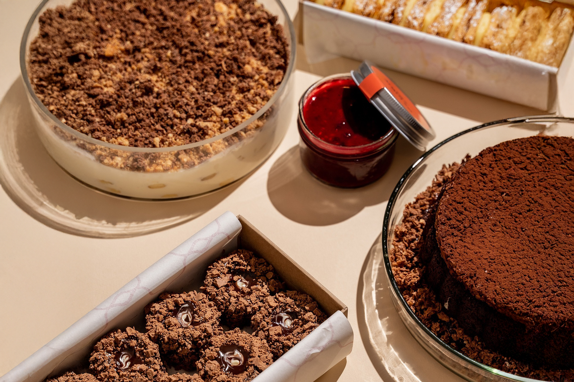


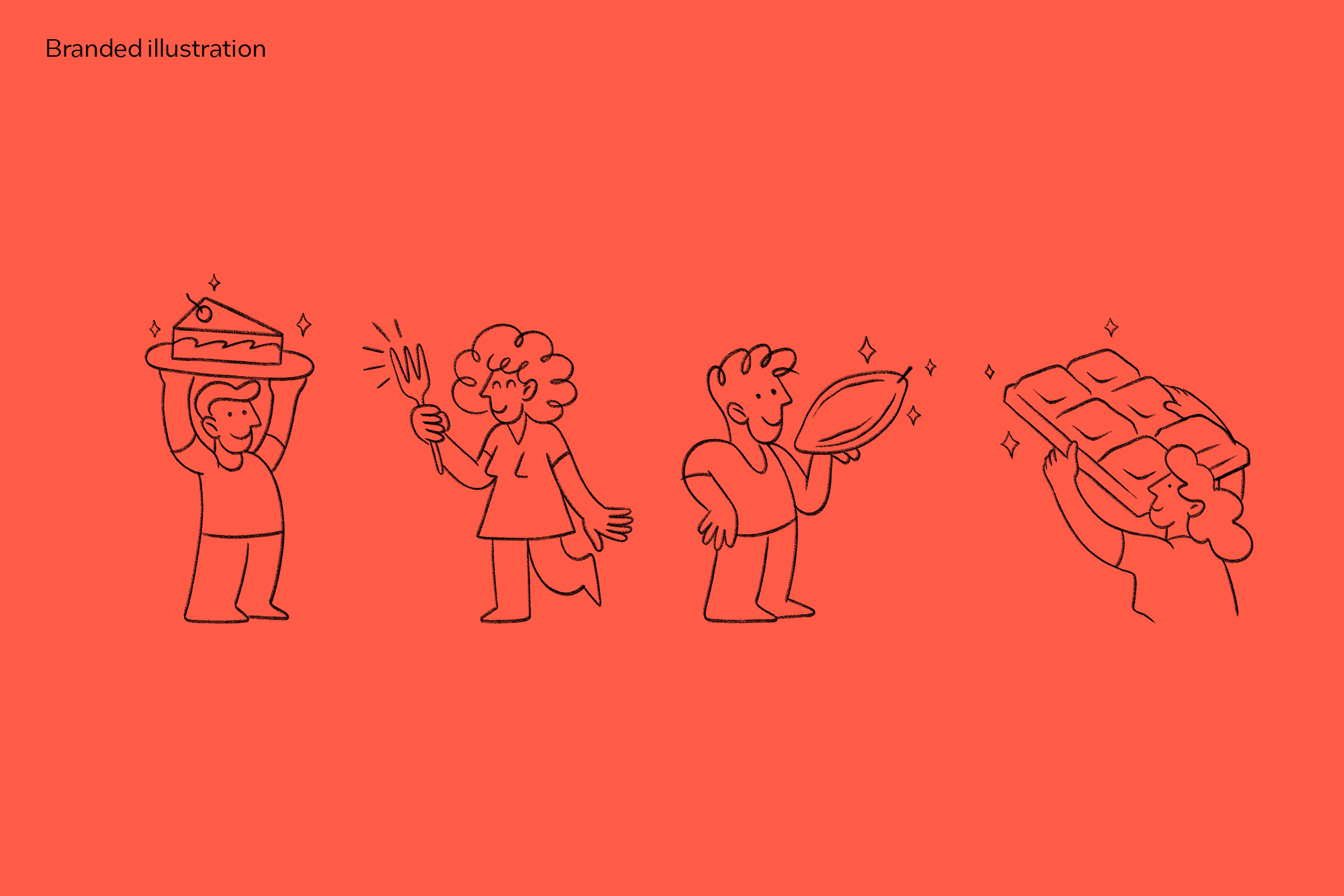

The illustrations in Kokoy play a vital role in expressing the brand’s essence — joyful, human, and full of personality. Drawn in an organic, free-flowing style, they mirror the imperfections and spontaneity of real life, reinforcing the brand’s commitment to authenticity and emotional connection.
These visuals aren’t just decorative; they are extensions of Kokoy’s soul. Every curve and splash of color reflects the warmth of human hands, echoing the same passion that goes into each dessert. This hand-drawn approach softens the boldness of the design, creating a dynamic balance between energy and empathy.
Through illustration, Kokoy becomes a world of its own, one where flavor, feeling, and imagination come together in every bite.


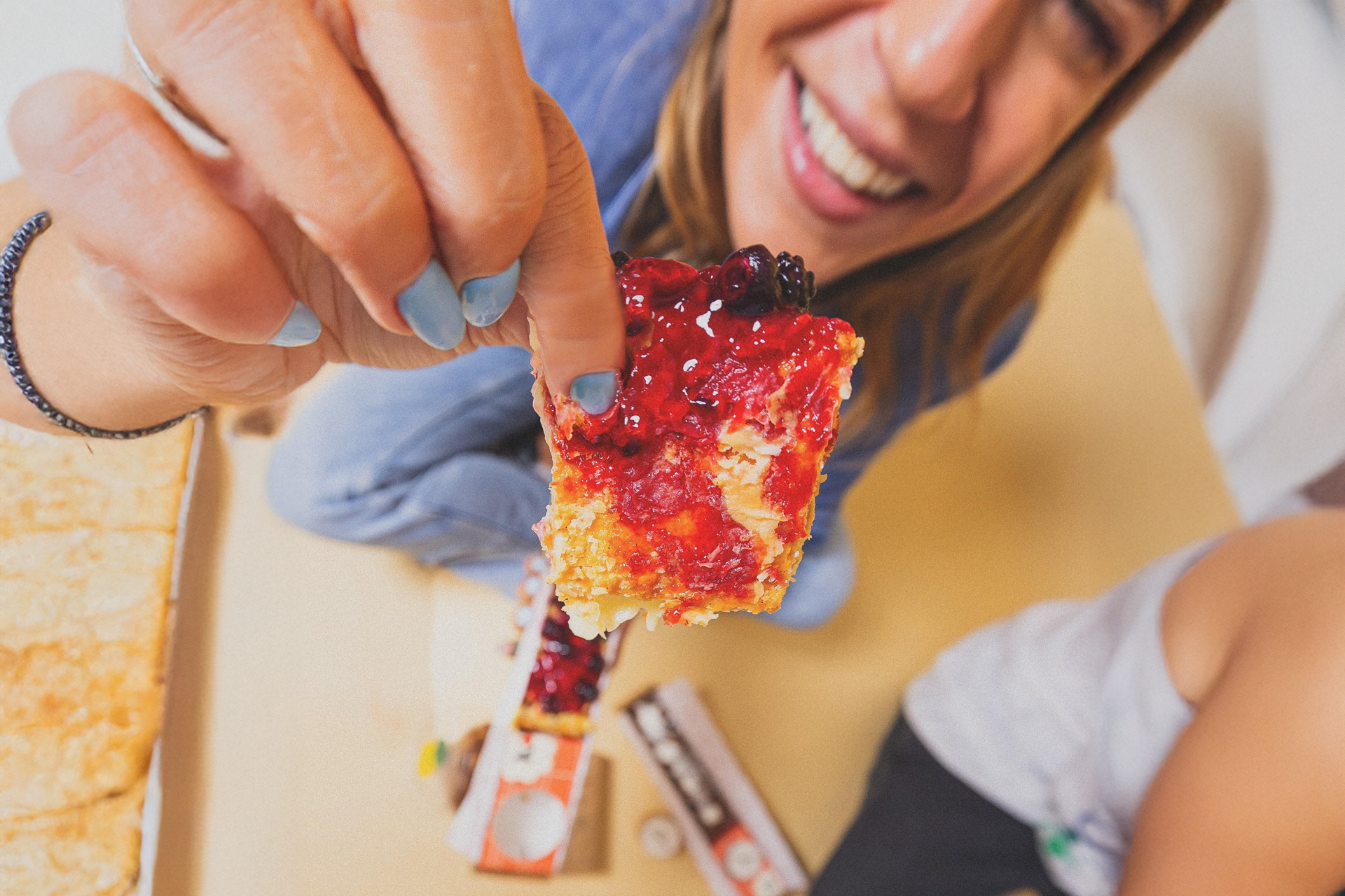
At the heart of Kokoy’s identity lies the illustration of hands — not only as a symbol of human warmth and interaction, but also as a tribute to the deep cultural meaning of hands in Arab traditions. In Kuwaiti and broader Arab culture, hands are central to acts of hospitality, generosity, and connection — from offering food to sharing conversations and blessings.
These illustrated hands represent more than touch; they embody ritual and respect, echoing the way desserts are often shared in moments of celebration and togetherness. They also reflect the intimacy between people and food, the gesture of giving, and the joy of receiving — all of which are fundamental to Kokoy’s spirit.
Drawn in a playful, organic style, the hands bridge the emotional and the cultural, reinforcing Kokoy’s human-centered approach. They invite customers not just to consume, but to feel, hold, and connect — making every dessert a small act of care, rooted in both tradition and emotion.


Project information
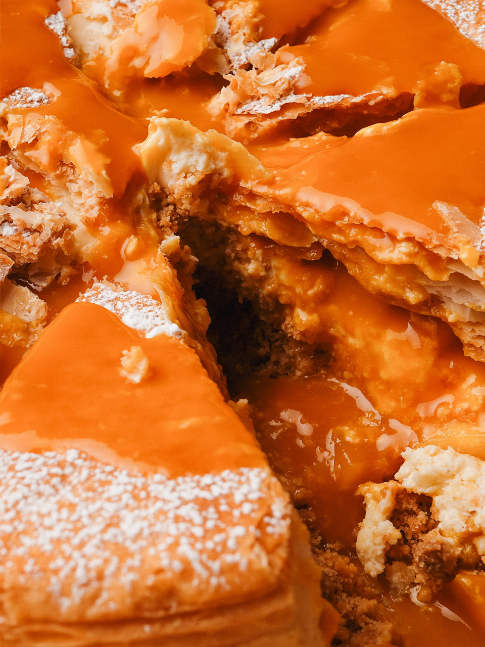
A Taste of Joy from Kuwait.
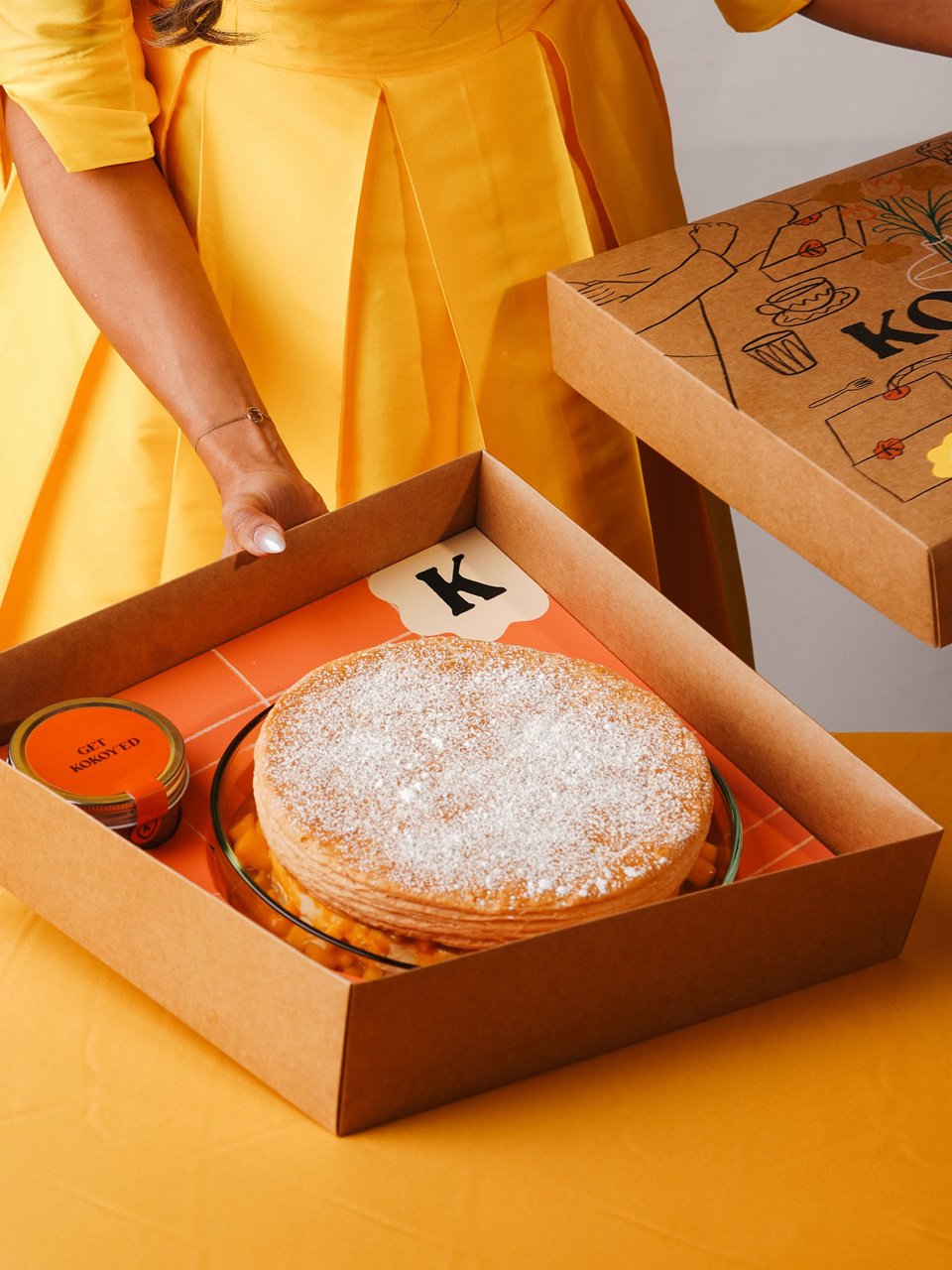
Kokoy is a vibrant dessert brand rooted in Kuwaiti culture, crafted to capture the joy and human warmth of shared moments around food.
I led the project holistically — from strategic discovery to creative execution and final delivery — shaping both the conceptual foundation and visual expression of the brand. Beginning with a deep understanding of Kokoy’s cultural context and emotional purpose, I defined the brand strategy and positioning, ensuring the visual identity would honor local heritage while expressing a playful, contemporary spirit.
From this strategic core, I developed the complete identity system including the custom logotype, brand mascot, illustrative language, reduced icon system, and comprehensive brand book. The logotype and visual elements draw from organic, hand-drawn forms to evoke warmth and approachability, while the illustration of hands reflects cultural significance of hospitality and connection.
Through these strategic choices, Kokoy’s brand experience bridges tradition and modernity, giving the dessert brand a distinctive visual voice and emotional resonance that strengthens its identity in both local and broader markets.
Outcomes
Brand Identity, Brand Design, Packaging, and Illustration
A Taste of Joy from Kuwait.
Kokoy is a vibrant dessert brand rooted in Kuwaiti culture, crafted to capture the joy and human warmth of shared moments around food.
I led the project holistically — from strategic discovery to creative execution and final delivery — shaping both the conceptual foundation and visual expression of the brand. Beginning with a deep understanding of Kokoy’s cultural context and emotional purpose, I defined the brand strategy and positioning, ensuring the visual identity would honor local heritage while expressing a playful, contemporary spirit.
From this strategic core, I developed the complete identity system including the custom logotype, brand mascot, illustrative language, reduced icon system, and comprehensive brand book. The logotype and visual elements draw from organic, hand-drawn forms to evoke warmth and approachability, while the illustration of hands reflects cultural significance of hospitality and connection.
Through these strategic choices, Kokoy’s brand experience bridges tradition and modernity, giving the dessert brand a distinctive visual voice and emotional resonance that strengthens its identity in both local and broader markets.
Outcomes
Brand Identity, Brand Design, Packaging, and Illustration
Kuwait City
Kuwait
2024
Kuwait
2024


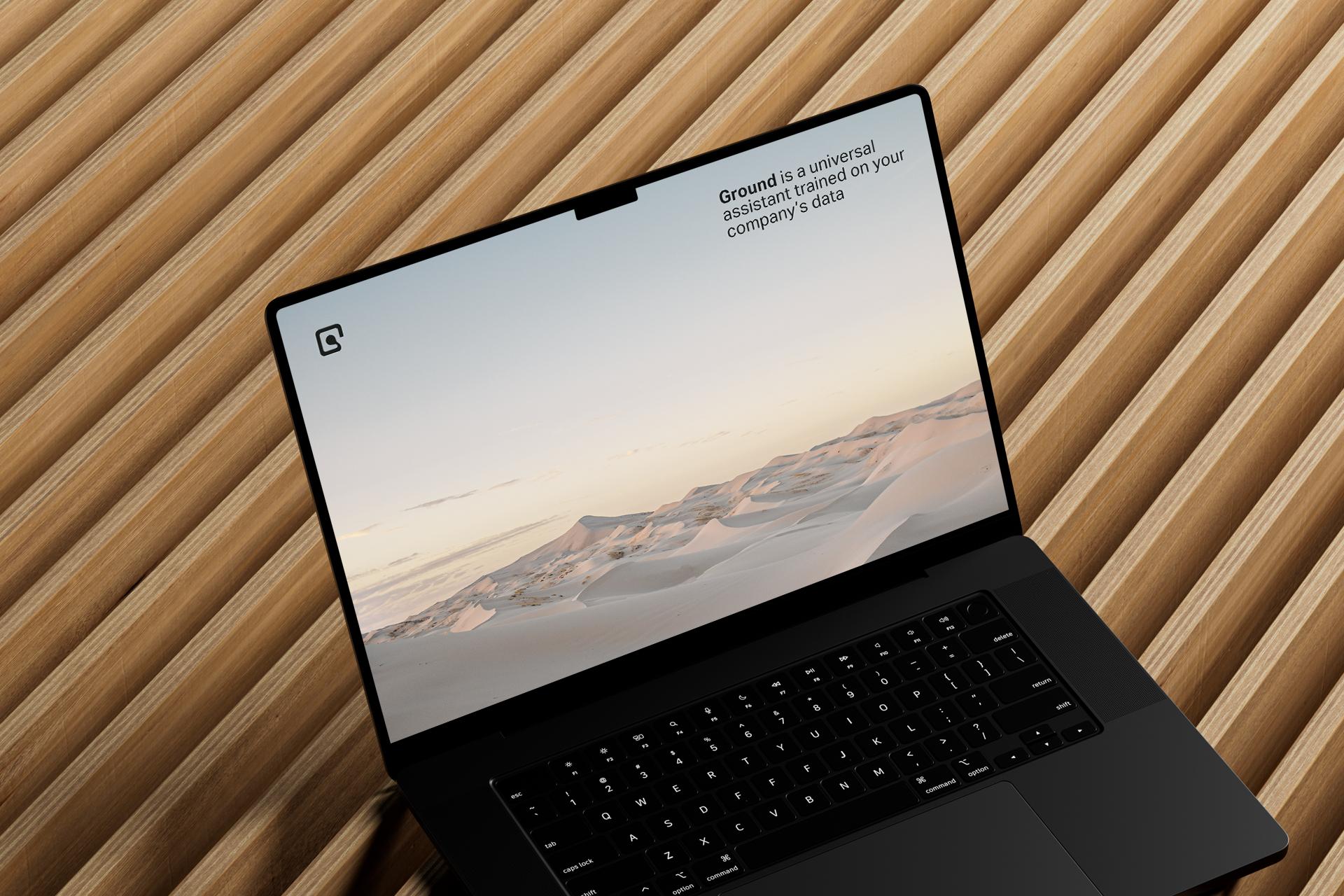


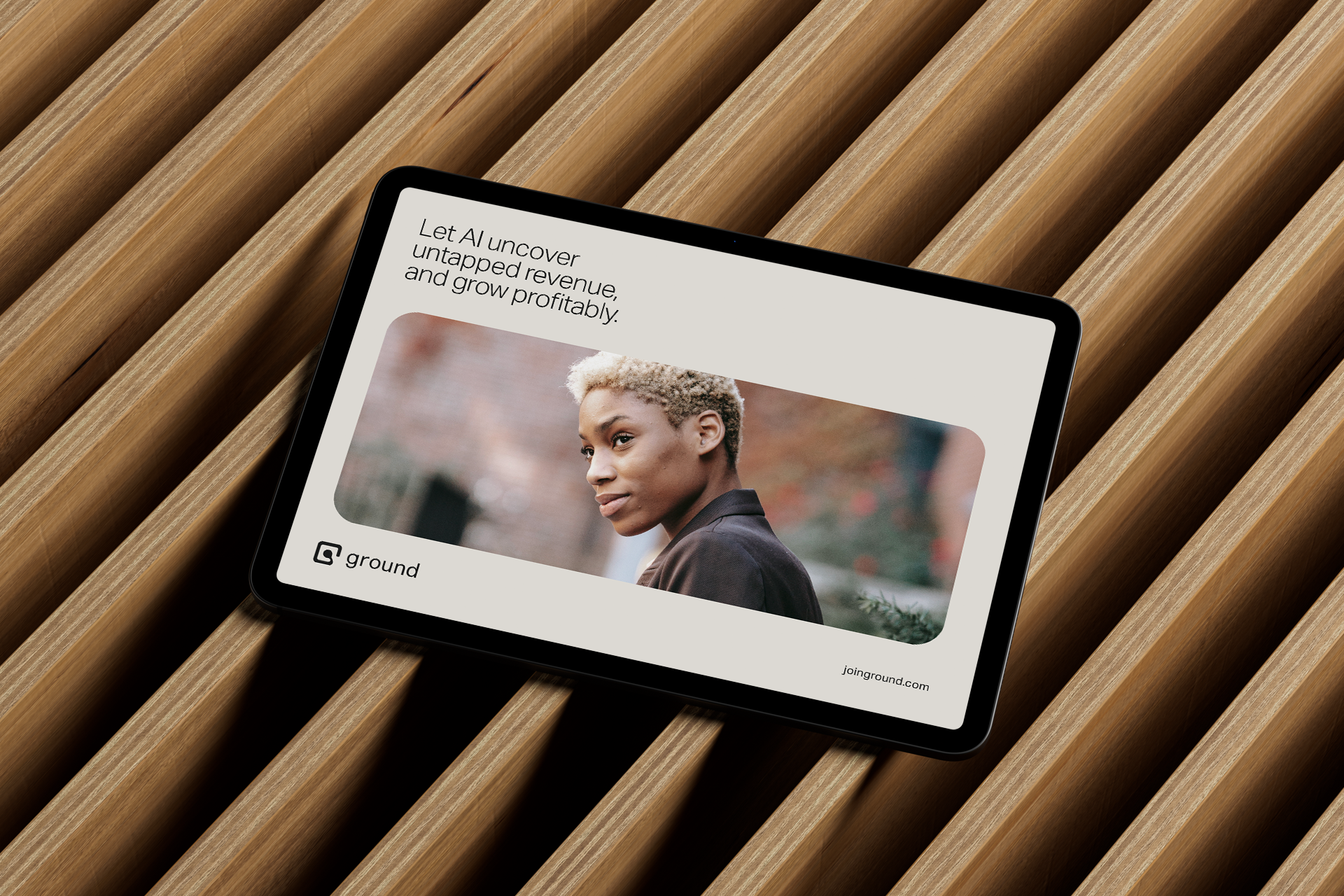
The icon is rooted in the recognizable shape of the letter G, immediately tying it to the brand’s name and identity. The use of bold, rounded geometry gives it a solid yet approachable feel. The inner curve that loops down and back up creates a cyclical motion, evoking a sense of ongoing momentum and iteration — symbolic of how the brand drives growth through continuous learning and optimization.
Its simplicity makes it highly versatile, whether scaled for digital use or print. The design balances tech-forward sharpness with human-centered curves, making it ideal for a product at the intersection of AI and marketing.
Its simplicity makes it highly versatile, whether scaled for digital use or print. The design balances tech-forward sharpness with human-centered curves, making it ideal for a product at the intersection of AI and marketing.


Project information
Ground is a forward-thinking brand designed to establish a distinctive visual identity and narrative within its category.
I led this project end-to-end — from strategic discovery and brand positioning to creative direction and final delivery. Beginning with an in-depth strategic phase, I established the brand’s core purpose, personality, and visual foundations to ensure the identity would meaningfully reflect its values and market positioning.
With this strategic groundwork, I guided key creative decisions and built a cohesive identity system including the custom logotype, visual language, system components, and comprehensive brand guidelines. Every design choice was rooted in strategic intent — balancing clarity, differentiation, and resonance with the target audience.
The result is a robust brand identity that confidently communicates Ground’s essence while providing a flexible framework for application across touchpoints; from digital experiences to visual collateral.
Outcomes
Strategy, Concept Development, Creative Direction, Logotype, Visual Language, Design System & Brand Book
New York
New York
US
2023
New York
US
2023
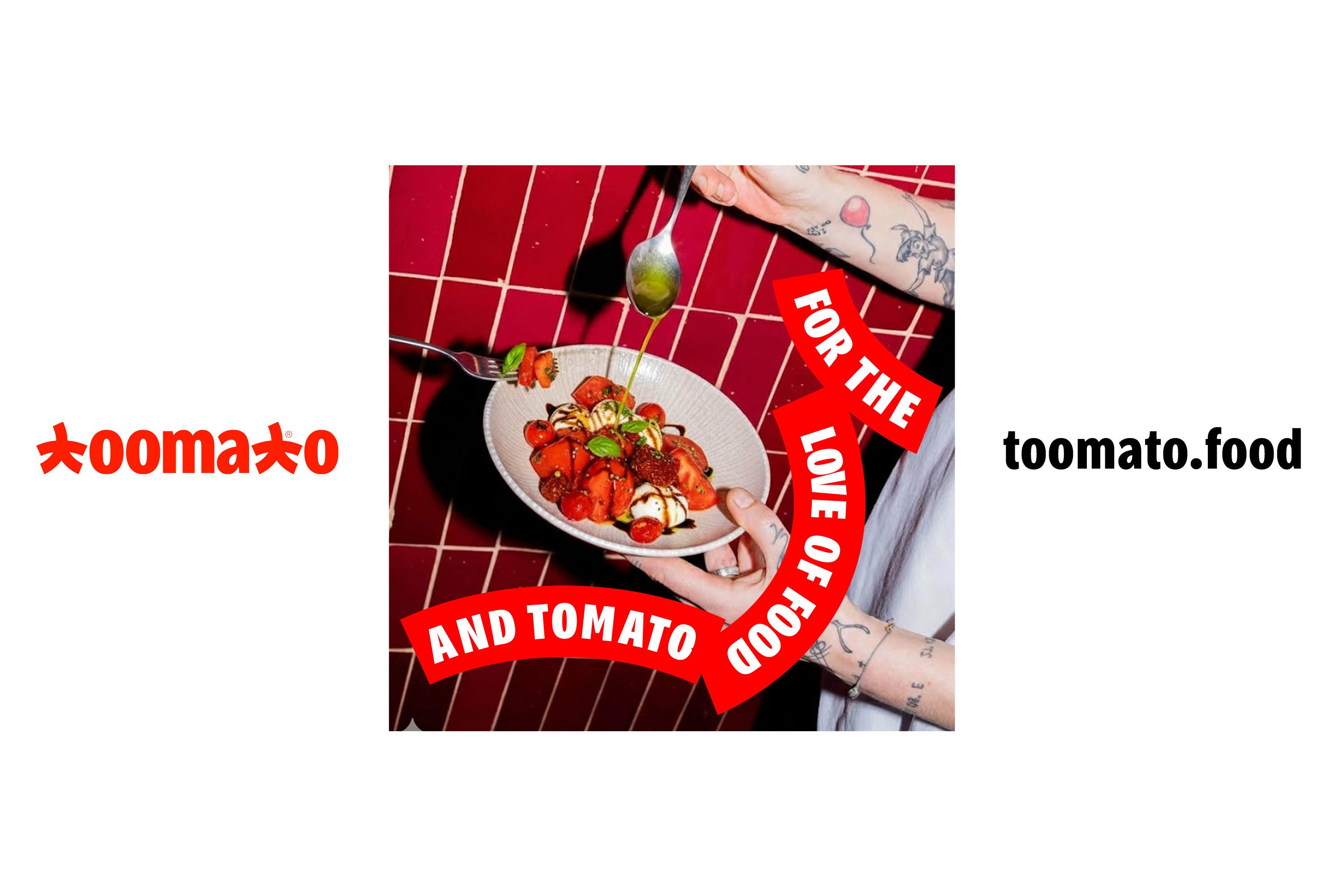
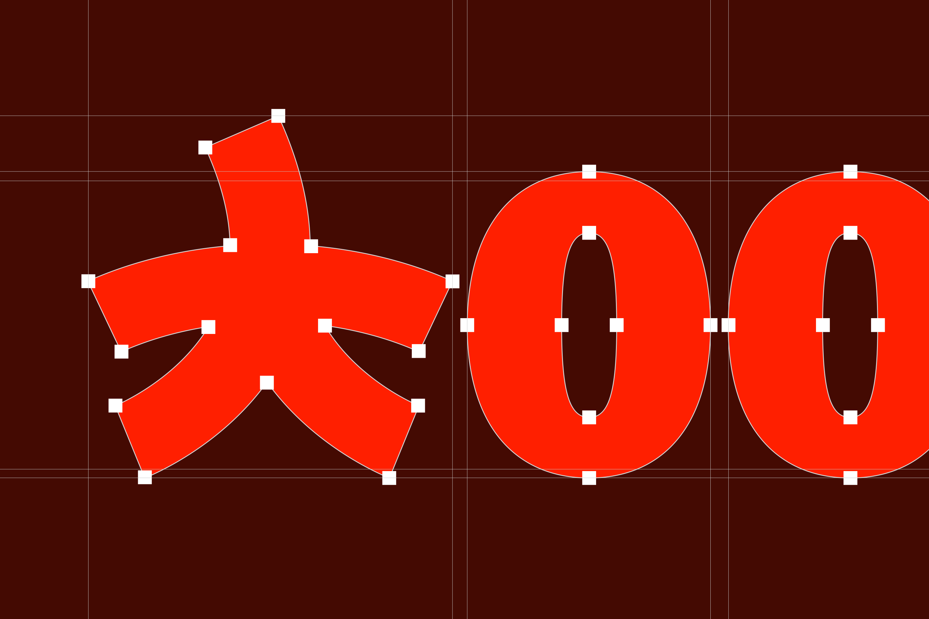
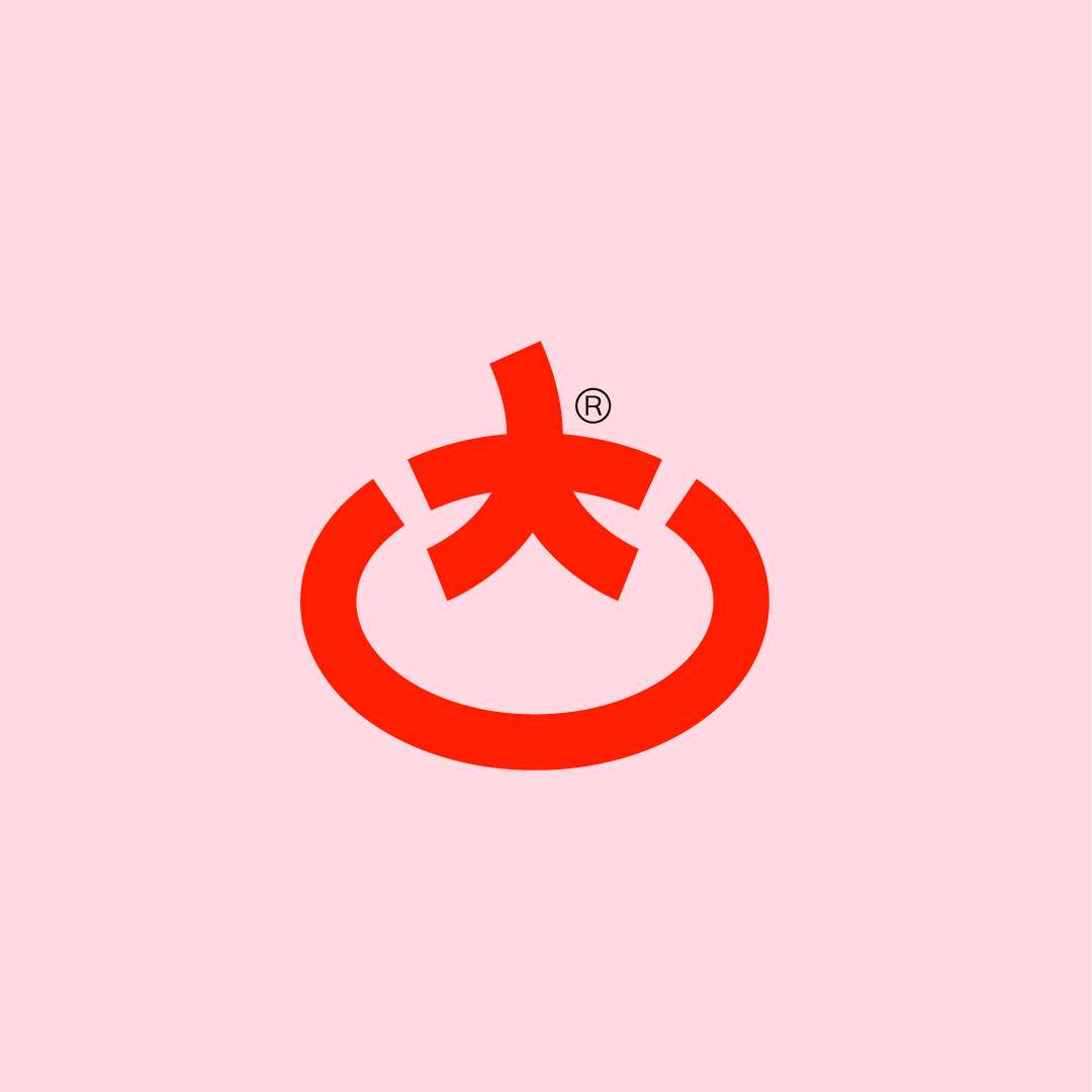
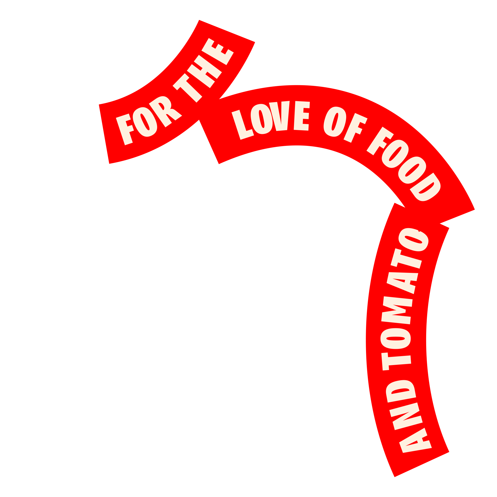
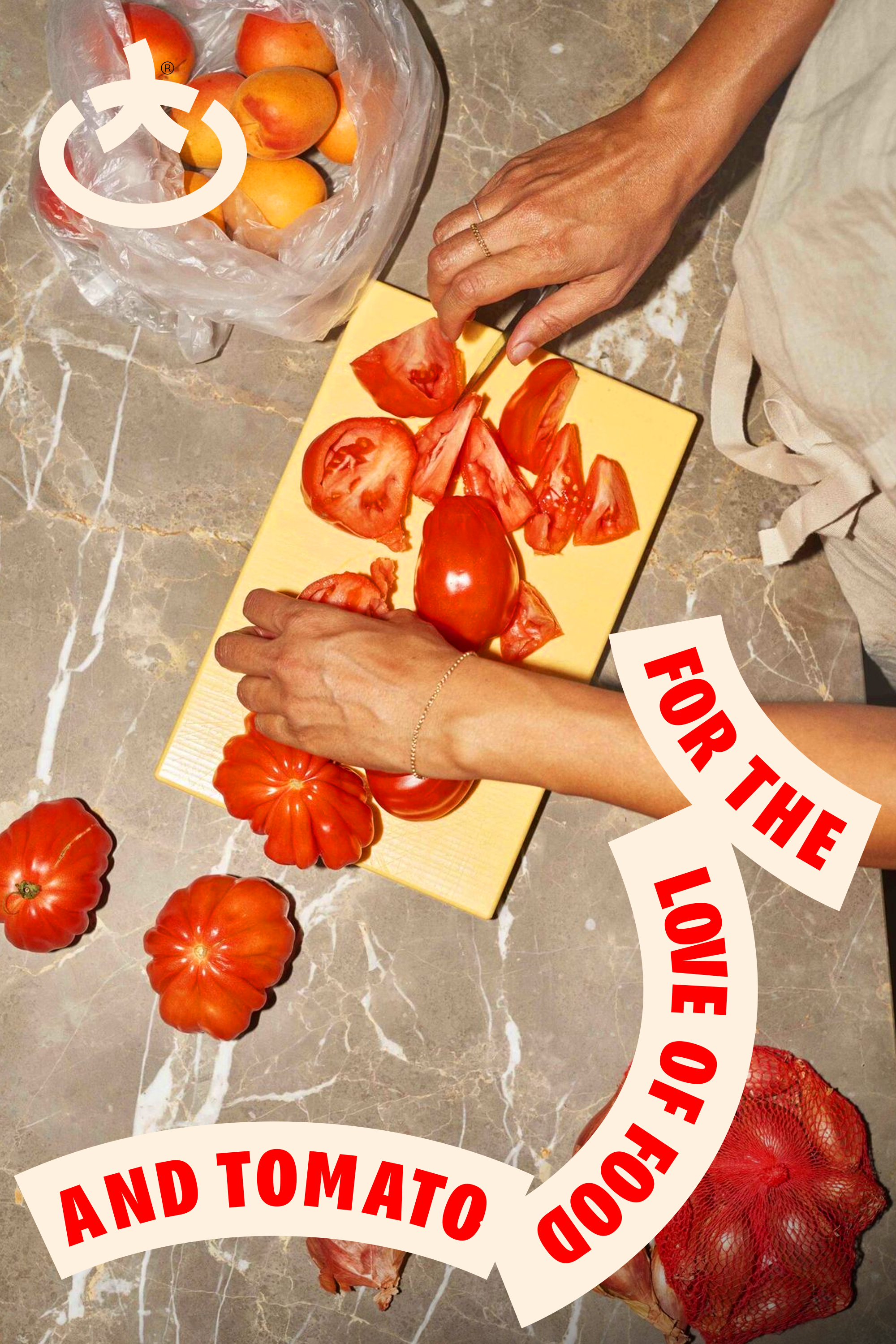
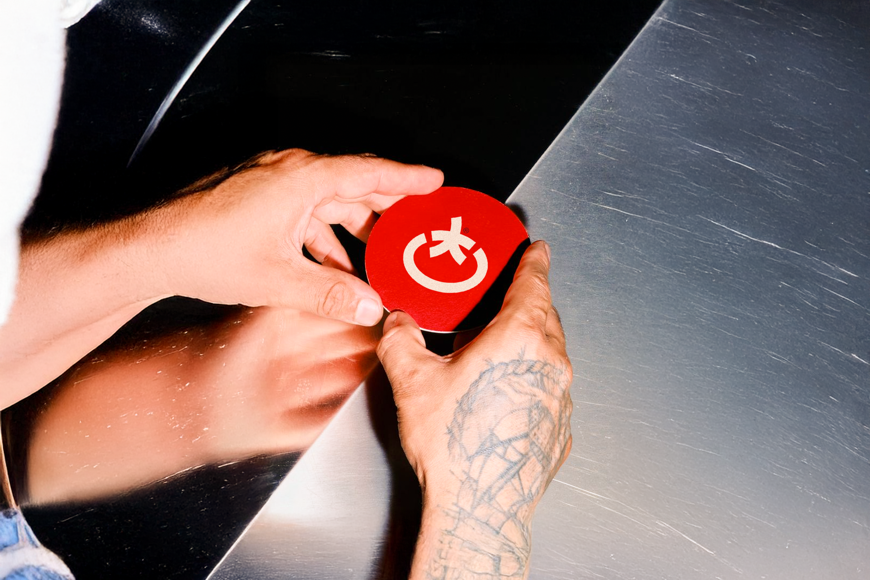
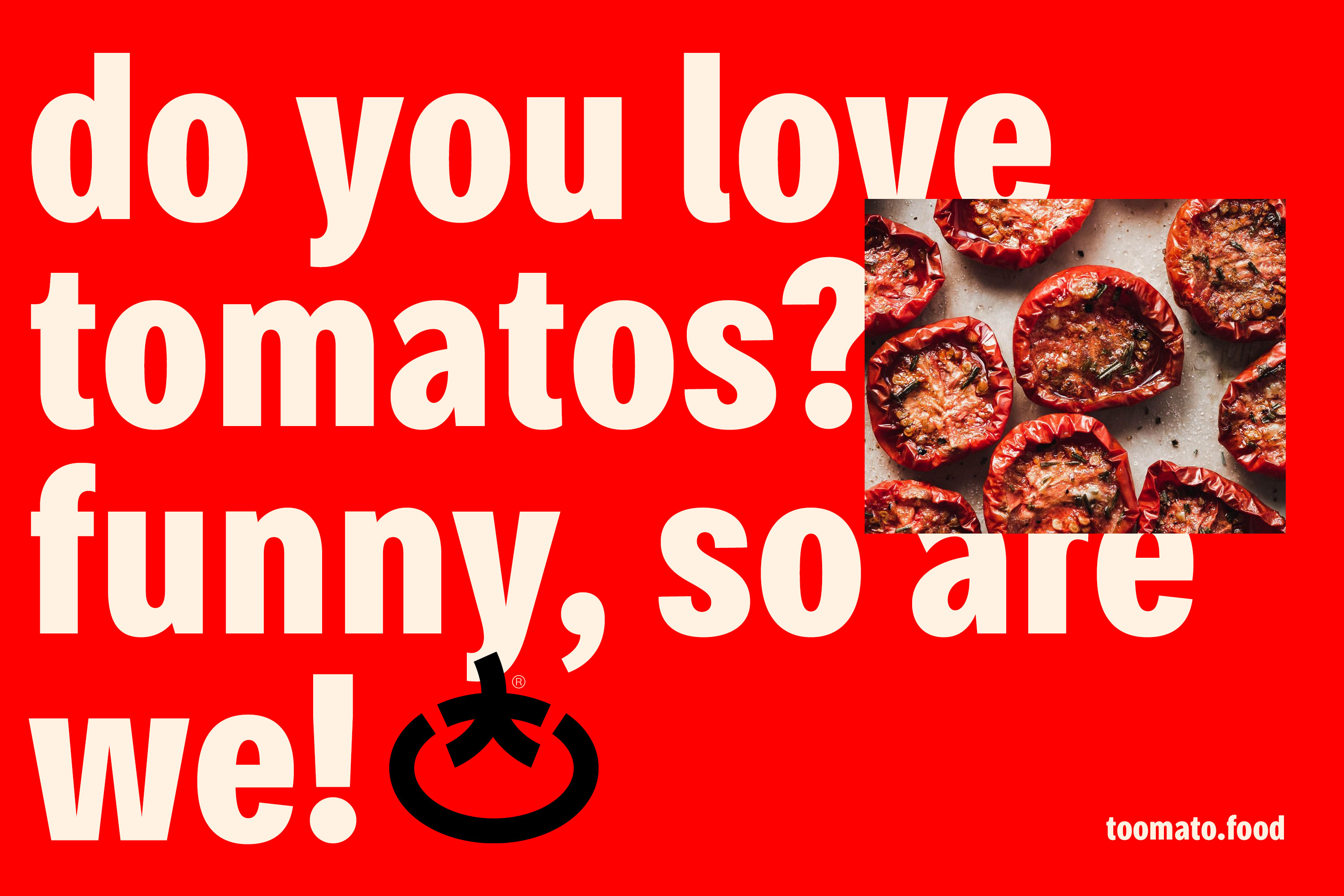
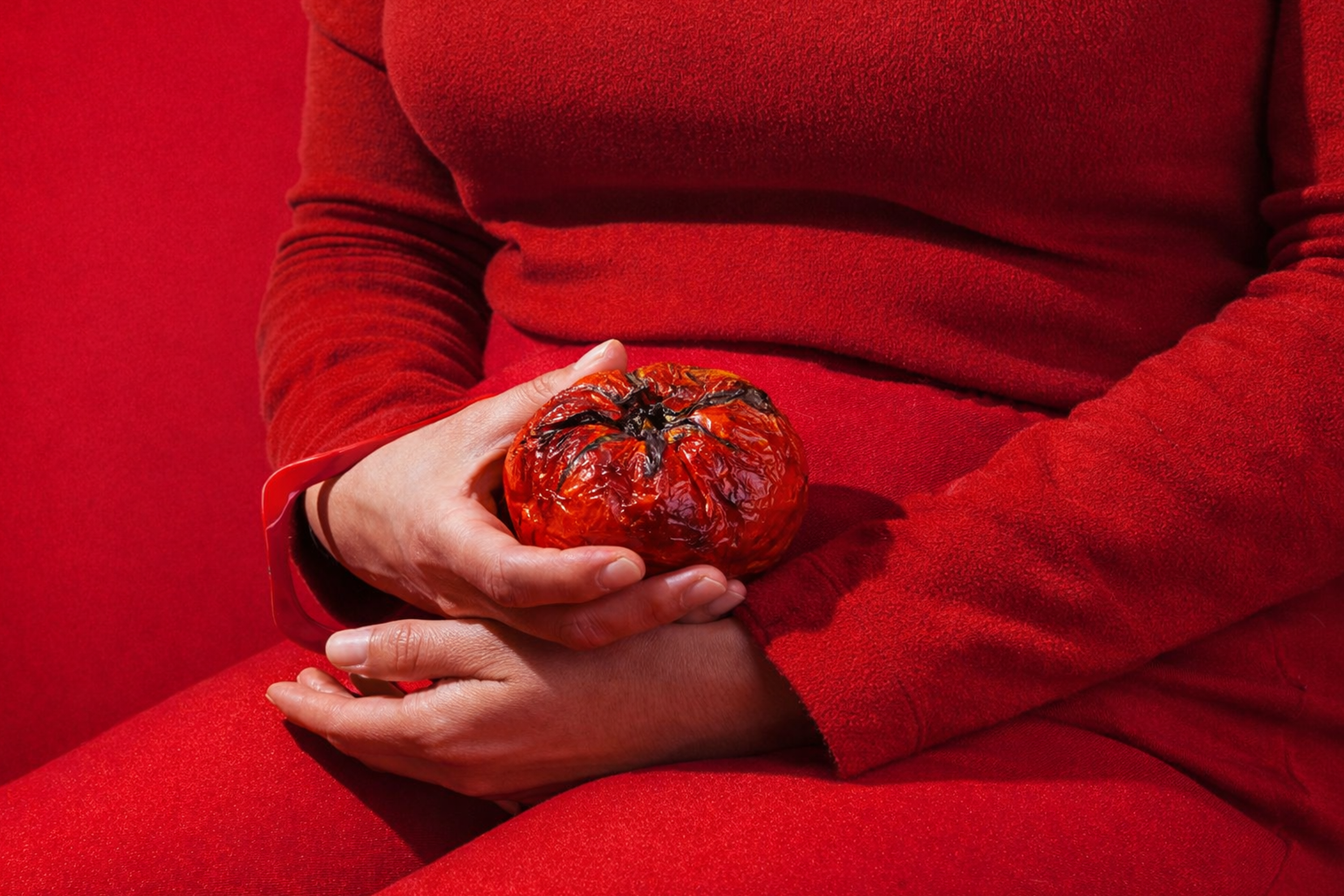
Tomato Shaped Icon
The icon was created by merging the project’s core elements into a single, memorable shape. I combined the letter T from Toomato with the silhouette of a tomato, using the leaf structure as the foundation for the letterform itself.
This approach transforms the brand’s initial into a symbolic element, creating an icon that feels both literal and abstract, instantly recognizable while still playful and organic.

Graphics
The graphic system expands from the icon’s structure. I developed a simple form built from curved rectangles, a soft, modular shape derived from the same T/leaf geometry.
These elements work as flexible building blocks across layouts, adding rhythm, movement, and personality while keeping the visual language cohesive and unmistakably tied to the brand.


Project information
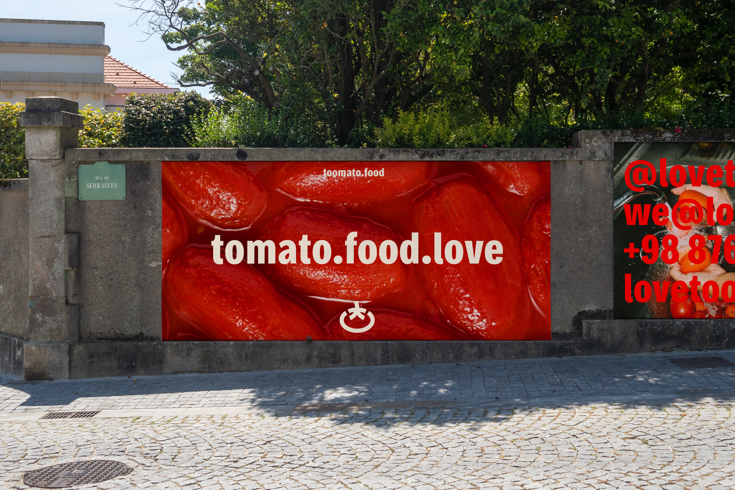
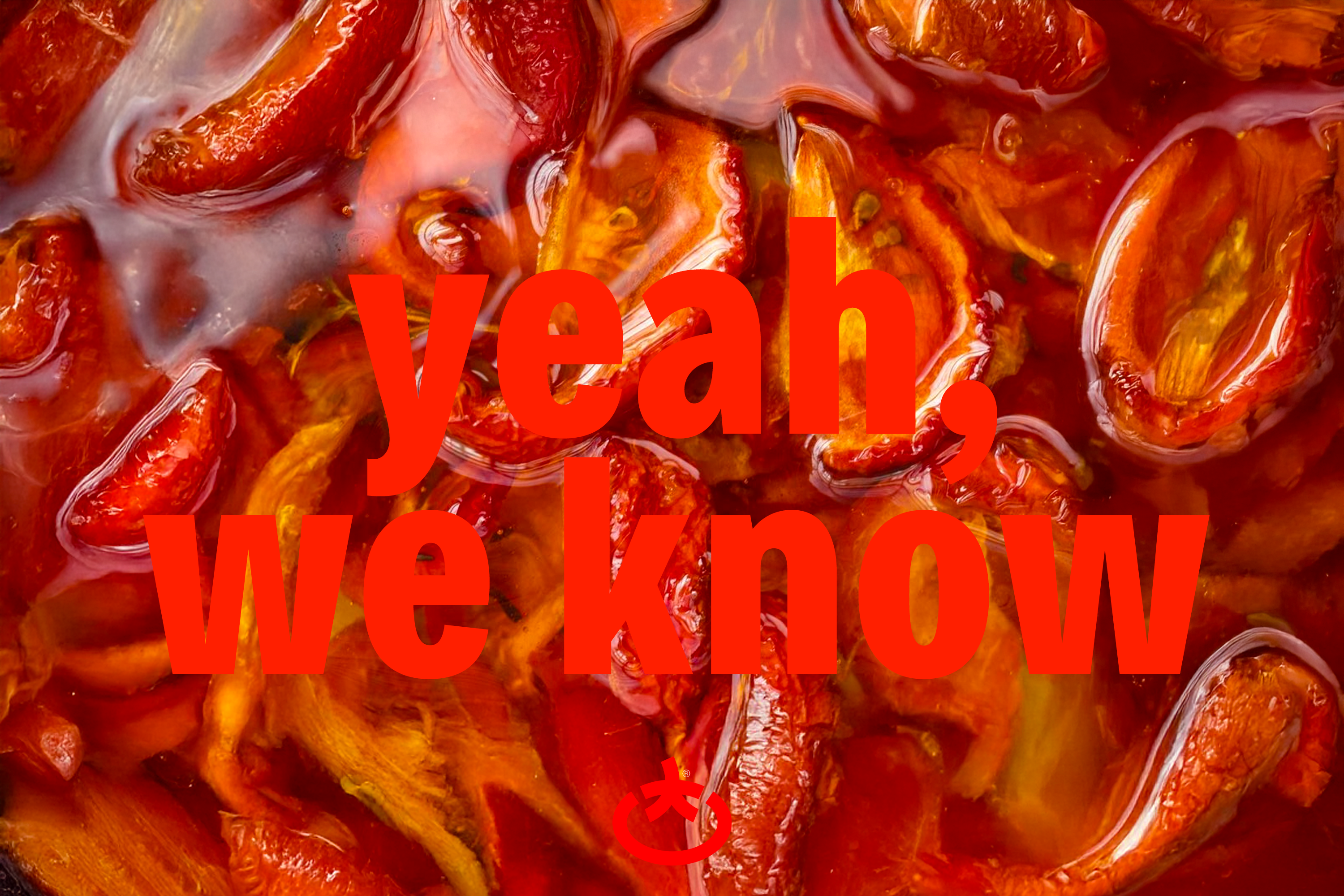
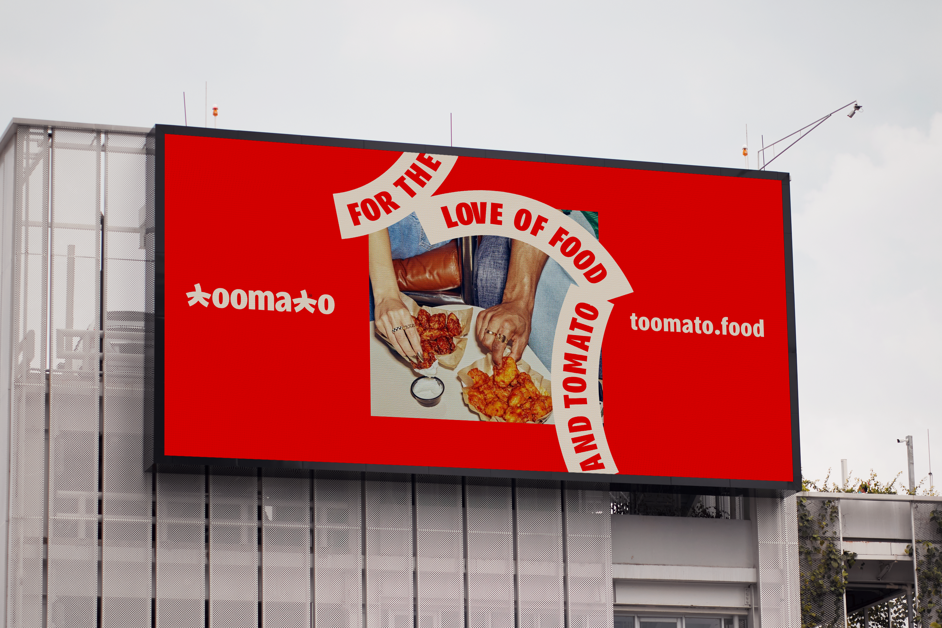
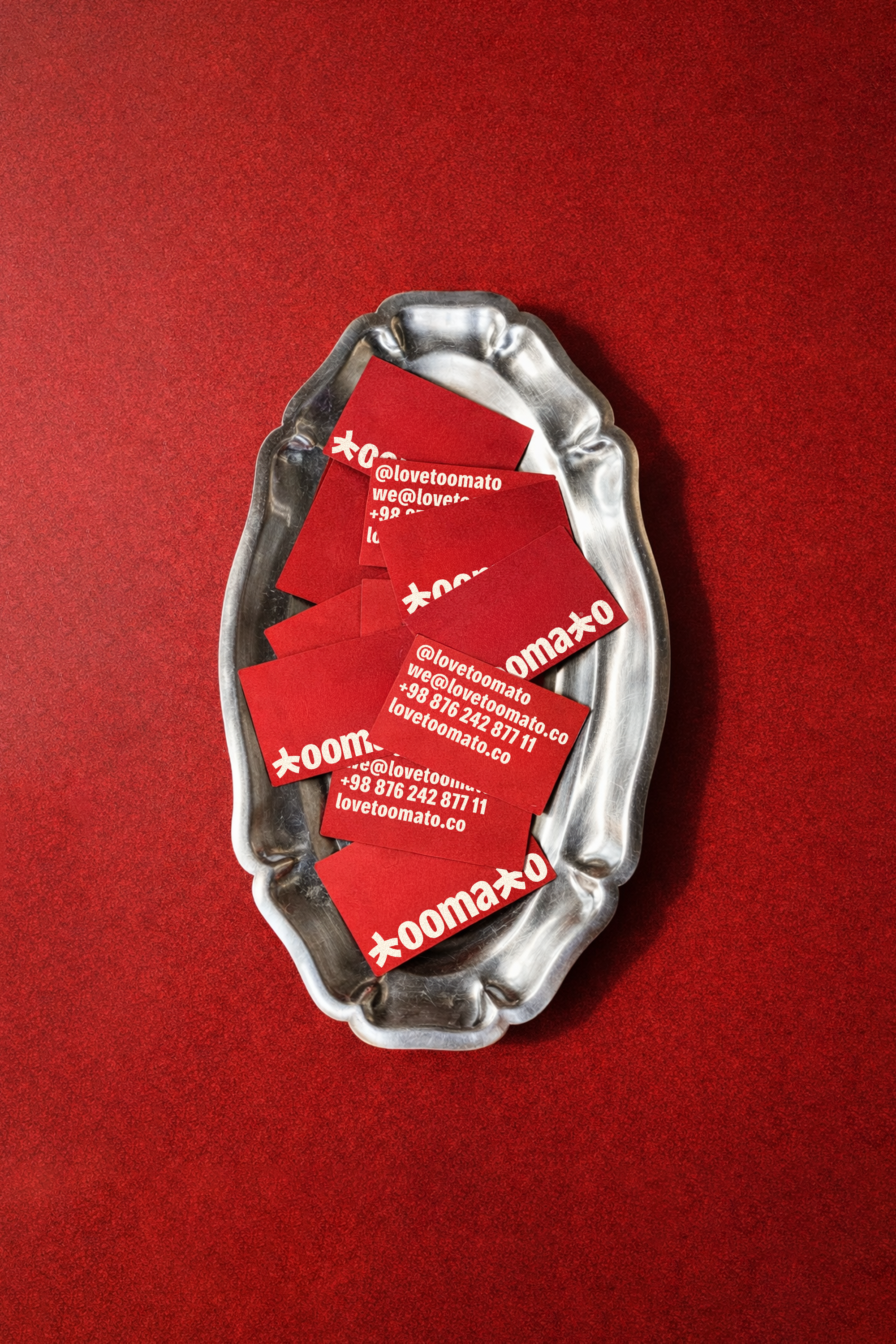
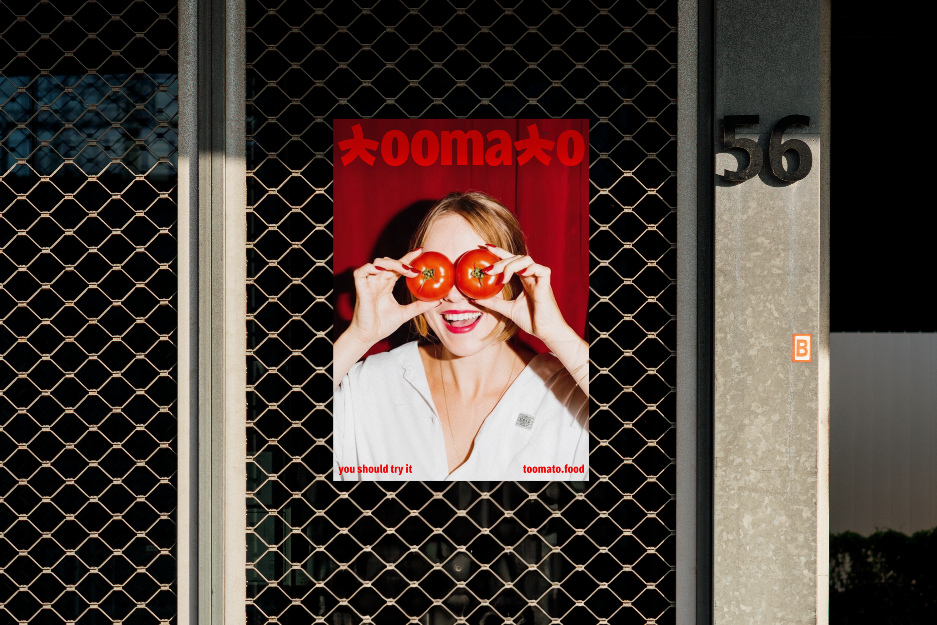
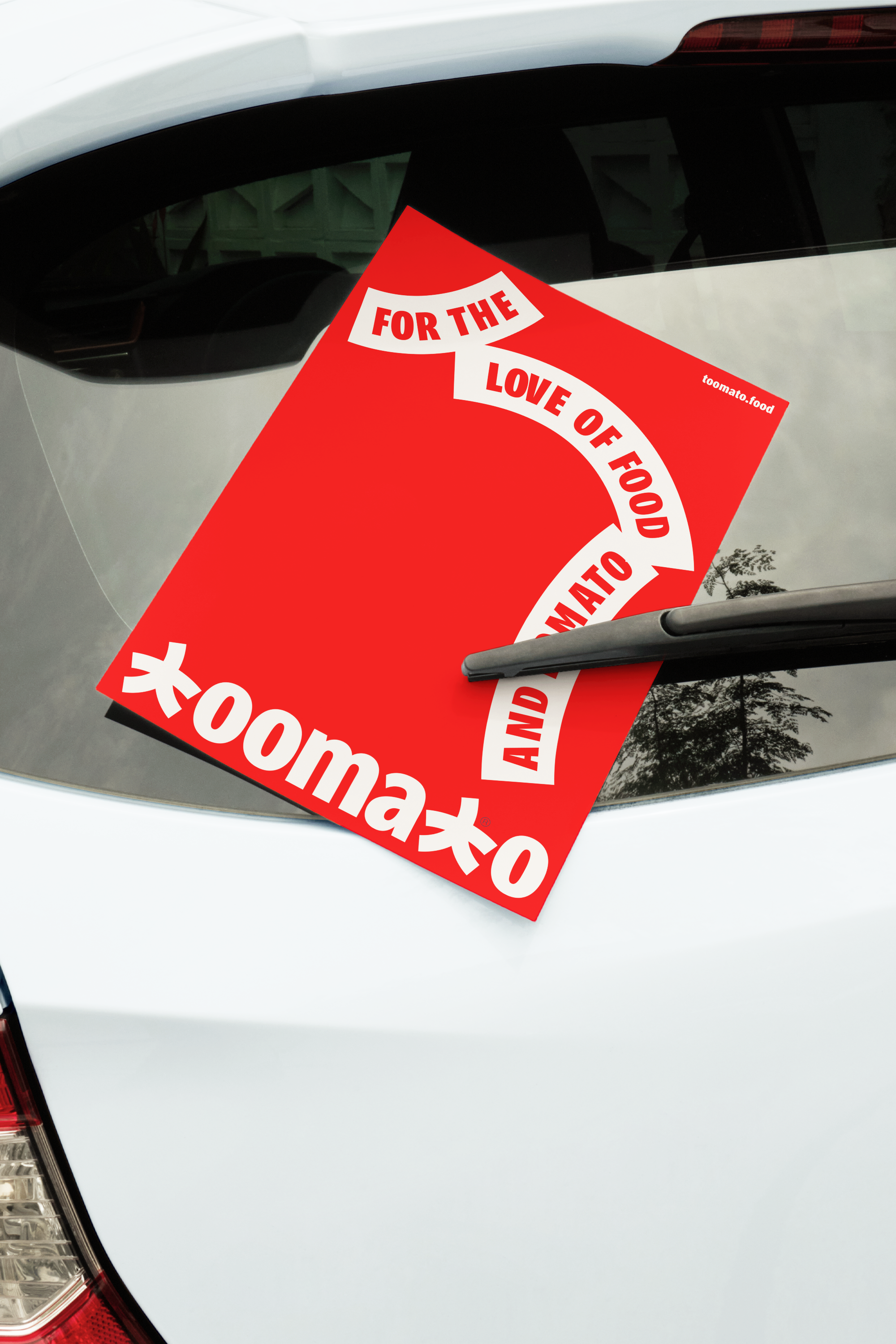
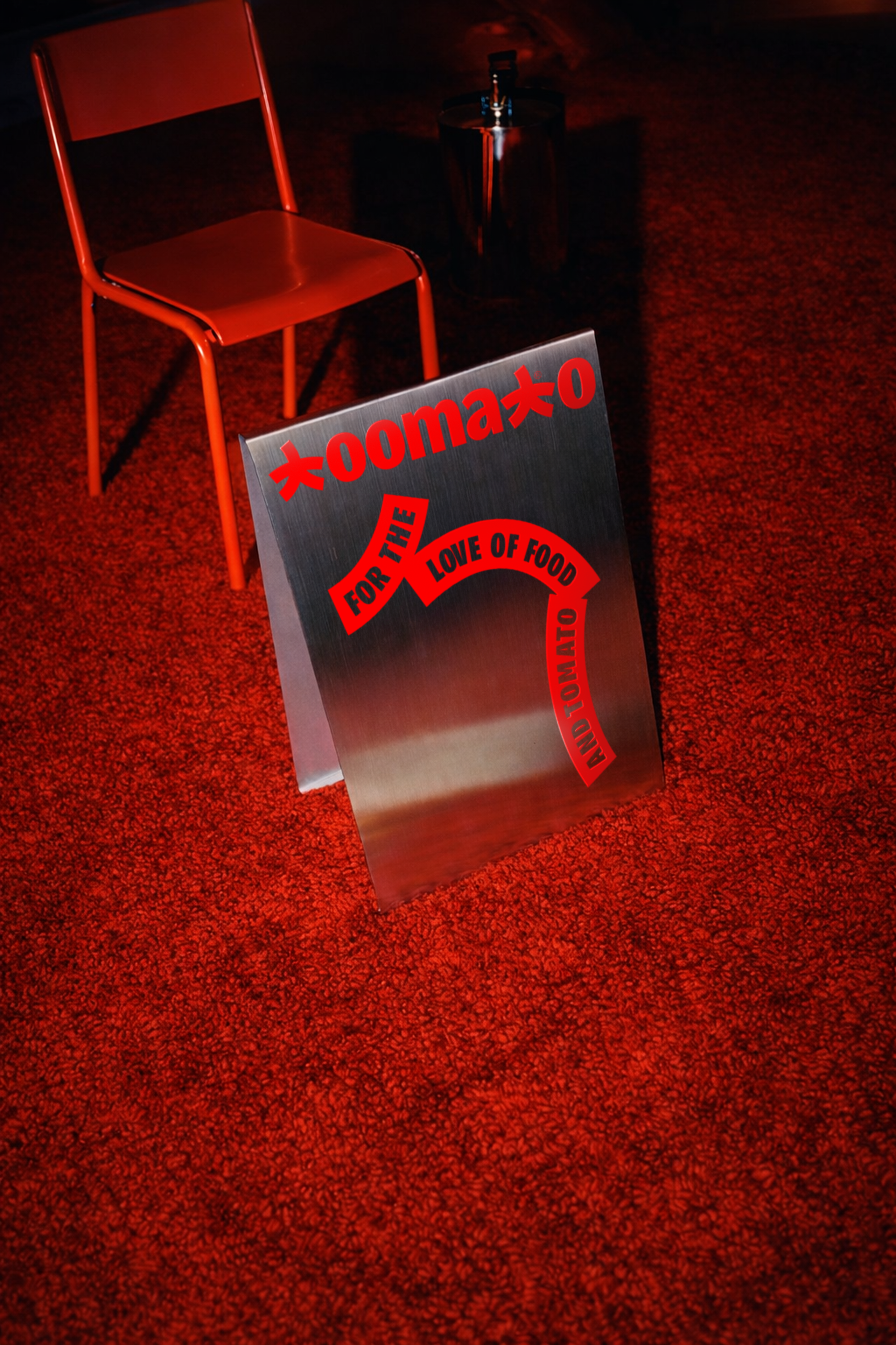
Toomato is a fresh, personality-driven tomato sauce brand designed to combine everyday utility with bold visual character.
I led this project end-to-end — from strategic discovery and positioning through creative direction and final execution — shaping both the conceptual foundation and distinctive visual identity. Beginning with a strategic understanding of the category and consumer context, I defined the brand’s core personality and positioning, establishing a set of guiding principles for tone, character, and visual expression.
Informed by this foundation, I directed and developed the complete brand system — including logotype, illustration style, packaging design, typographic approach, and comprehensive brand guidelines — ensuring a cohesive and flexible visual language tailored to stand out on shelf and in communication. The visual identity balances bold color, expressive forms, and playful voice to embody Toomato’s vibrant and confident spirit.
The resulting brand identity system equips Toomato with a memorable, differentiated presence that resonates across packaging, digital, and point-of-sale applications — visually reinforcing the product’s personality and positioning within a competitive category.
Outcomes
Brand Strategy, Positioning, Creative Direction, Visual Identity, Packaging & Brand Guidelines
New York
New York
US
2023
New York
US
2023


Design System
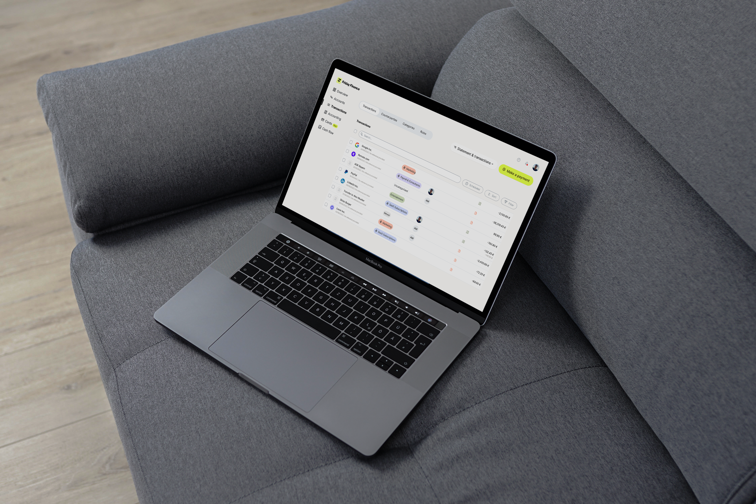
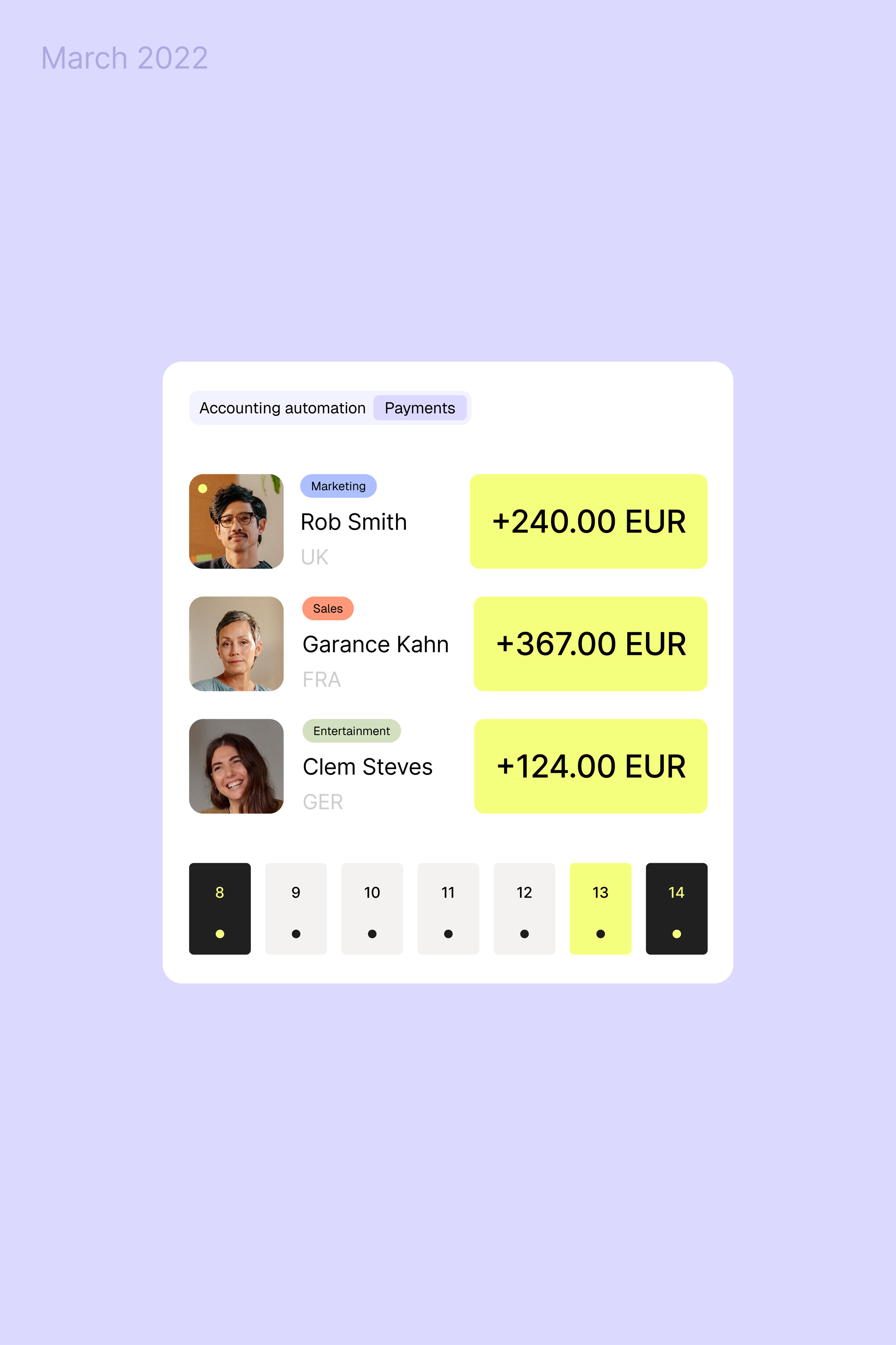
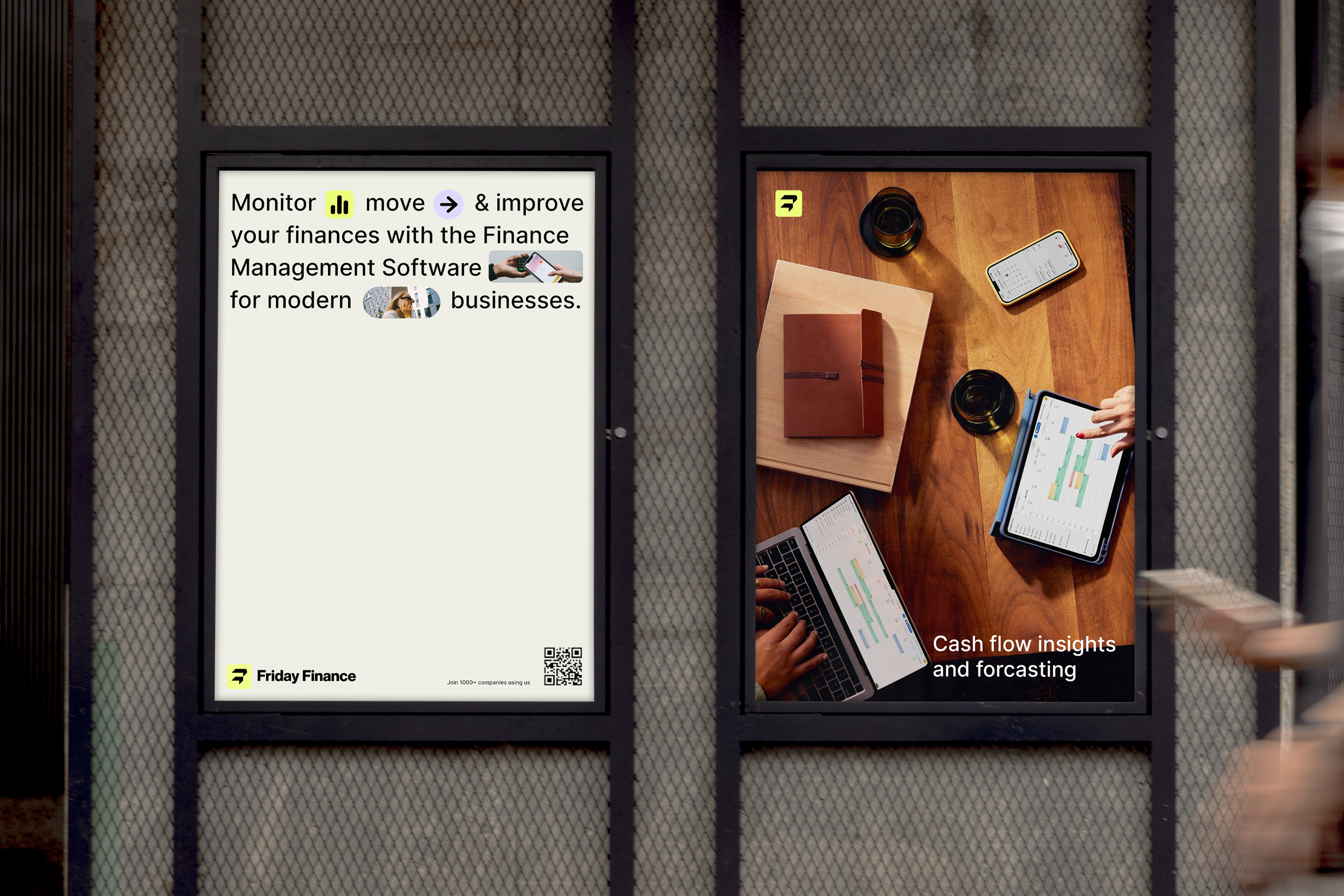
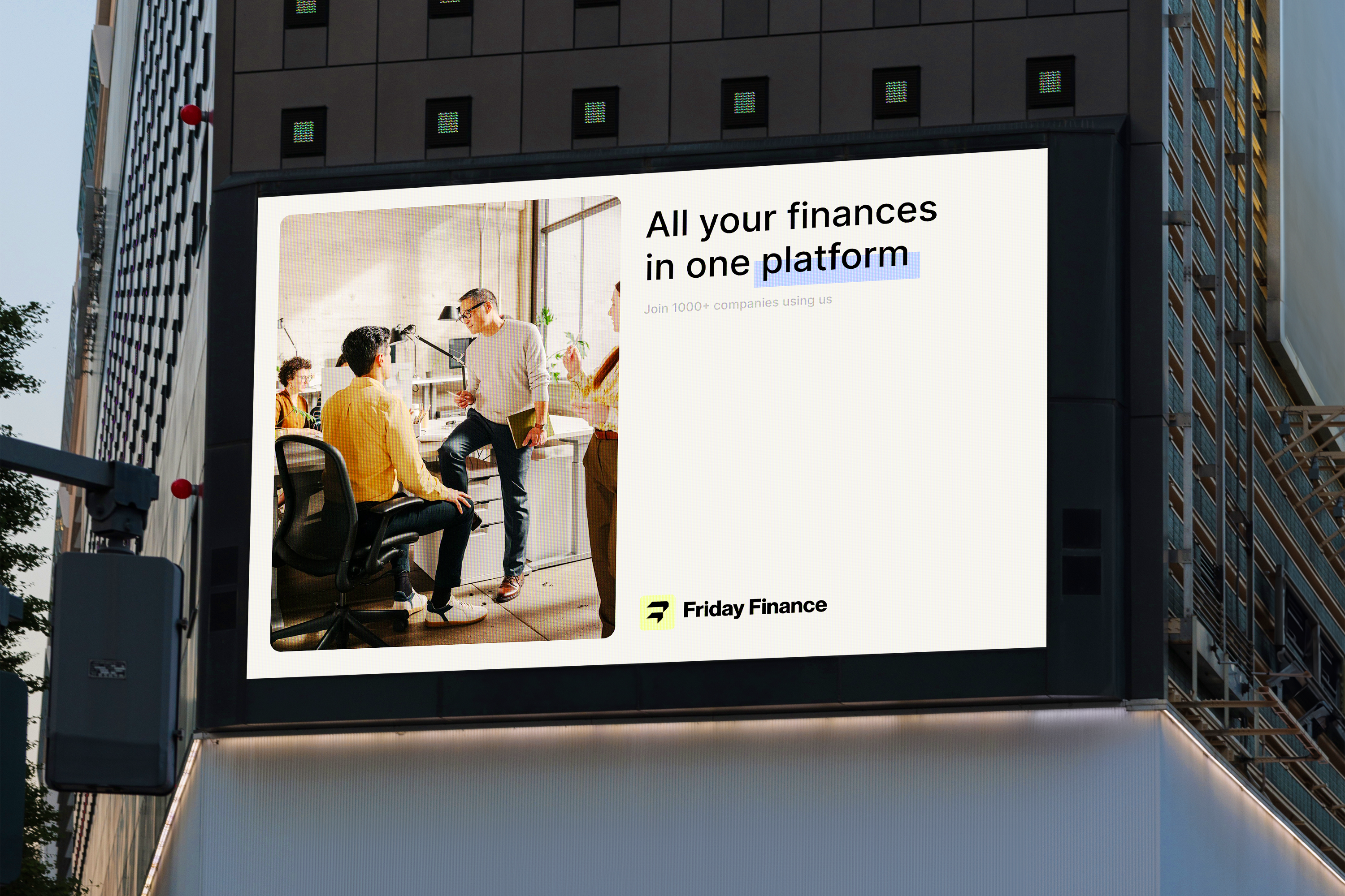
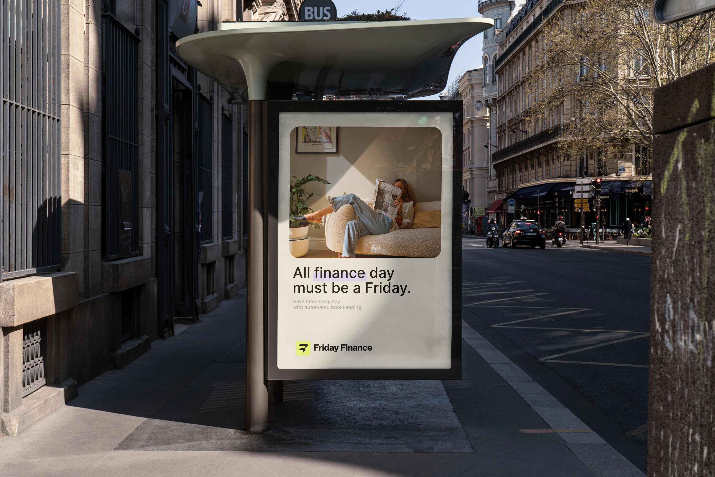
At the heart of the system is a visual language driven by a deliberate mix of icons and typography. Instead of relying on static assets alone, we created a flexible icon family that interacts with type, turning every touchpoint into an expressive, data-driven narrative. The rounded forms of the symbols aren’t just aesthetic; they reflect our belief in approachable business communication, technical where it needs to be, human where it matters most.
By pairing these icons with thoughtful typographic hierarchies, we built a system that feels dynamic and adaptable, communicating complex financial concepts with clarity and confidence. This identity lets Friday Finance explain its products and values visually, not just verbally, which is crucial for a B2B fintech that must earn trust at first glance.

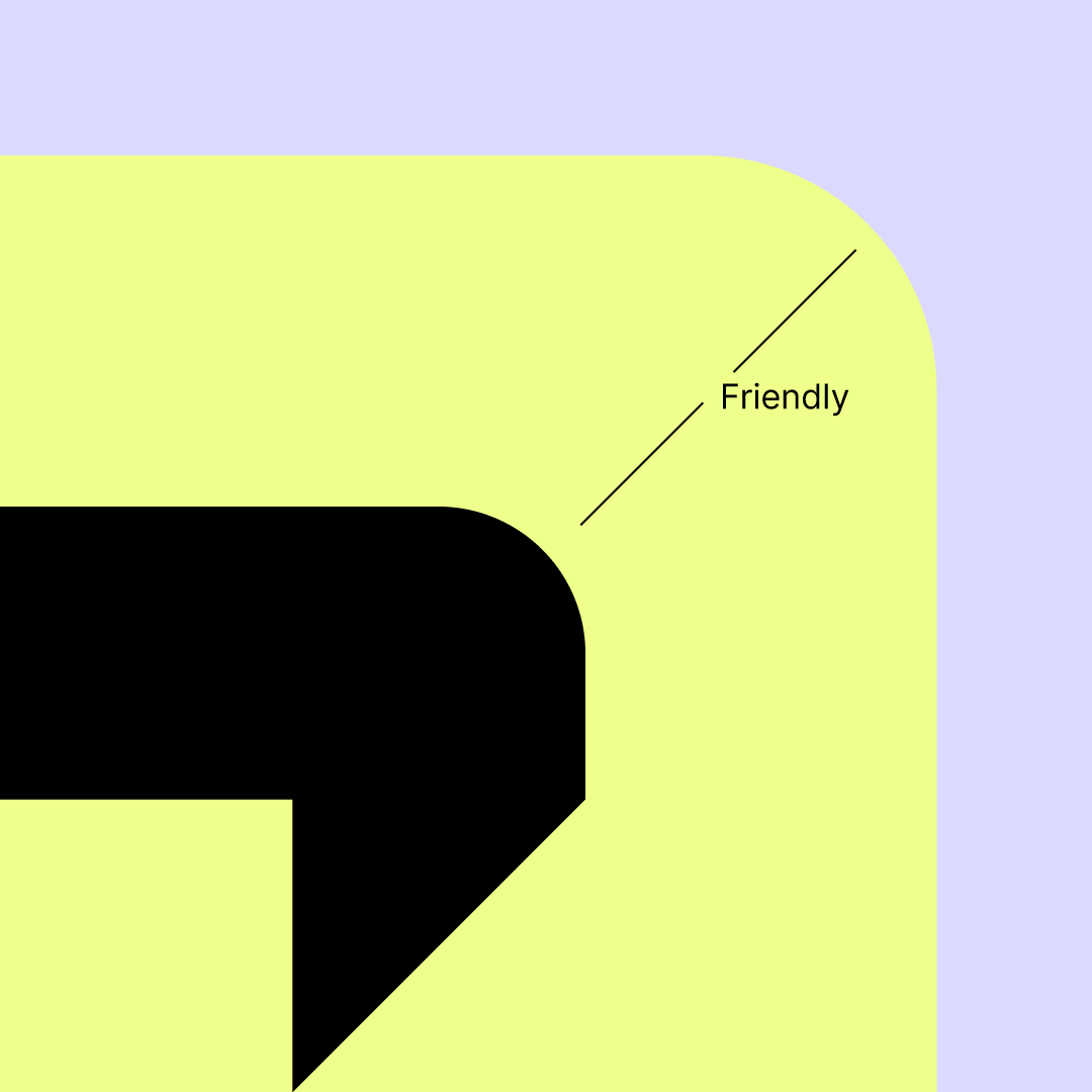
Icon
What sets this brand apart from typical fintech identities is its balance between professionalism and personality. The choice of shapes, colour relationships, and typographic rhythm communicates expertise and reliability, while the flexibility of the visual system signals innovation and forward motion, a promise that Friday Finance isn’t just another fintech, but a partner that understands business, anticipates change, and builds a safer financial future.
In essence, this identity positions Friday Finance as a trusted, future-oriented fintech, one that speaks the language of business leaders while remaining distinctly human and approachable.


Project information
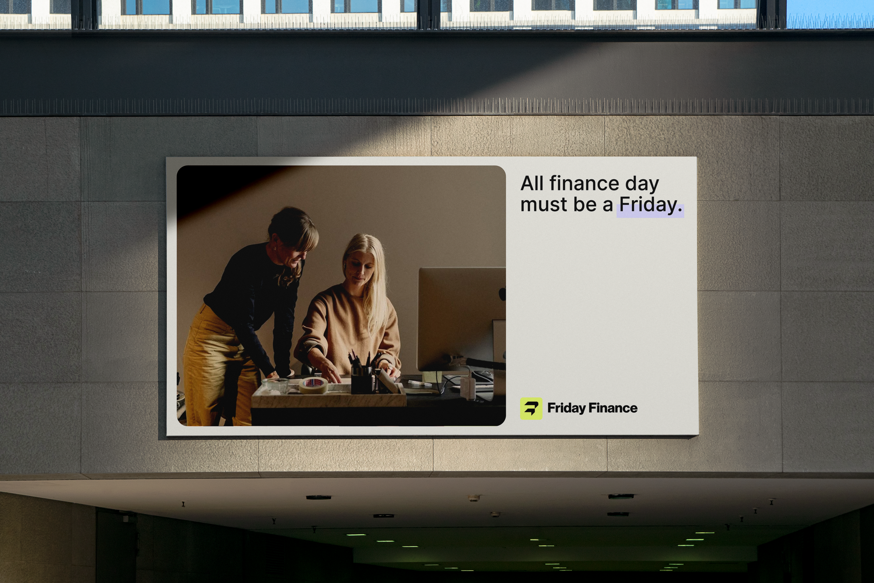
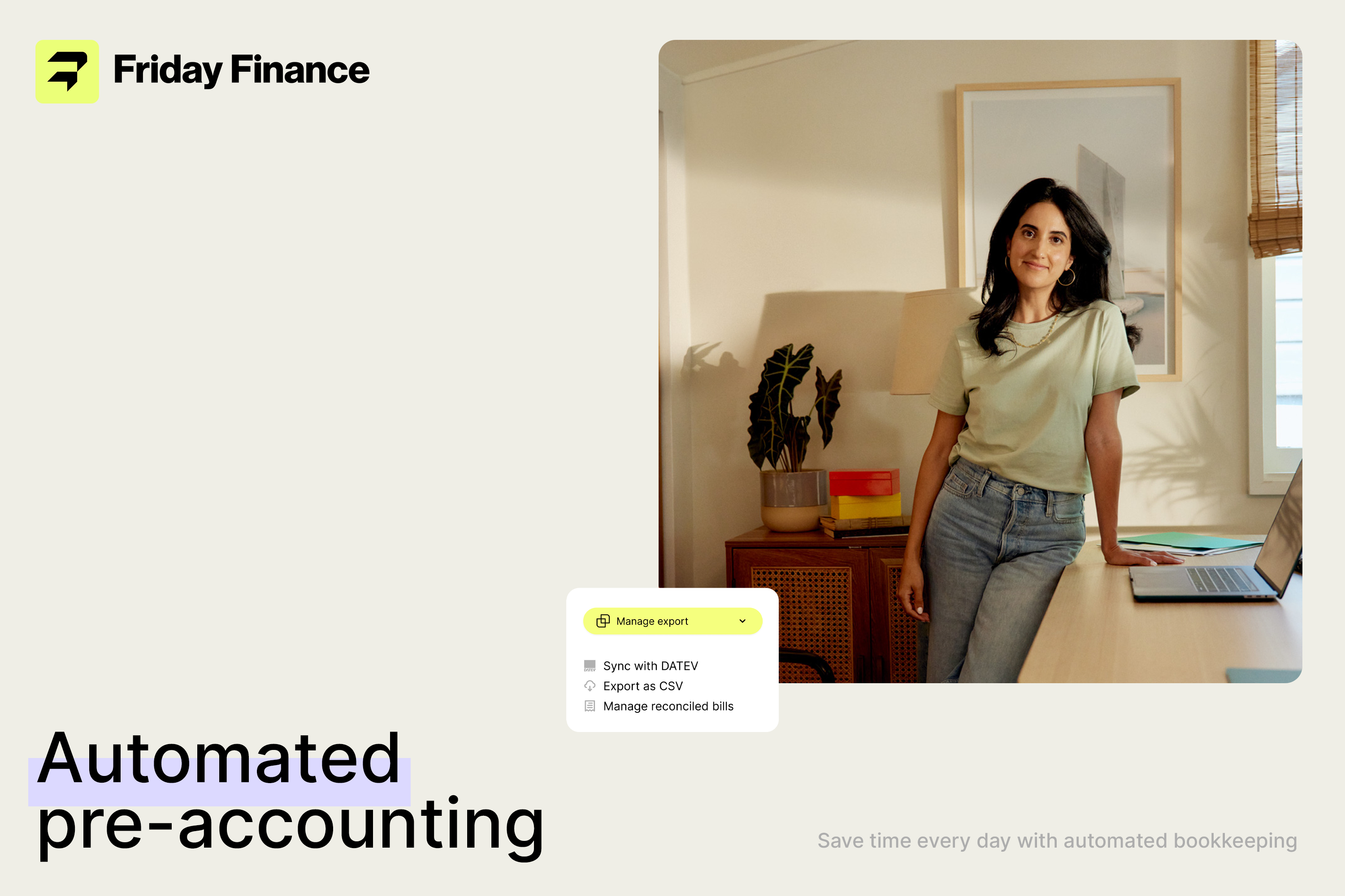
Faced with the challenge of repositioning a fintech brand to balance technical credibility with human connection, I led the strategic and creative direction to redefine Friday Finance’s identity from concept through delivery.
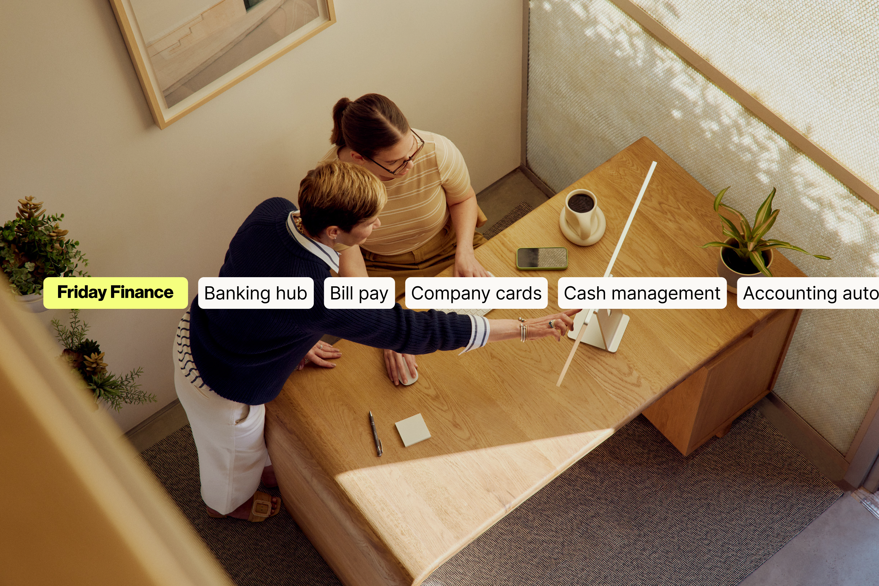
Friday Finance is the evolved brand identity for a fintech formerly known as Airbank, repositioned to build stronger connection, clarity, and human resonance in the financial management space.
I led this project from strategic definition through creative execution and delivery, guiding the brand transformation with both internal teams and executive stakeholders. Working directly with the CEOs and product designers, I helped establish the brand’s strategic positioning — balancing the technical foundations of financial services with a more humanized, approachable presence in the market.
This strategic framing informed a comprehensive identity system, including the development of a distinctive logotype, custom iconography, rounded visual language, and flexible visual assets that reflect the brand’s dual nature — technical credibility and human connection. I also coordinated the multi-team collaboration required to align visual strategy with broader product and marketing goals, ensuring the new identity supported both customer recognition and internal adoption.
The resulting brand system equips Friday Finance with a visual voice that is both confident and adaptive, helping the fintech communicate its value with clarity and warmth in a competitive financial ecosystem.
Outcome
Brand Strategy, Positioning, Creative Direction, Visual Identity, System & Multi-Team Collaboration
Faced with the challenge of repositioning a fintech brand to balance technical credibility with human connection, I led the strategic and creative direction to redefine Friday Finance’s identity from concept through delivery.
Friday Finance is the evolved brand identity for a fintech formerly known as Airbank, repositioned to build stronger connection, clarity, and human resonance in the financial management space.
I led this project from strategic definition through creative execution and delivery, guiding the brand transformation with both internal teams and executive stakeholders. Working directly with the CEOs and product designers, I helped establish the brand’s strategic positioning — balancing the technical foundations of financial services with a more humanized, approachable presence in the market.
This strategic framing informed a comprehensive identity system, including the development of a distinctive logotype, custom iconography, rounded visual language, and flexible visual assets that reflect the brand’s dual nature — technical credibility and human connection. I also coordinated the multi-team collaboration required to align visual strategy with broader product and marketing goals, ensuring the new identity supported both customer recognition and internal adoption.
The resulting brand system equips Friday Finance with a visual voice that is both confident and adaptive, helping the fintech communicate its value with clarity and warmth in a competitive financial ecosystem.
Outcome
Brand Strategy, Positioning, Creative Direction, Visual Identity, System & Multi-Team Collaboration
Sector︎︎︎
Financial, Technology, B2B
Client︎︎︎
Patrick Neuhaus
Collaborator︎︎︎
Hadria Sánchez
Type Foundry︎︎︎
Pangram Pangram
Photography︎︎︎
Brittney Christie
fridayfinance.com
What the experts say:
Link 1, Link 2, Link 3
Financial, Technology, B2B
Client︎︎︎
Patrick Neuhaus
Collaborator︎︎︎
Hadria Sánchez
Type Foundry︎︎︎
Pangram Pangram
Photography︎︎︎
Brittney Christie
fridayfinance.com
What the experts say:
Link 1, Link 2, Link 3
Berlin
Germany
2022
Germany
2022
