


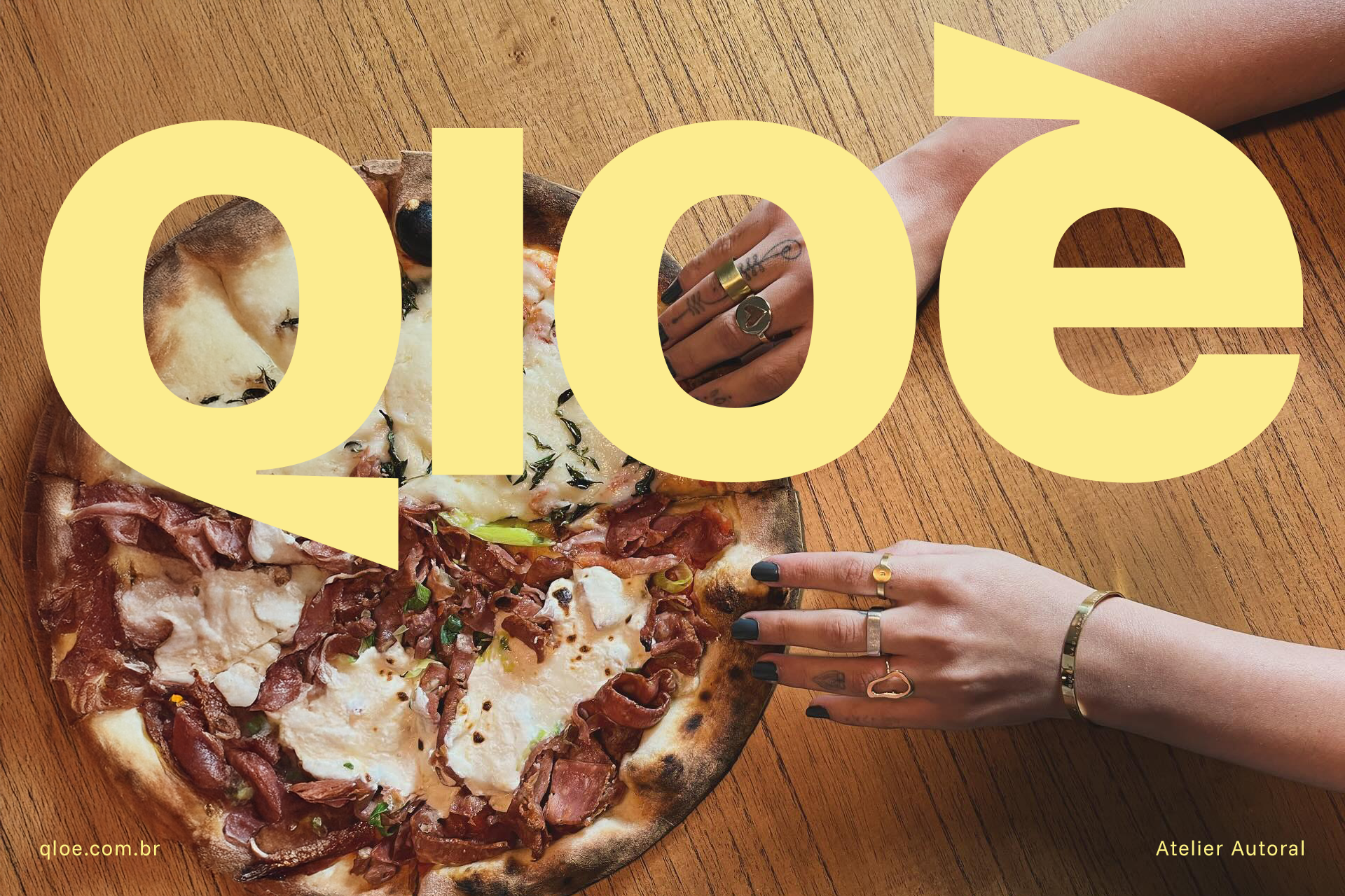

Its unique design, with the graphic accent fluidly integrated into the body of the letter, evokes movement, direction and lightness — like the precise gesture of a goldsmith. The generous curve contrasts with the firm cut of the accent, creating a visual play of balance and rhythm, which reinforces the brand's authorial and artisanal character.
It is a letter that seems to dance alone in space, but with strength and purpose. A symbol that carries the spirit of handmade, timeless beauty and Brazilian identity with elegance and originality.
It is a letter that seems to dance alone in space, but with strength and purpose. A symbol that carries the spirit of handmade, timeless beauty and Brazilian identity with elegance and originality.


Project information
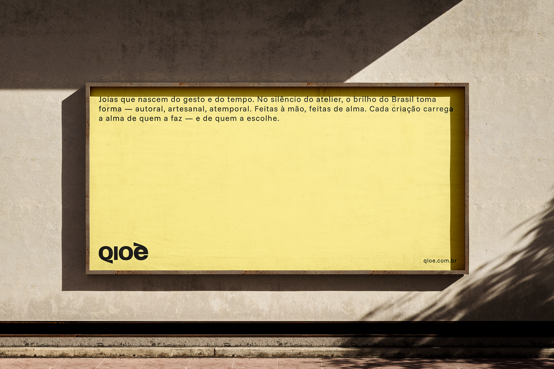
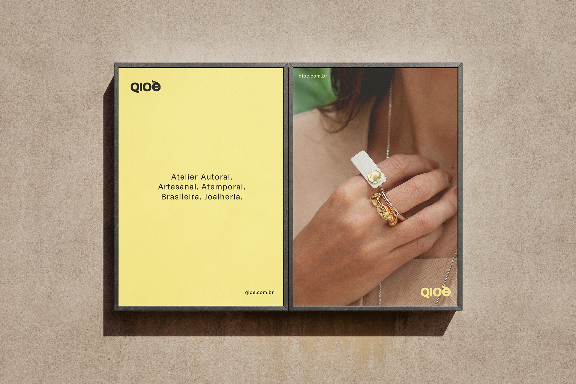
Atelier Autoral. Artesanal. Atemporal. Brasileira.
Qloé is an authorial Brazilian jewelry brand rooted in artisanal craft, refined technique, and expressive identity.
I led this project end-to-end — from strategic discovery and positioning through creative execution and final delivery — shaping both the conceptual foundation and visual expression of the brand. Beginning with a deep understanding of Qloé’s values — craftsmanship, organic form, and timeless beauty — I established the brand’s strategic narrative and identity direction.
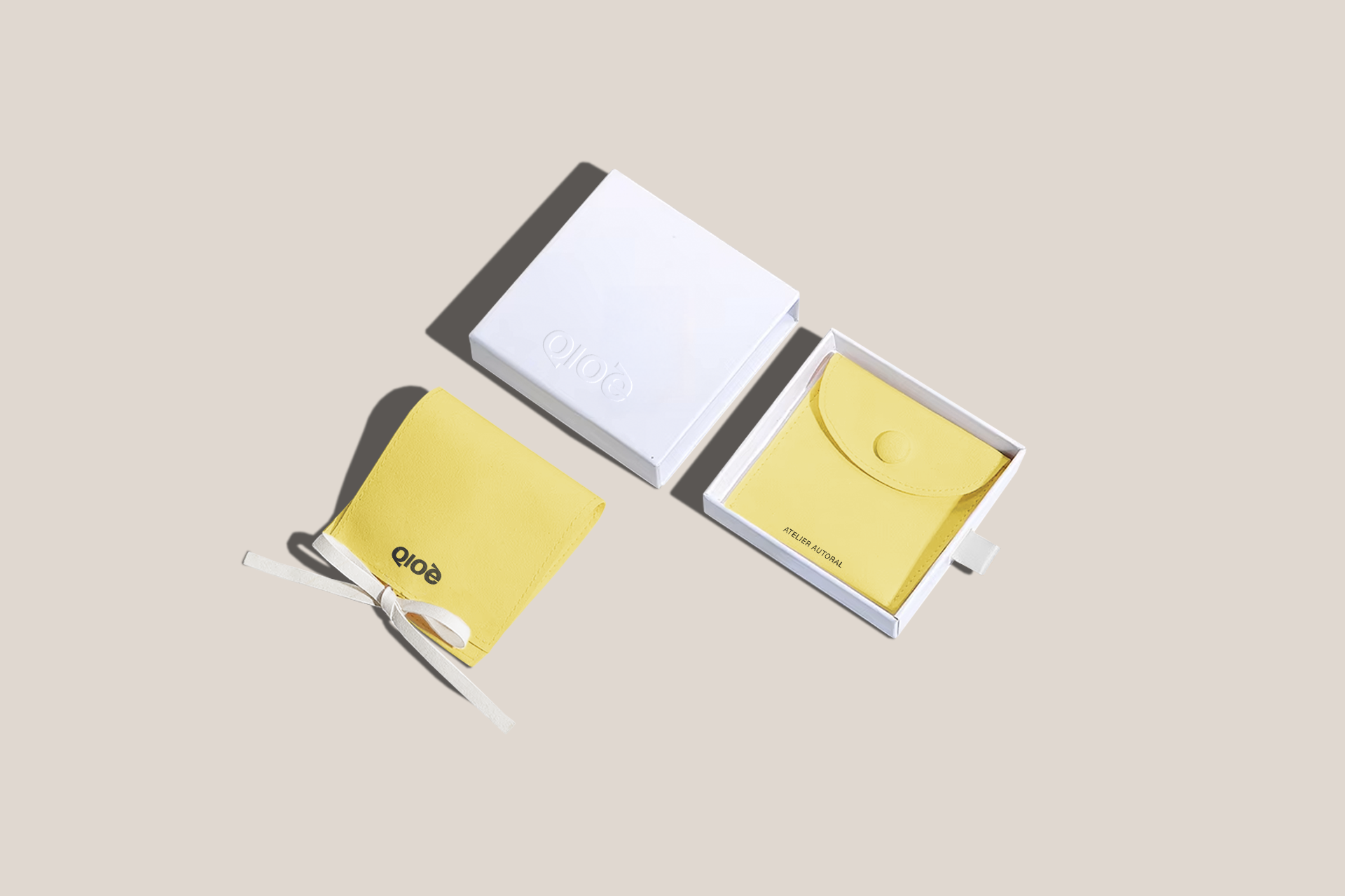
With this strategic core, I developed a distinctive brand identity system including a custom logotype that reflects movement, balance, and artisanal gesture, as well as supporting visual elements, packaging, and a comprehensive brand book that ensures consistency across touchpoints.
The identity communicates elegance, fluidity, and soul — mirroring the organic forms and intuitive inspiration behind the jewelry itself — while reinforcing Qloé’s unique place in the market as a brand that celebrates individual expression and handcrafted sophistication.
Outcomes
Brand Strategy, Positioning, Creative Direction, Logotype, Design System & Brand Book
Atelier Autoral. Artesanal. Atemporal. Brasileira.
Qloé is an authorial Brazilian jewelry brand rooted in artisanal craft, refined technique, and expressive identity.
I led this project end-to-end — from strategic discovery and positioning through creative execution and final delivery — shaping both the conceptual foundation and visual expression of the brand. Beginning with a deep understanding of Qloé’s values — craftsmanship, organic form, and timeless beauty — I established the brand’s strategic narrative and identity direction.
With this strategic core, I developed a distinctive brand identity system including a custom logotype that reflects movement, balance, and artisanal gesture, as well as supporting visual elements, packaging, and a comprehensive brand book that ensures consistency across touchpoints.
The identity communicates elegance, fluidity, and soul — mirroring the organic forms and intuitive inspiration behind the jewelry itself — while reinforcing Qloé’s unique place in the market as a brand that celebrates individual expression and handcrafted sophistication.
Outcomes
Brand Strategy, Positioning, Creative Direction, Logotype, Design System & Brand Book
São Paulo
State of São Paulo
Brazil
2024
State of São Paulo
Brazil
2024