Branding
Creative Direction
Illustration
Packaging
Campaign
Creative Direction
Illustration
Packaging
Campaign
São Paulo, SP, Brazil
2020
Brand Design
2020
Brand Design
— MYBEAUTYHAIR
Overview
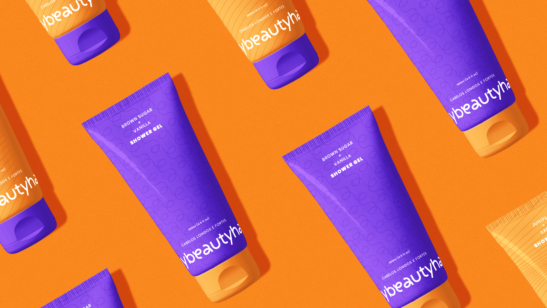
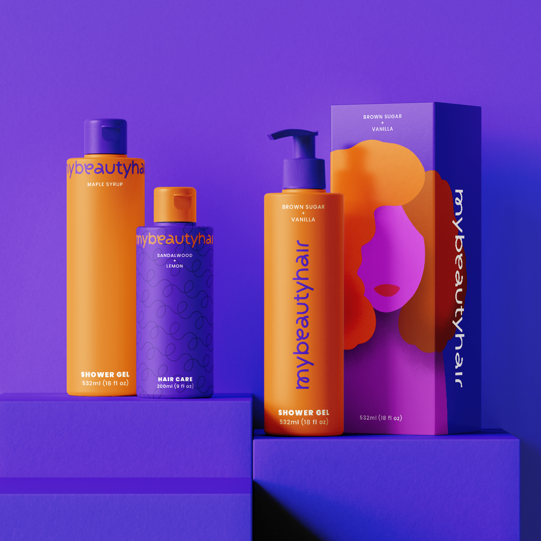
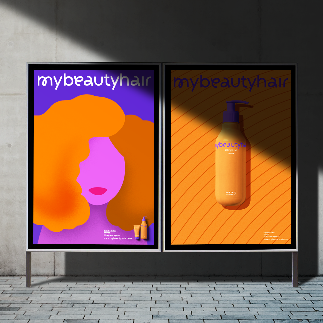
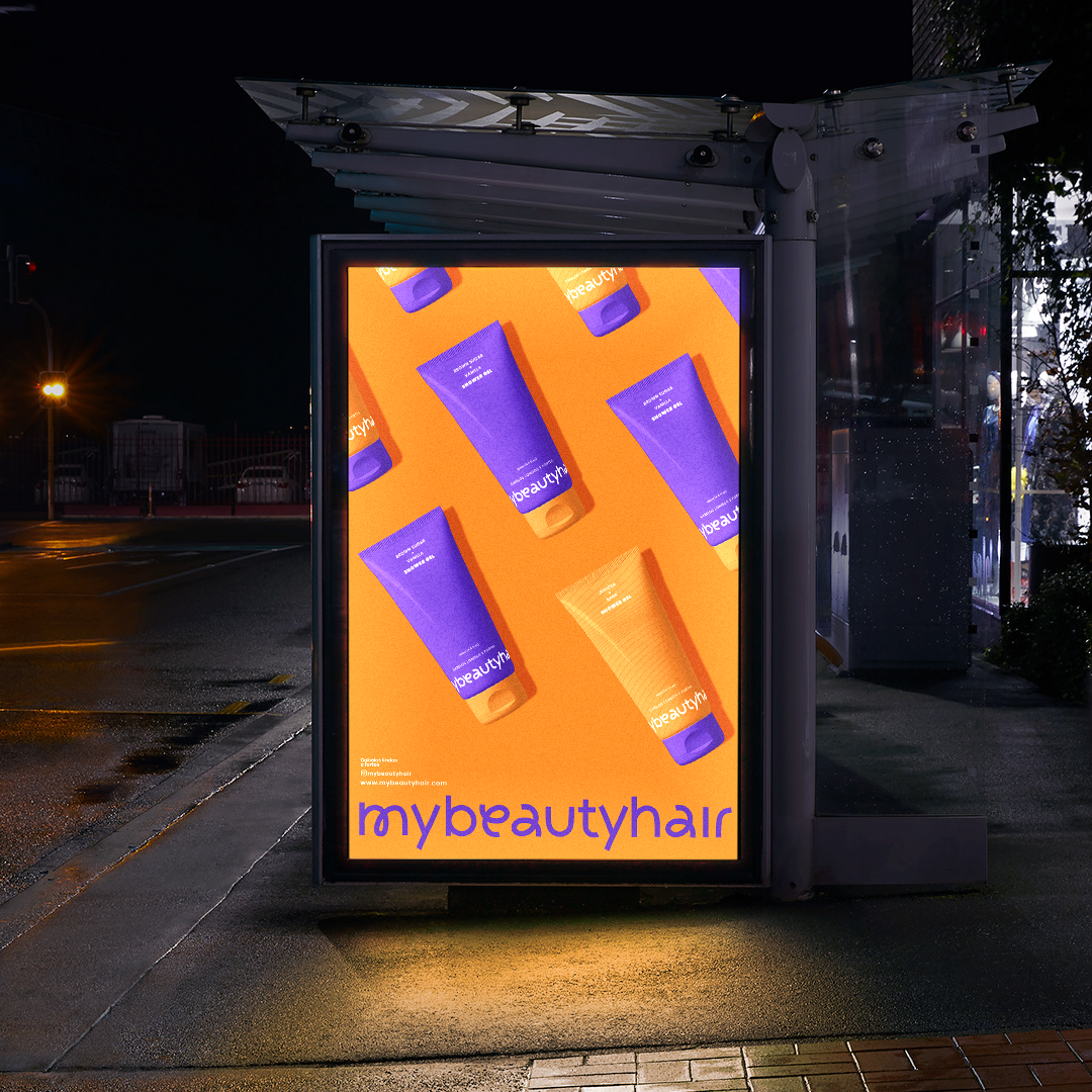
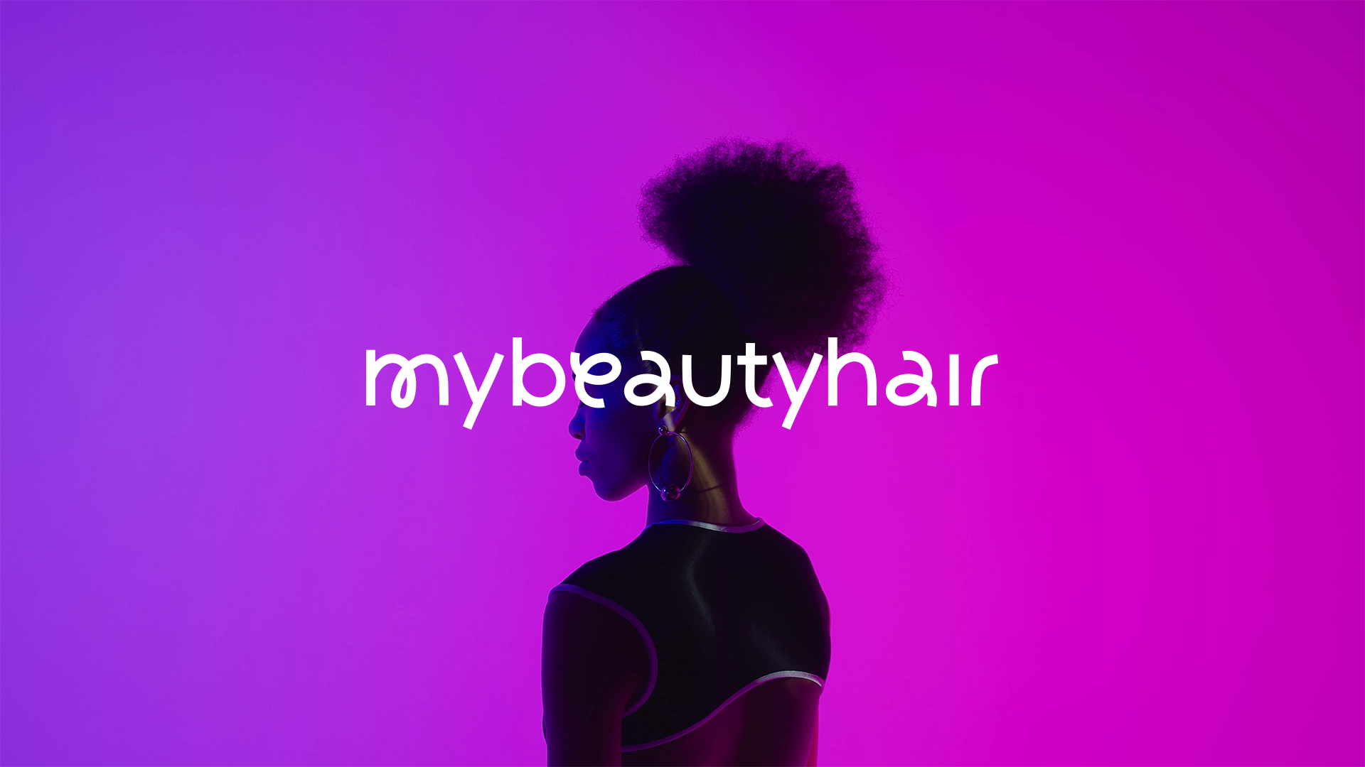
Inspired by organic shapes, we developed the identity and logo of the mybeautyhair hair products brand. The project arises with the need to bring joviality and modernism to the universe of the brand, with this, we built an organic typography inspired by the hair, the minimalist illustrations and identity make the charming look balanced with vibrant colors that bring the brand closer to the customer taking the position protagonist.
The typography signs in lower case and with its words "stuck" reaffirming the concept of proximity to the customer in a friendly way, it sustains itself as an informal and pleasant conversation, with a soft tone of voice.
Concept
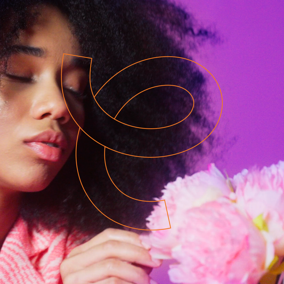
Inspired by curly hair, the typography was constructed with organic and fluent lines, taking a modern approach to the final product.
The shapes of the letters "a", "e" and "m" are the strongest connections with the visual concept, creating the sensation of empowerment.


DIVERSITY
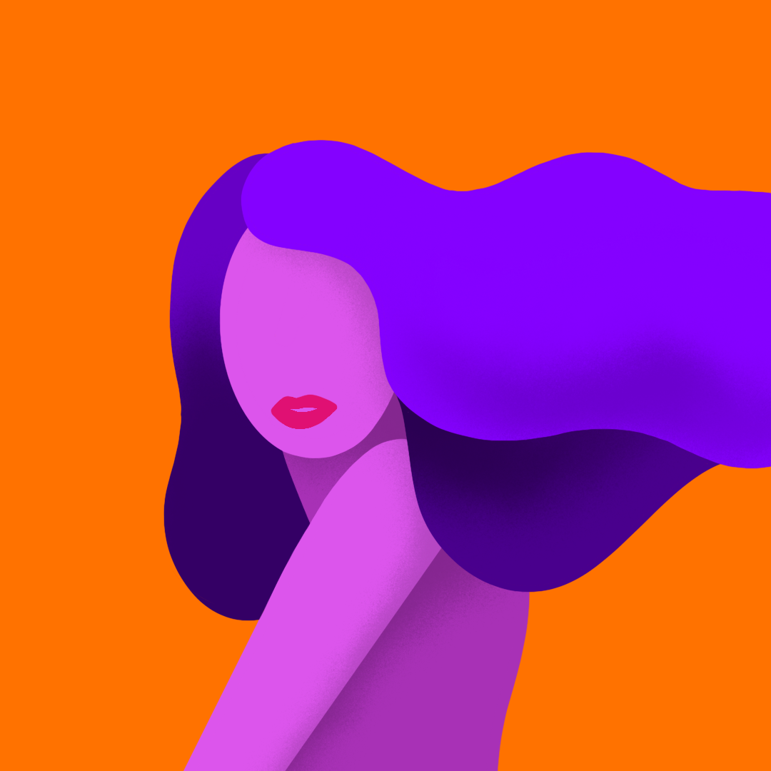
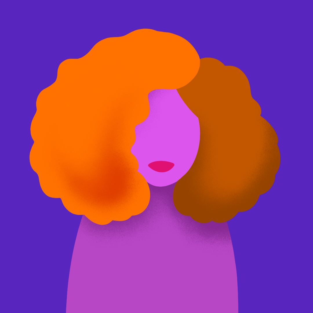
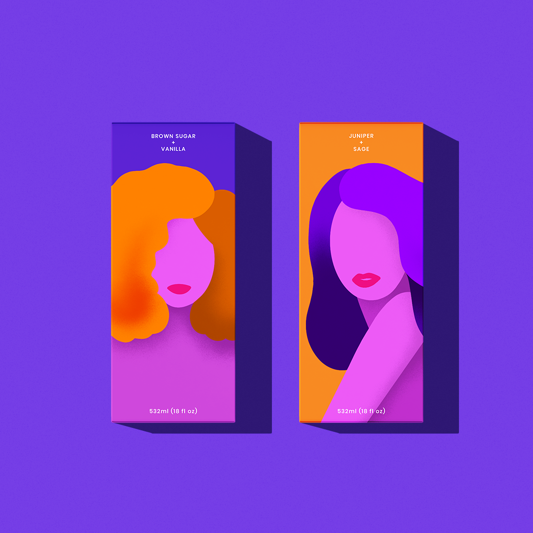
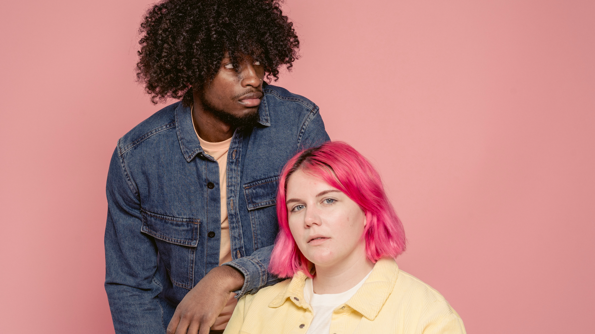
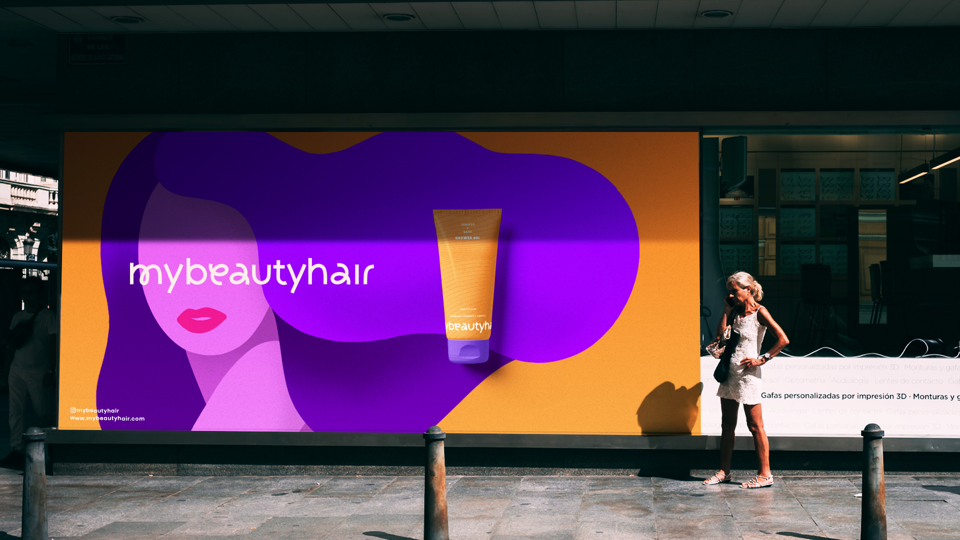
Hair can be the symbol of power and create a huge movement of feminine resistance. To improve this connection with the main concept, I illustrated the diversity of the shapes to show the many ways of self-confidence.
