


As Kokoy is rooted in Kuwait, a country where Arabic is both language and identity — it was essential to honor this cultural foundation in the visual expression of the brand. Translating the name into Arabic wasn’t just a linguistic decision; it was a gesture of cultural authenticity and local pride.
To deepen this connection, the logotype was redesigned drawing from traditional Arabic calligraphy, blending its rich, flowing heritage with Kokoy’s playful and bold personality. This allowed the brand to speak in a visual dialect that feels both familiar and fresh to its audience, celebrating Kuwait’s aesthetic traditions while inviting a new generation into a colorful, contemporary dessert experience.
Through this design choice, Kokoy becomes more than a brand, it becomes a bridge between tradition and modernity, between local roots and global reach.

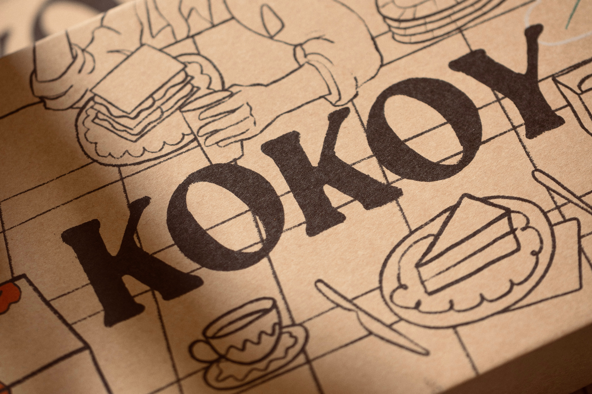
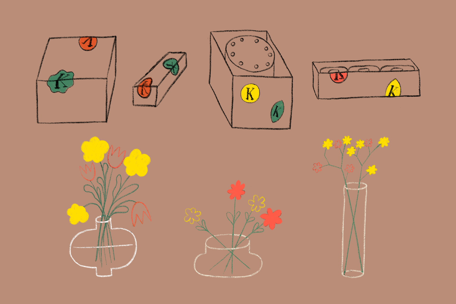
To complement Kokoy’s expressive logotype, a reduced brand icon was developed, a simplified yet distinctive variation that brings dynamism and flexibility to the identity system.
In fast-paced digital environments and small-scale applications, the full logotype may not always be practical. The reduced icon ensures Kokoy remains recognizable across all contexts, from social media avatars to packaging stamps and merchandise. More than a functional asset, it captures the essence of the brand in its purest form, allowing it to move with ease and spontaneity, just like the organic illustrations and playful personality that define it.
This strategic reduction doesn’t dilute Kokoy, it amplifies its adaptability, ensuring the brand feels alive, responsive, and ever-present in the modern visual landscape.


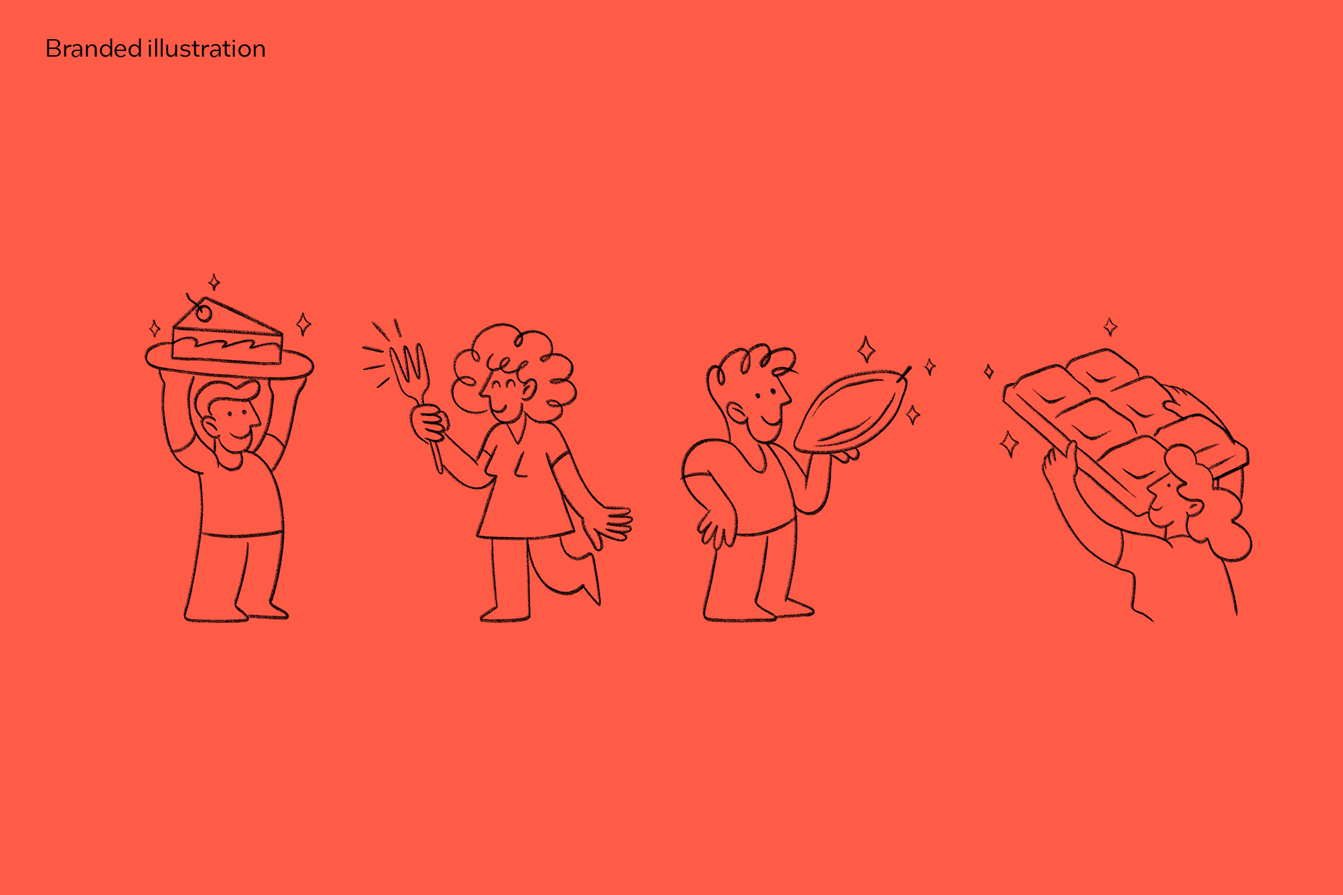

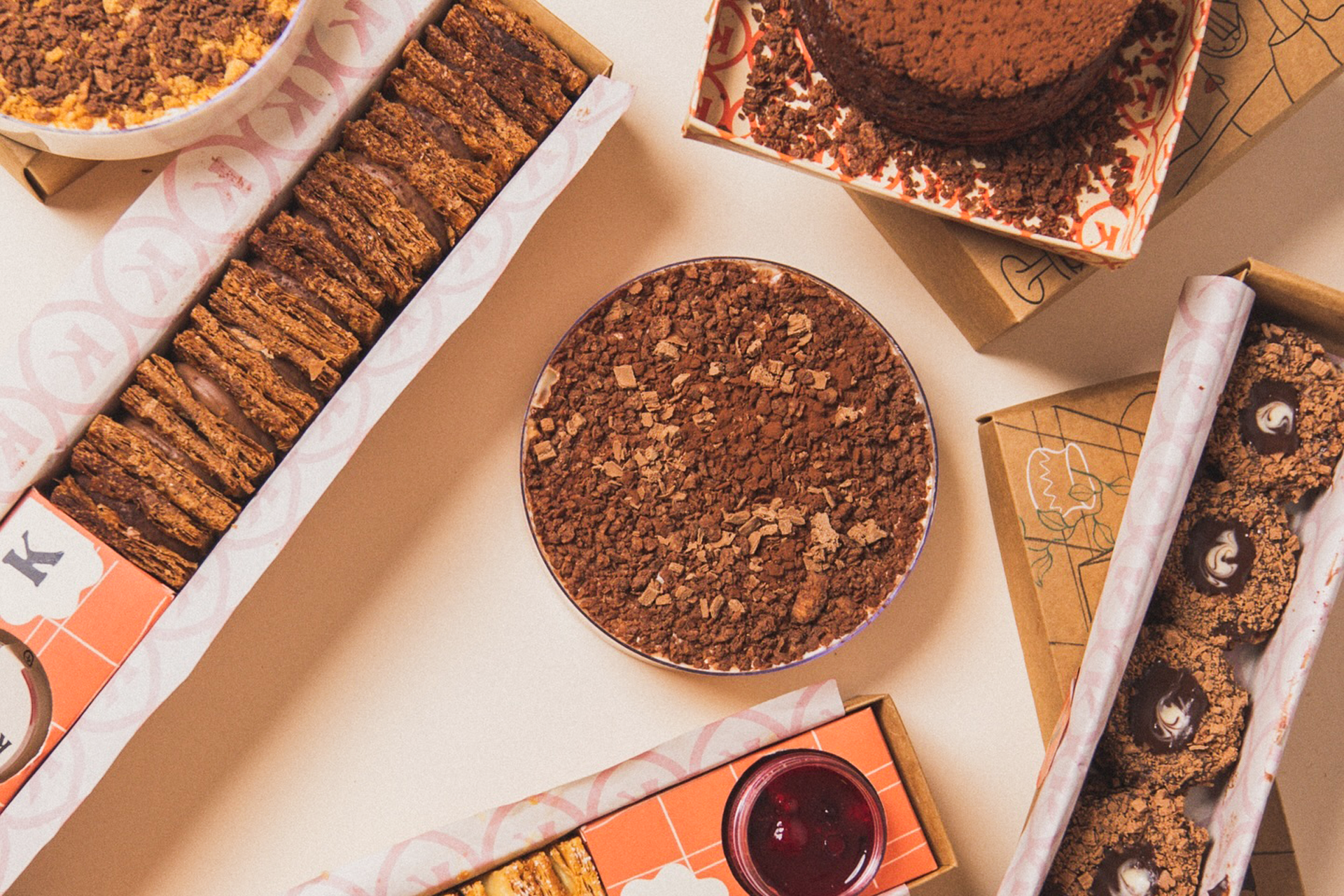
The illustrations in Kokoy play a vital role in expressing the brand’s essence — joyful, human, and full of personality. Drawn in an organic, free-flowing style, they mirror the imperfections and spontaneity of real life, reinforcing the brand’s commitment to authenticity and emotional connection.
These visuals aren’t just decorative; they are extensions of Kokoy’s soul. Every curve and splash of color reflects the warmth of human hands, echoing the same passion that goes into each dessert. This hand-drawn approach softens the boldness of the design, creating a dynamic balance between energy and empathy.
Through illustration, Kokoy becomes a world of its own, one where flavor, feeling, and imagination come together in every bite.


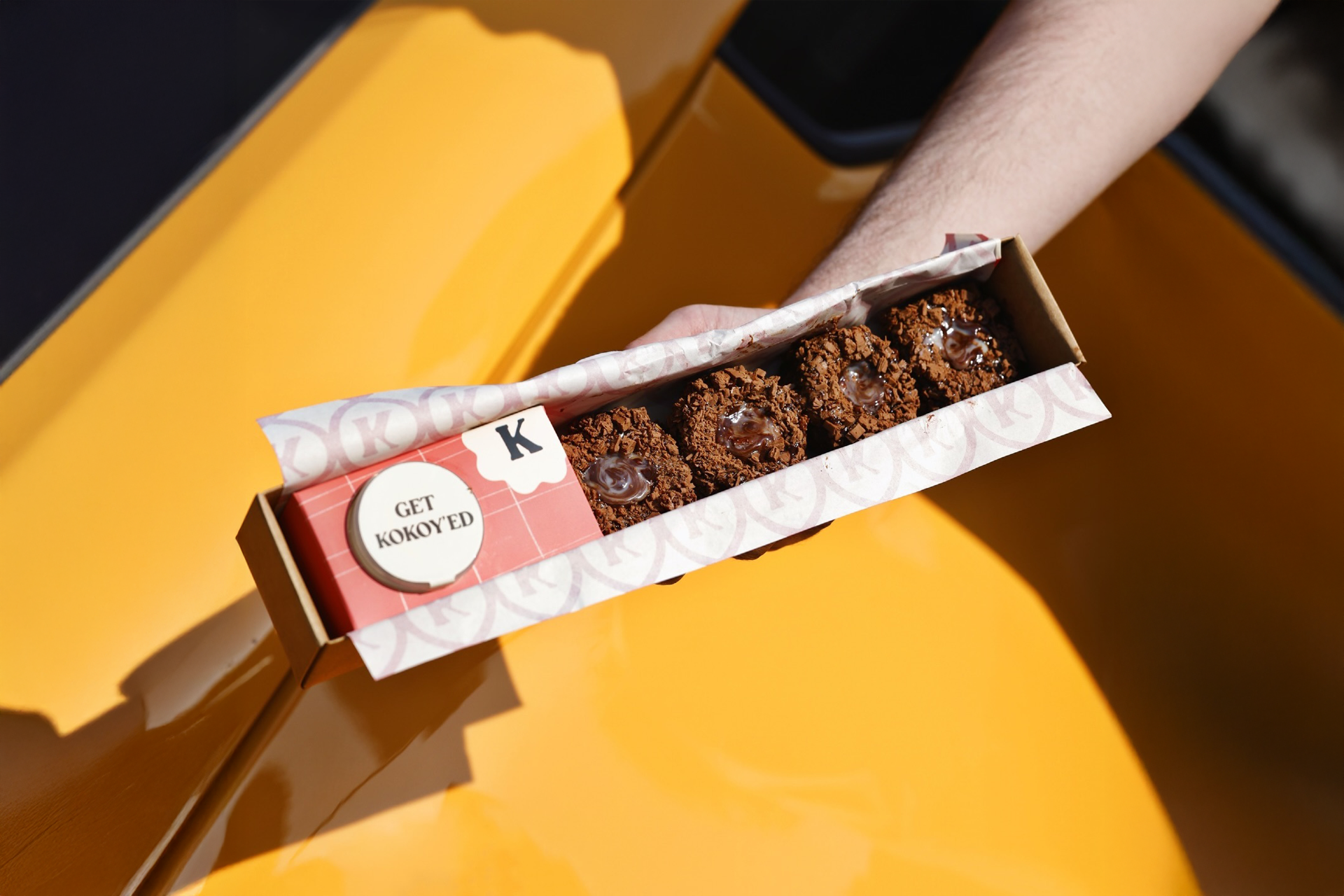
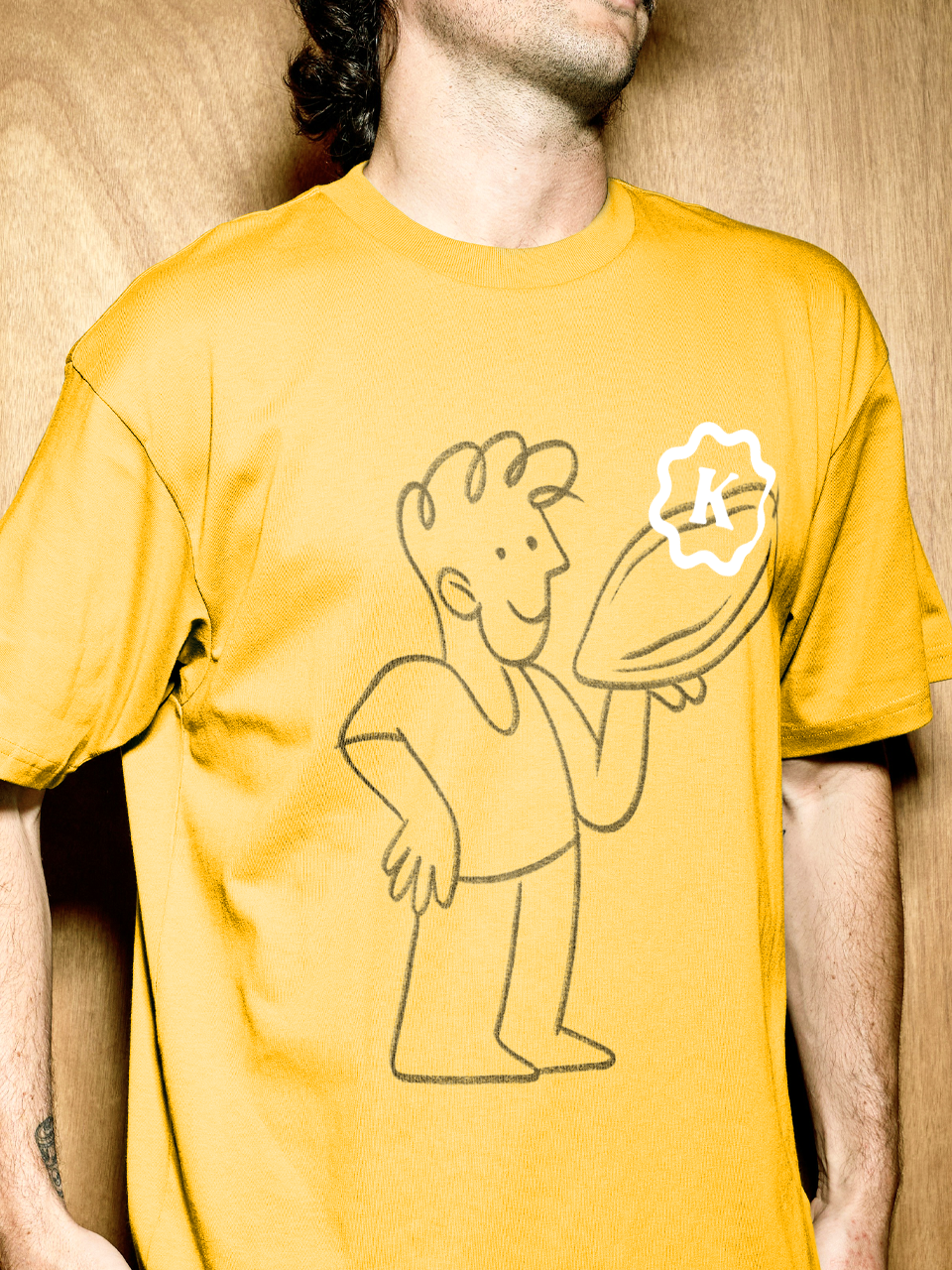
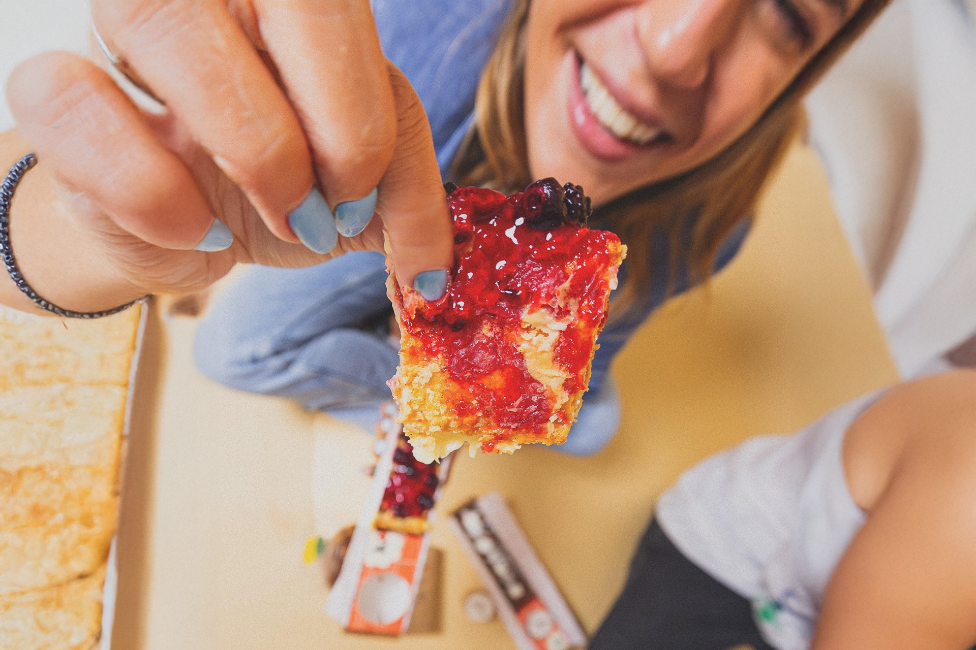
At the heart of Kokoy’s identity lies the illustration of hands — not only as a symbol of human warmth and interaction, but also as a tribute to the deep cultural meaning of hands in Arab traditions. In Kuwaiti and broader Arab culture, hands are central to acts of hospitality, generosity, and connection — from offering food to sharing conversations and blessings.
These illustrated hands represent more than touch; they embody ritual and respect, echoing the way desserts are often shared in moments of celebration and togetherness. They also reflect the intimacy between people and food, the gesture of giving, and the joy of receiving — all of which are fundamental to Kokoy’s spirit.
Drawn in a playful, organic style, the hands bridge the emotional and the cultural, reinforcing Kokoy’s human-centered approach. They invite customers not just to consume, but to feel, hold, and connect — making every dessert a small act of care, rooted in both tradition and emotion.


Project information
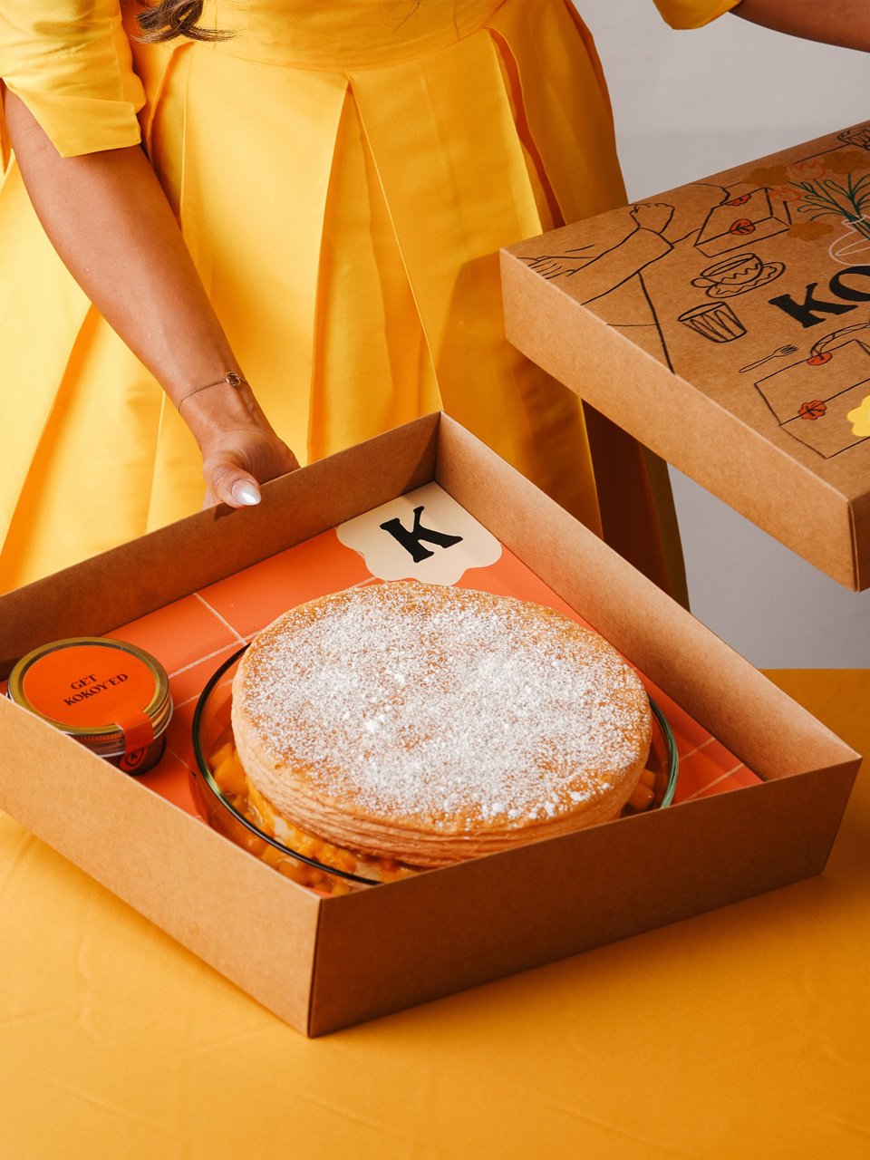
A Taste of Joy from Kuwait.
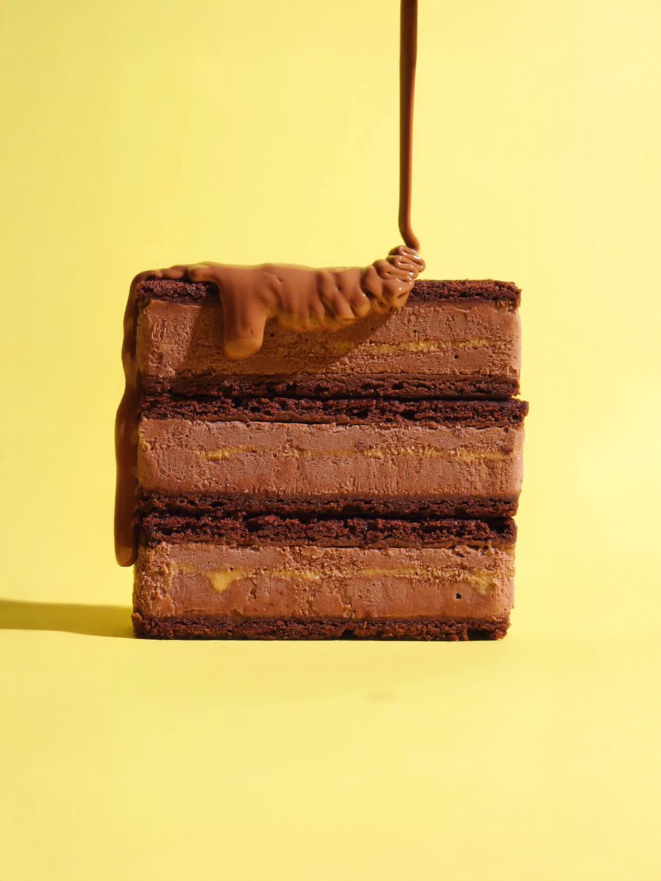
Kokoy is a vibrant dessert brand rooted in Kuwaiti culture, crafted to capture the joy and human warmth of shared moments around food.
I led the project holistically — from strategic discovery to creative execution and final delivery — shaping both the conceptual foundation and visual expression of the brand. Beginning with a deep understanding of Kokoy’s cultural context and emotional purpose, I defined the brand strategy and positioning, ensuring the visual identity would honor local heritage while expressing a playful, contemporary spirit.
From this strategic core, I developed the complete identity system including the custom logotype, brand mascot, illustrative language, reduced icon system, and comprehensive brand book. The logotype and visual elements draw from organic, hand-drawn forms to evoke warmth and approachability, while the illustration of hands reflects cultural significance of hospitality and connection.
Through these strategic choices, Kokoy’s brand experience bridges tradition and modernity, giving the dessert brand a distinctive visual voice and emotional resonance that strengthens its identity in both local and broader markets.
Outcomes
Brand Identity, Brand Design, Packaging, and Illustration
A Taste of Joy from Kuwait.
Kokoy is a vibrant dessert brand rooted in Kuwaiti culture, crafted to capture the joy and human warmth of shared moments around food.
I led the project holistically — from strategic discovery to creative execution and final delivery — shaping both the conceptual foundation and visual expression of the brand. Beginning with a deep understanding of Kokoy’s cultural context and emotional purpose, I defined the brand strategy and positioning, ensuring the visual identity would honor local heritage while expressing a playful, contemporary spirit.
From this strategic core, I developed the complete identity system including the custom logotype, brand mascot, illustrative language, reduced icon system, and comprehensive brand book. The logotype and visual elements draw from organic, hand-drawn forms to evoke warmth and approachability, while the illustration of hands reflects cultural significance of hospitality and connection.
Through these strategic choices, Kokoy’s brand experience bridges tradition and modernity, giving the dessert brand a distinctive visual voice and emotional resonance that strengthens its identity in both local and broader markets.
Outcomes
Brand Identity, Brand Design, Packaging, and Illustration
Kuwait City
Kuwait
2024
Kuwait
2024