


Design System
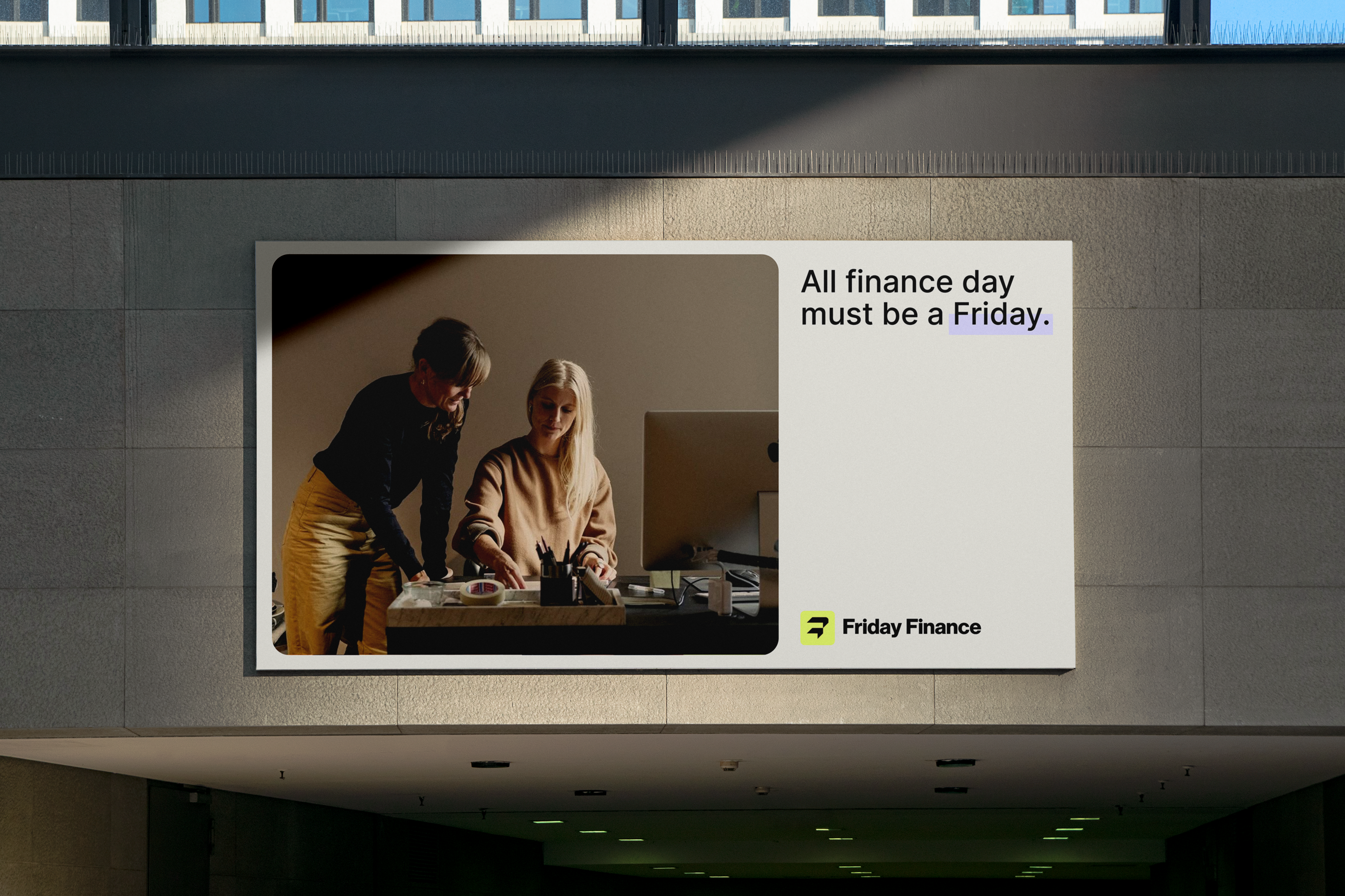
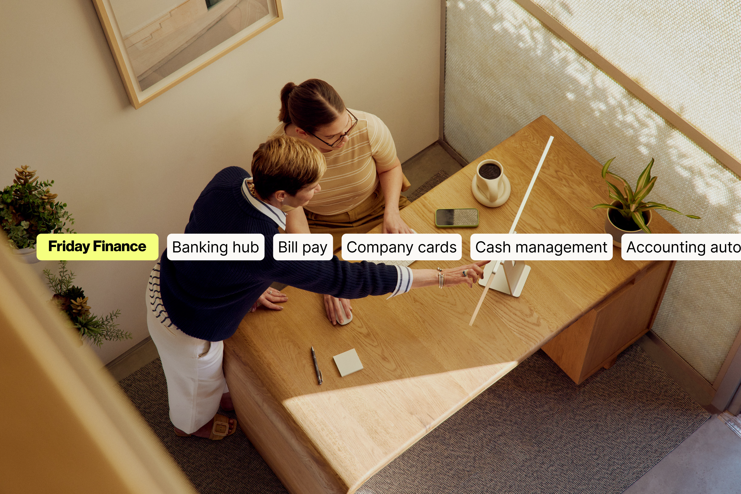
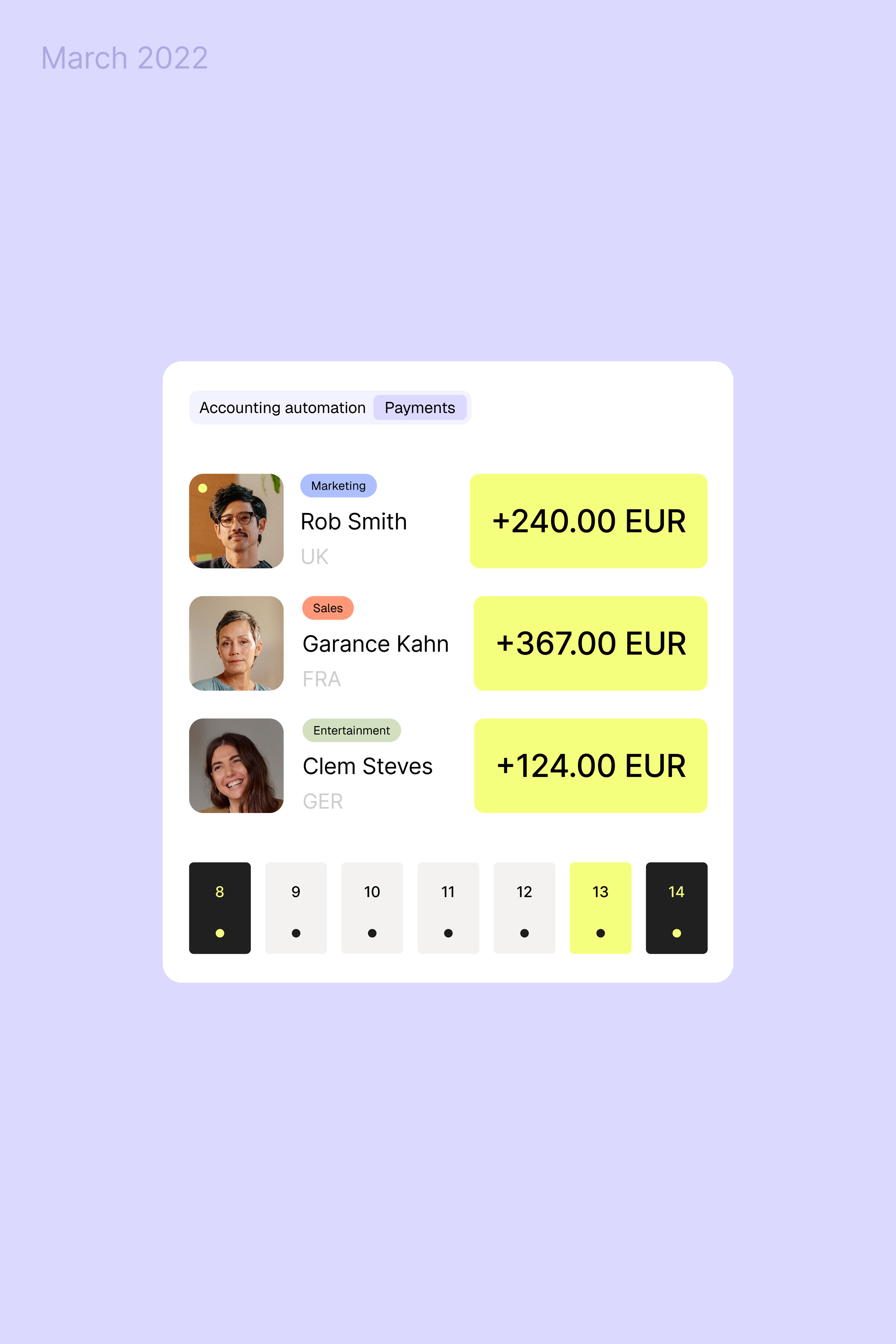
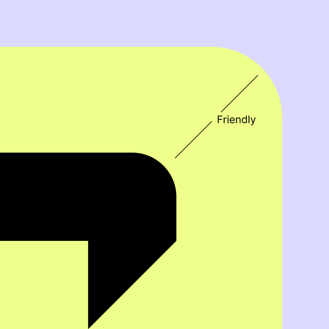
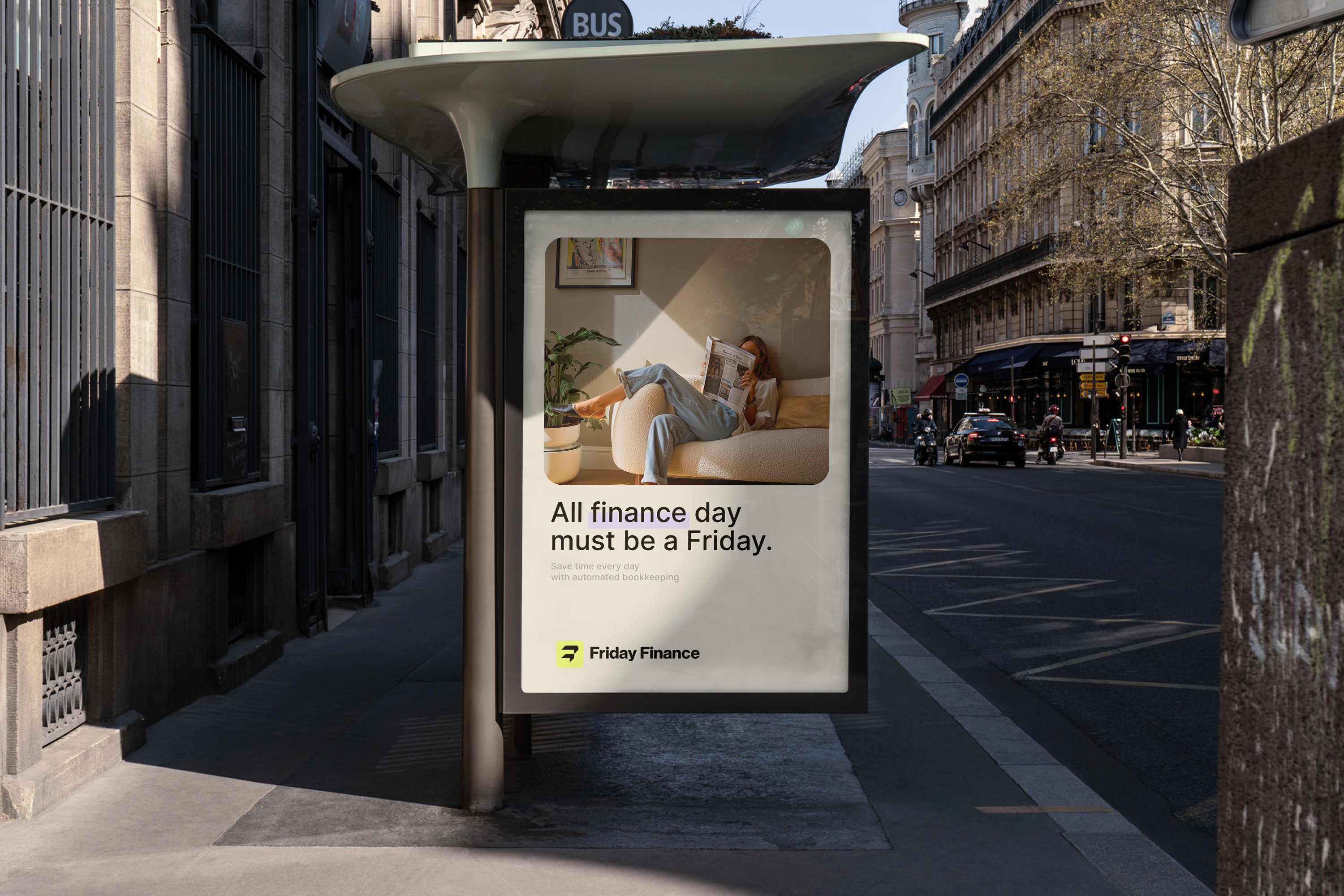
At the heart of the system is a visual language driven by a deliberate mix of icons and typography. Instead of relying on static assets alone, we created a flexible icon family that interacts with type, turning every touchpoint into an expressive, data-driven narrative. The rounded forms of the symbols aren’t just aesthetic; they reflect our belief in approachable business communication, technical where it needs to be, human where it matters most.
By pairing these icons with thoughtful typographic hierarchies, we built a system that feels dynamic and adaptable, communicating complex financial concepts with clarity and confidence. This identity lets Friday Finance explain its products and values visually, not just verbally, which is crucial for a B2B fintech that must earn trust at first glance.

Icon
What sets this brand apart from typical fintech identities is its balance between professionalism and personality. The choice of shapes, colour relationships, and typographic rhythm communicates expertise and reliability, while the flexibility of the visual system signals innovation and forward motion, a promise that Friday Finance isn’t just another fintech, but a partner that understands business, anticipates change, and builds a safer financial future.
In essence, this identity positions Friday Finance as a trusted, future-oriented fintech, one that speaks the language of business leaders while remaining distinctly human and approachable.


Project information
Faced with the challenge of repositioning a fintech brand to balance technical credibility with human connection, I led the strategic and creative direction to redefine Friday Finance’s identity from concept through delivery.
Friday Finance is the evolved brand identity for a fintech formerly known as Airbank, repositioned to build stronger connection, clarity, and human resonance in the financial management space.
I led this project from strategic definition through creative execution and delivery, guiding the brand transformation with both internal teams and executive stakeholders. Working directly with the CEOs and product designers, I helped establish the brand’s strategic positioning — balancing the technical foundations of financial services with a more humanized, approachable presence in the market.
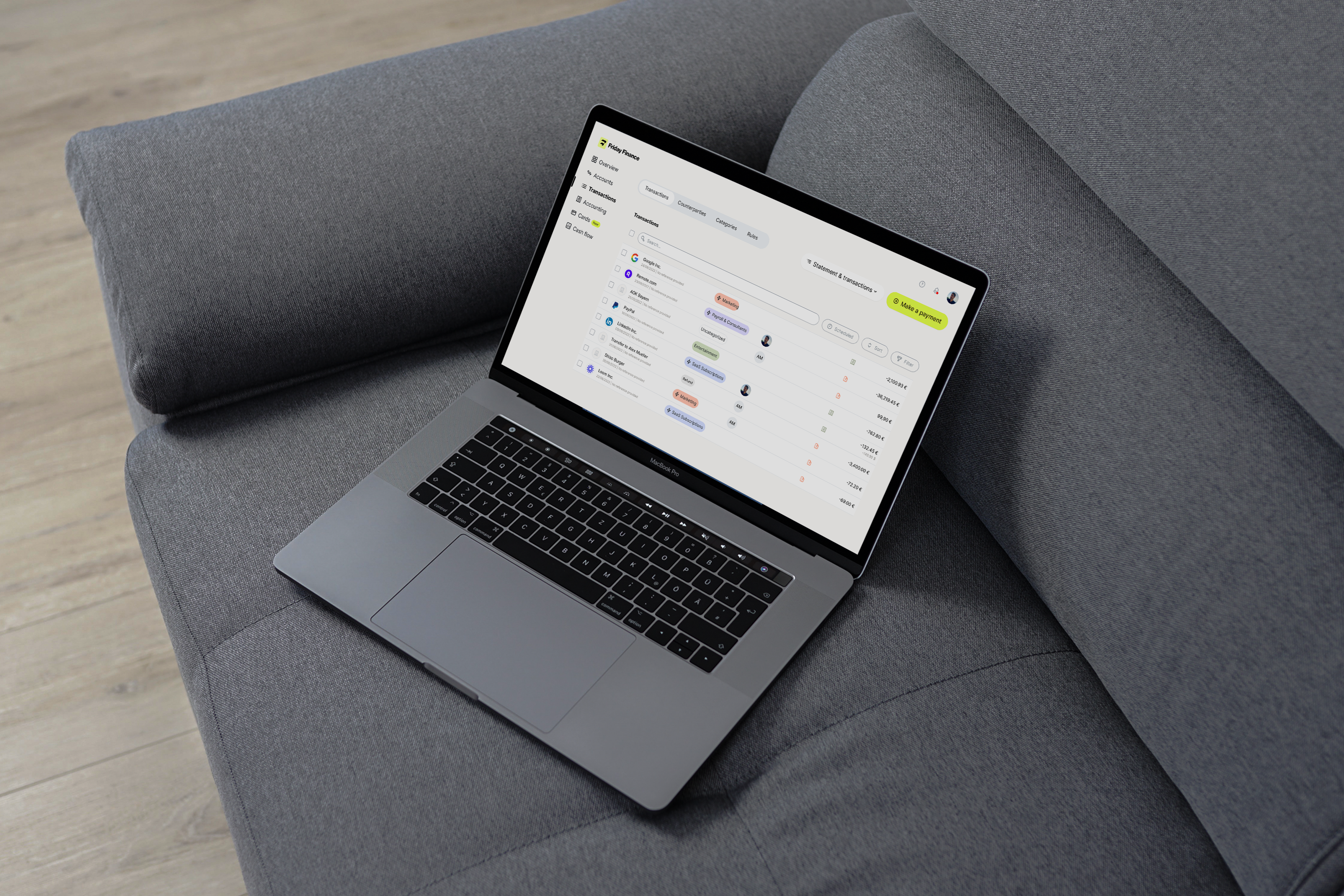
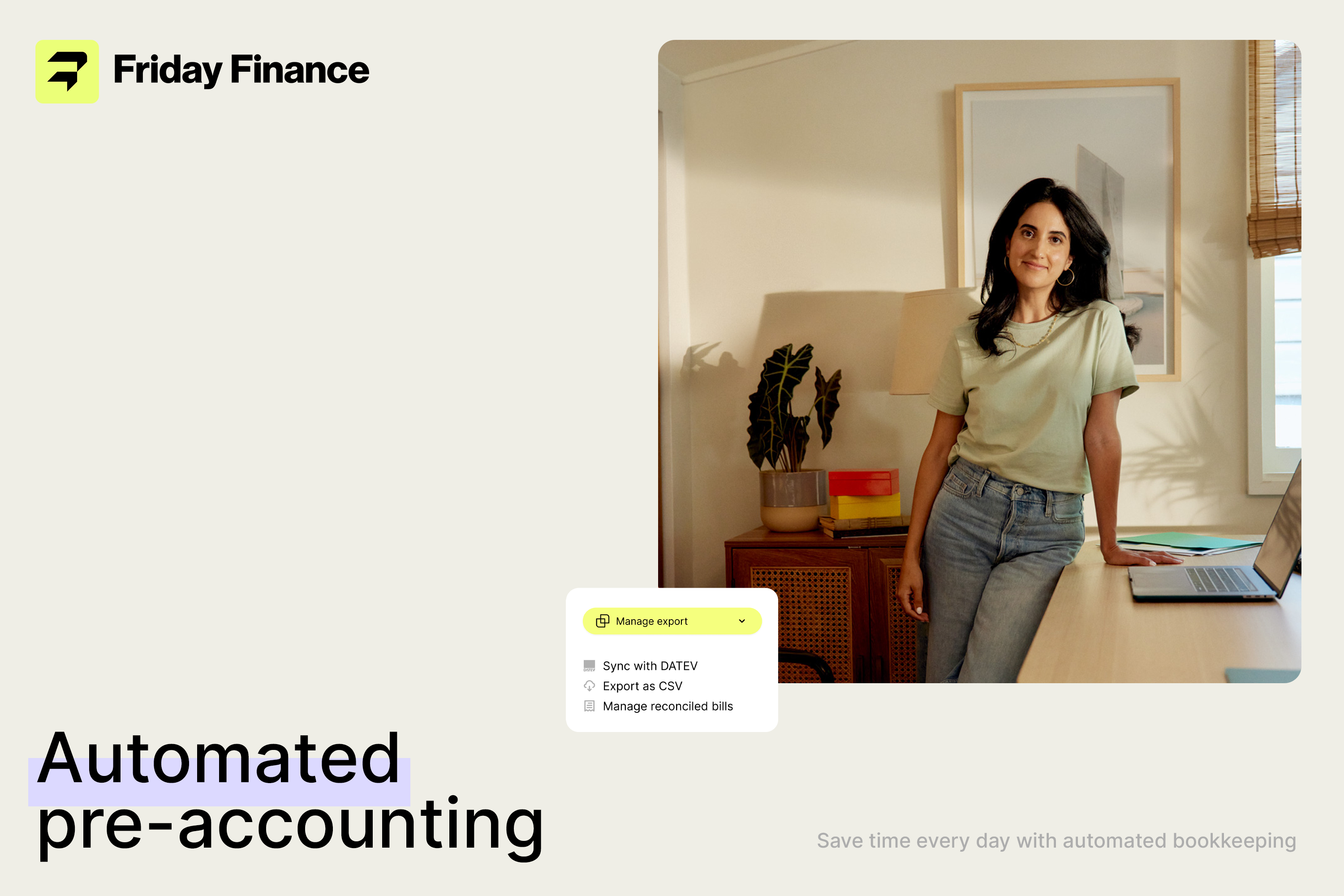
This strategic framing informed a comprehensive identity system, including the development of a distinctive logotype, custom iconography, rounded visual language, and flexible visual assets that reflect the brand’s dual nature — technical credibility and human connection. I also coordinated the multi-team collaboration required to align visual strategy with broader product and marketing goals, ensuring the new identity supported both customer recognition and internal adoption.
The resulting brand system equips Friday Finance with a visual voice that is both confident and adaptive, helping the fintech communicate its value with clarity and warmth in a competitive financial ecosystem.
Outcome
Brand Strategy, Positioning, Creative Direction, Visual Identity, System & Multi-Team Collaboration
Faced with the challenge of repositioning a fintech brand to balance technical credibility with human connection, I led the strategic and creative direction to redefine Friday Finance’s identity from concept through delivery.
Friday Finance is the evolved brand identity for a fintech formerly known as Airbank, repositioned to build stronger connection, clarity, and human resonance in the financial management space.
I led this project from strategic definition through creative execution and delivery, guiding the brand transformation with both internal teams and executive stakeholders. Working directly with the CEOs and product designers, I helped establish the brand’s strategic positioning — balancing the technical foundations of financial services with a more humanized, approachable presence in the market.
This strategic framing informed a comprehensive identity system, including the development of a distinctive logotype, custom iconography, rounded visual language, and flexible visual assets that reflect the brand’s dual nature — technical credibility and human connection. I also coordinated the multi-team collaboration required to align visual strategy with broader product and marketing goals, ensuring the new identity supported both customer recognition and internal adoption.
The resulting brand system equips Friday Finance with a visual voice that is both confident and adaptive, helping the fintech communicate its value with clarity and warmth in a competitive financial ecosystem.
Outcome
Brand Strategy, Positioning, Creative Direction, Visual Identity, System & Multi-Team Collaboration
Sector︎︎︎
Financial, Technology, B2B
Client︎︎︎
Patrick Neuhaus
Collaborator︎︎︎
Hadria Sánchez
Type Foundry︎︎︎
Pangram Pangram
Photography︎︎︎
Brittney Christie
fridayfinance.com
What the experts say:
Link 1, Link 2, Link 3
Financial, Technology, B2B
Client︎︎︎
Patrick Neuhaus
Collaborator︎︎︎
Hadria Sánchez
Type Foundry︎︎︎
Pangram Pangram
Photography︎︎︎
Brittney Christie
fridayfinance.com
What the experts say:
Link 1, Link 2, Link 3
Berlin
Germany
2022
Germany
2022