— ÊME Architecture
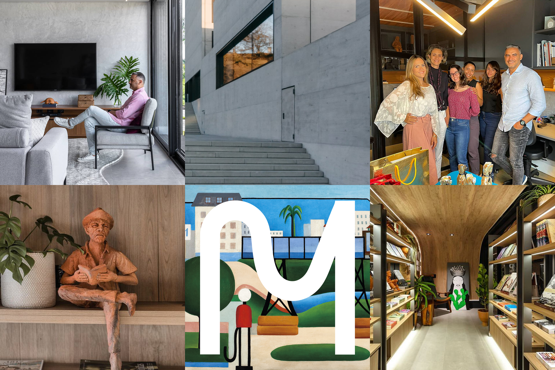
When two minds come together and build incredible things, the result is a mature language that is concerned with urban gentleness, delivering projects that dialogue with the city, translating regionality into contemporary architecture.
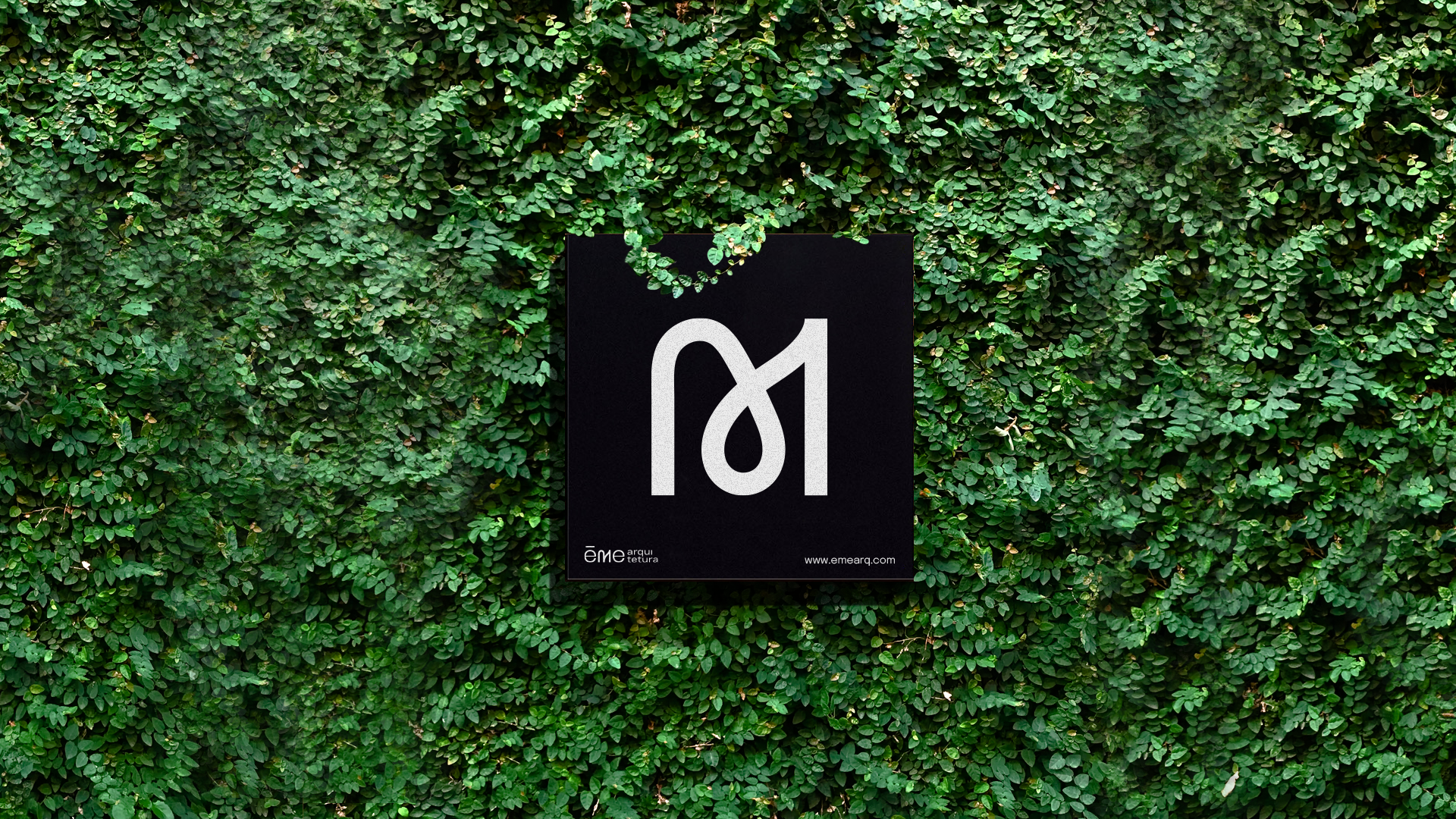
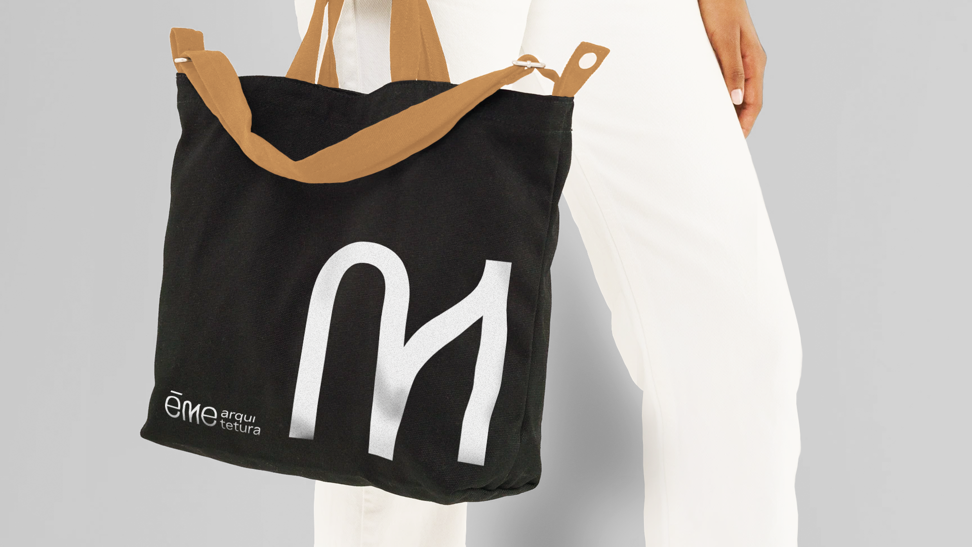
Thus was born the @emearq.com.br office, the sum of two restless minds that complement each other in a professional way. The name comes from the initials of their names, which both start with the same letter.
Featured on Behance.
Concept
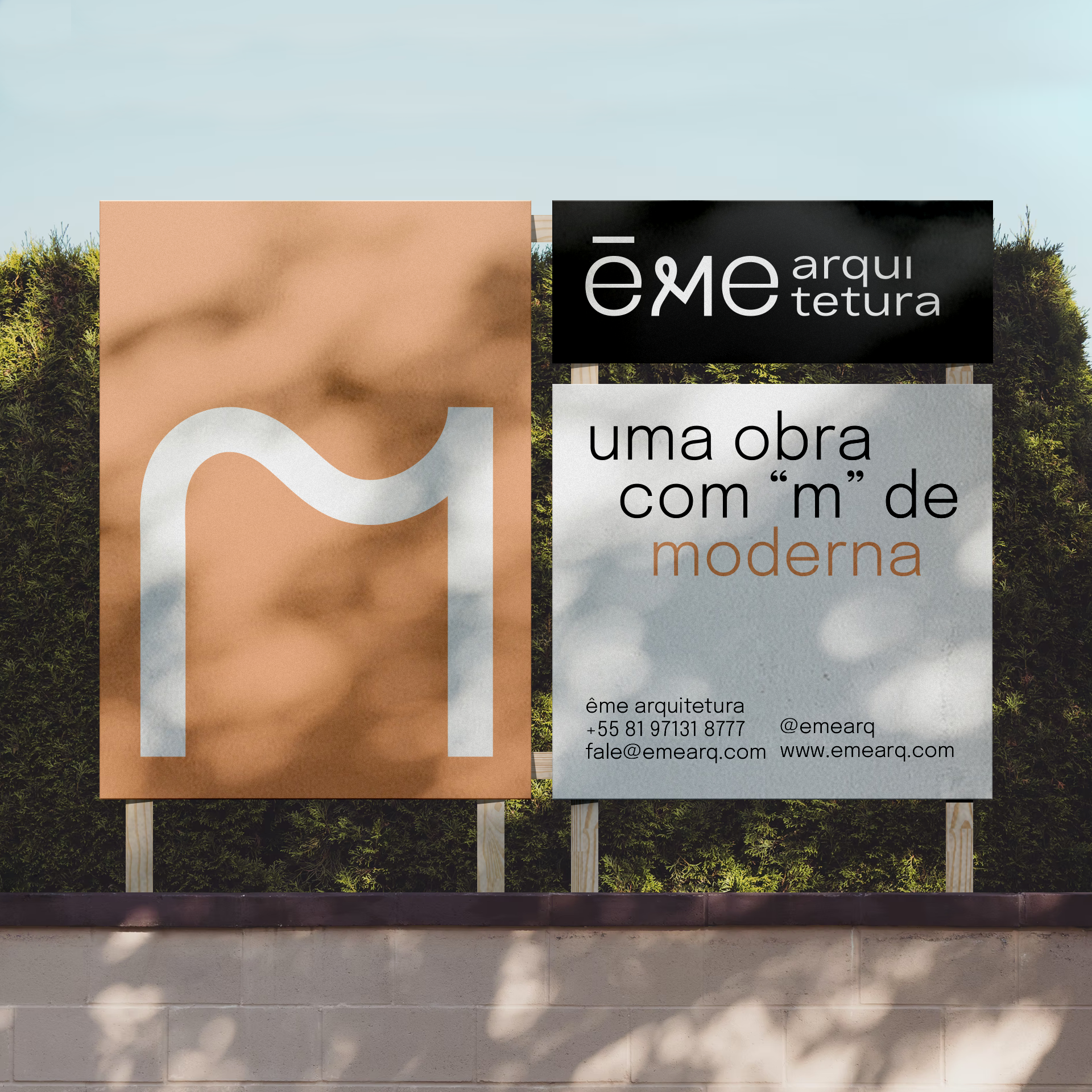
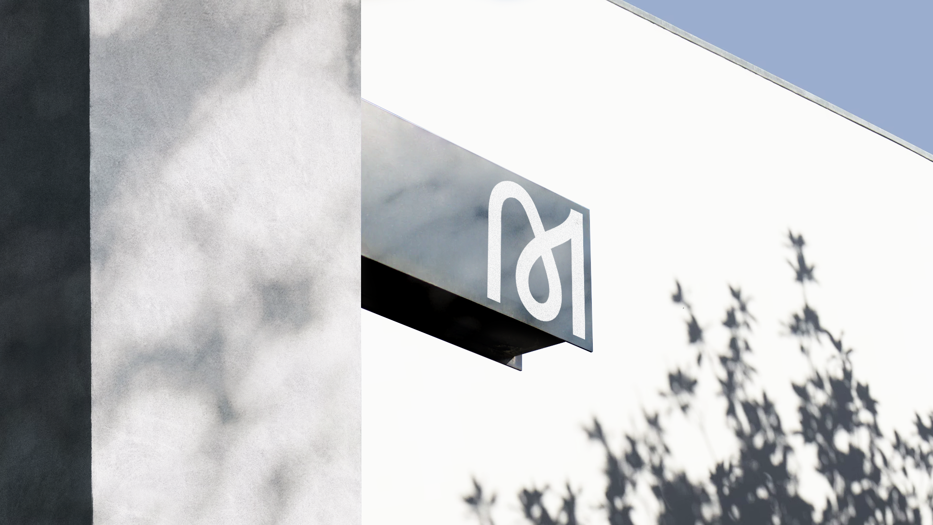
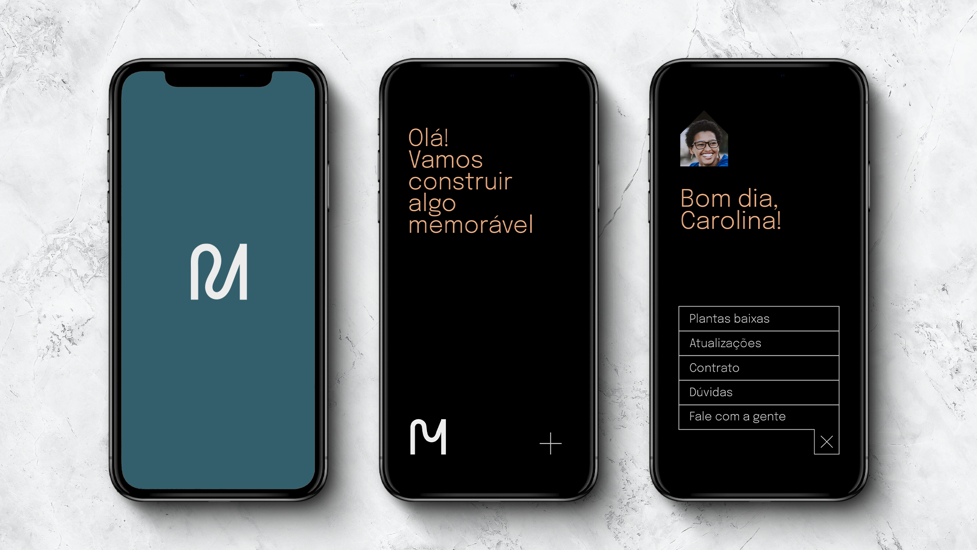
"Ême" comes from the phonology of the letter "m", which can be elevated as a visual element to conceptualize the multidisciplinary approach of the office, being translated into a series of versions of the lyrics, which will be used as bridges that converse with each delivery.
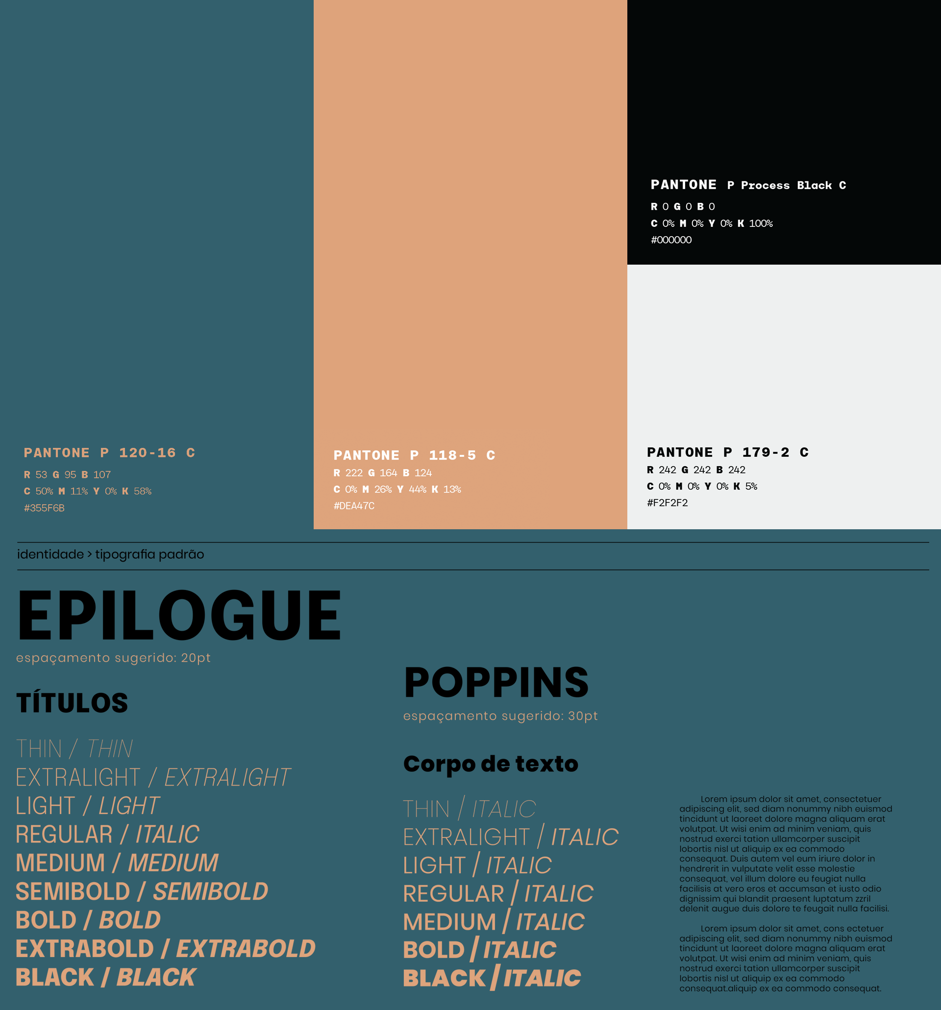
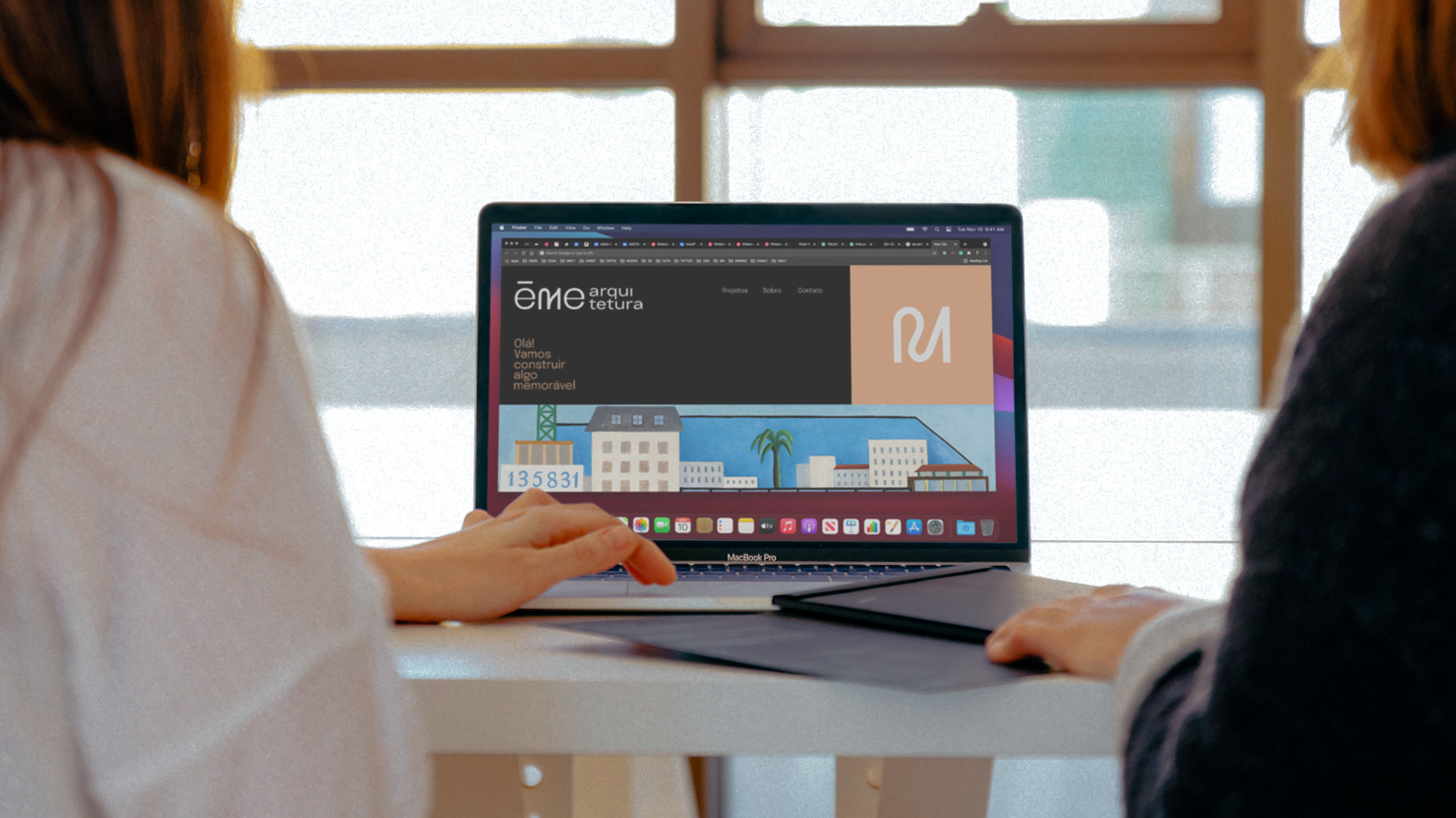
Ême is multidisciplinary, housing, memorable, modern, minimalist. It's much more than a letter, it's the way to see the environment to build an affective world like every house should be.