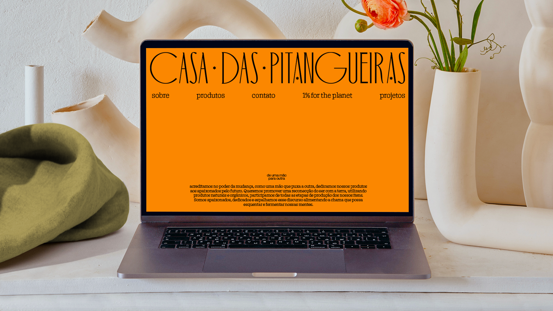
— Casa das Pitangueiras
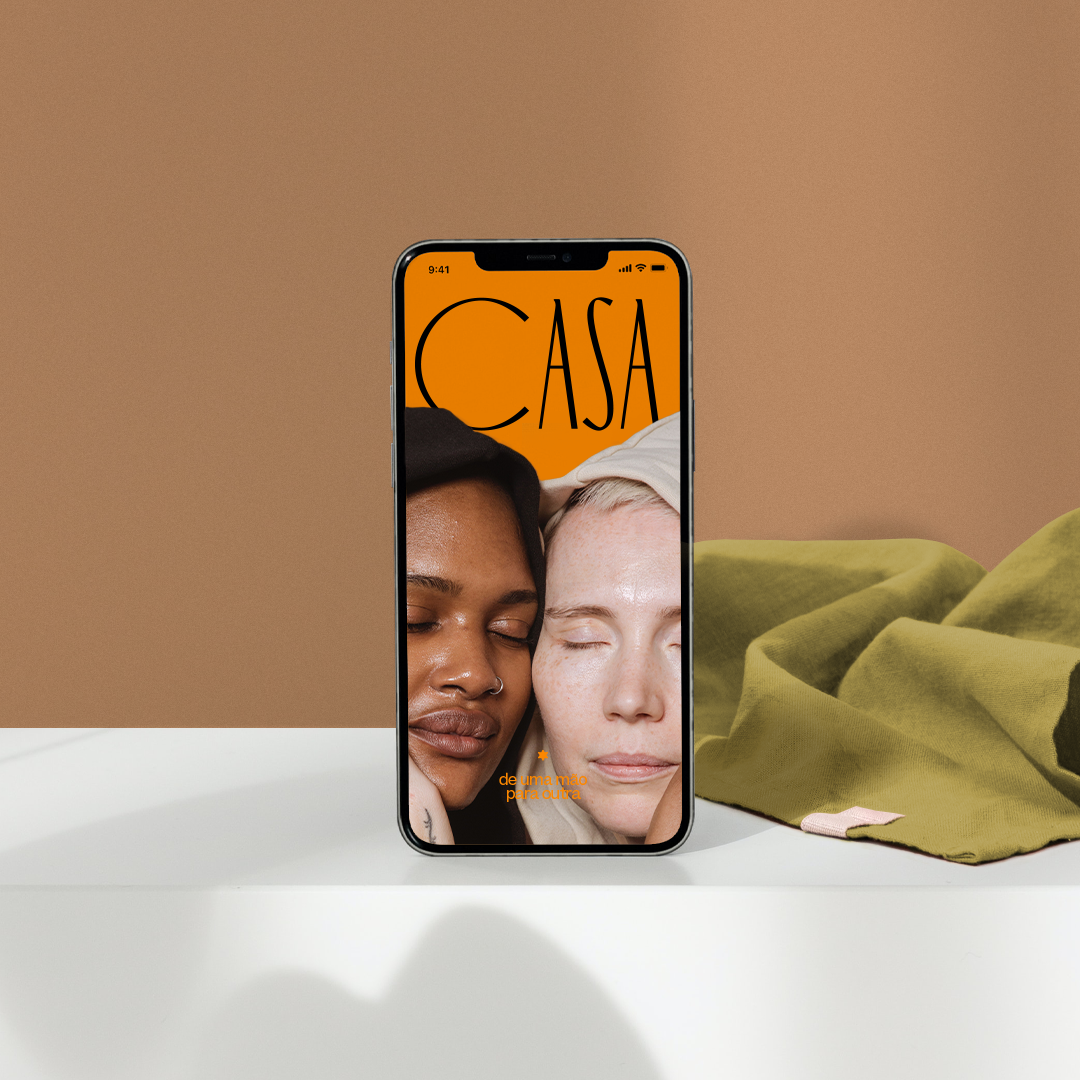
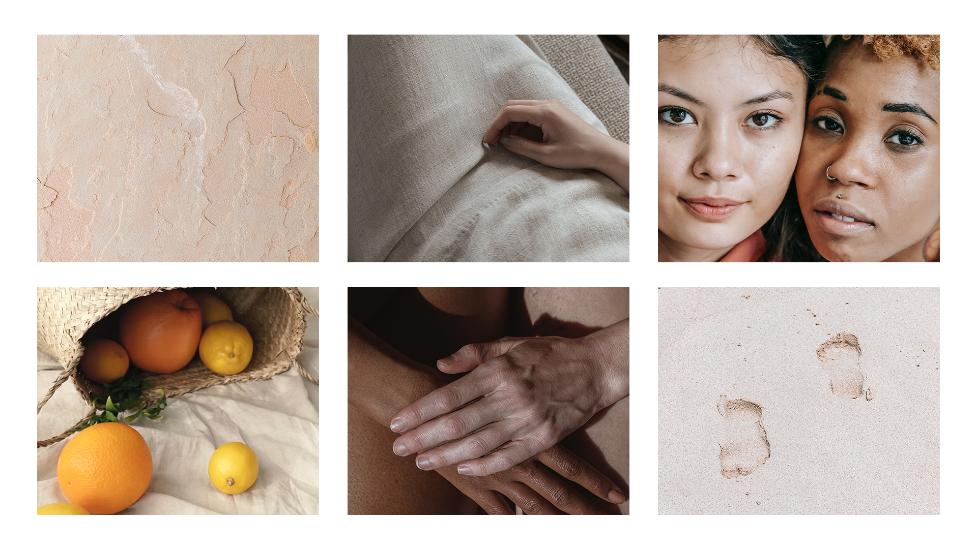
As a slow fashion company, her creator is looking to provide a closer connection between humans and nature, and that is the starting point to developing the whole brand investigation. I pushed the boundaries to create a vibrant stylish while keeping the inspiration from the handcrafted works.
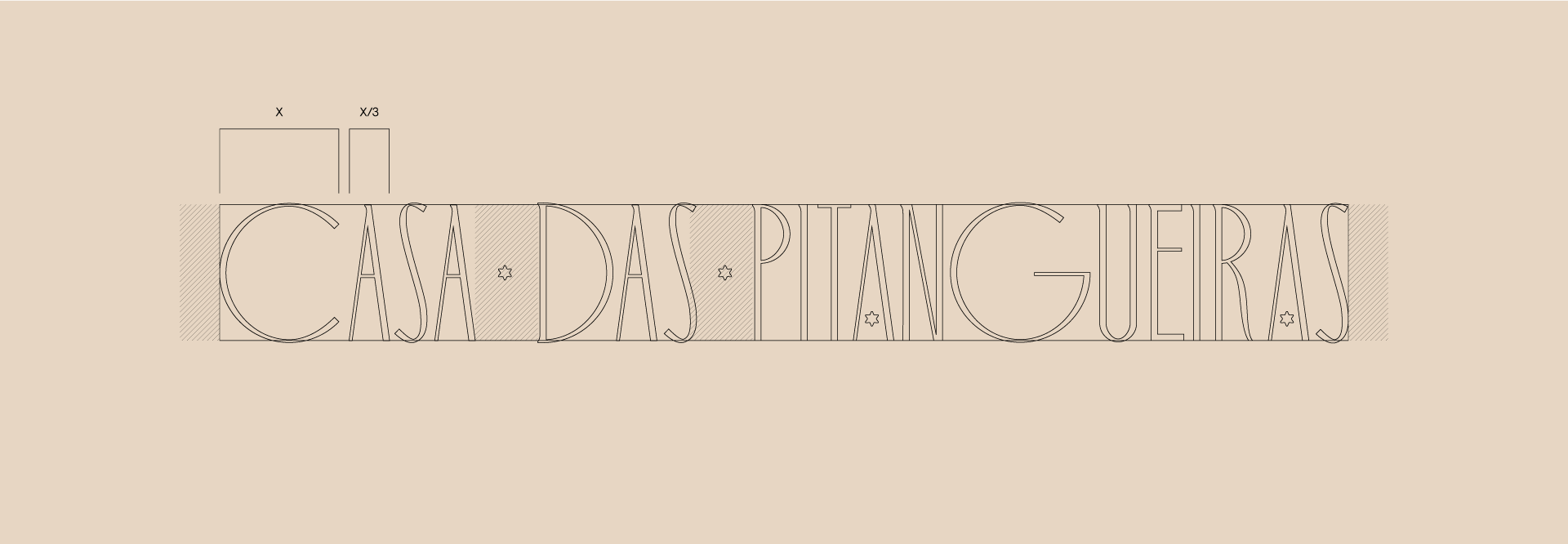
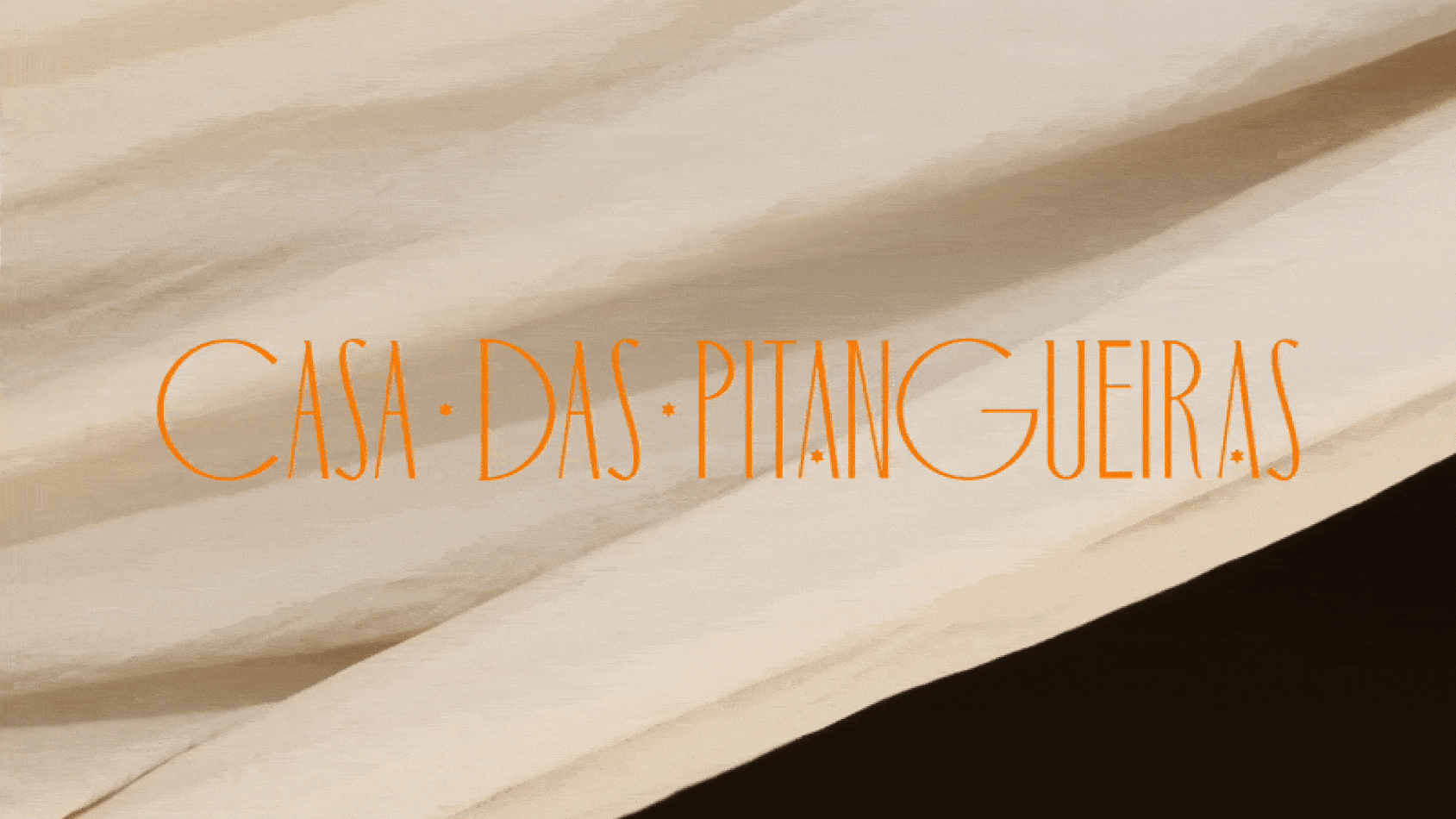
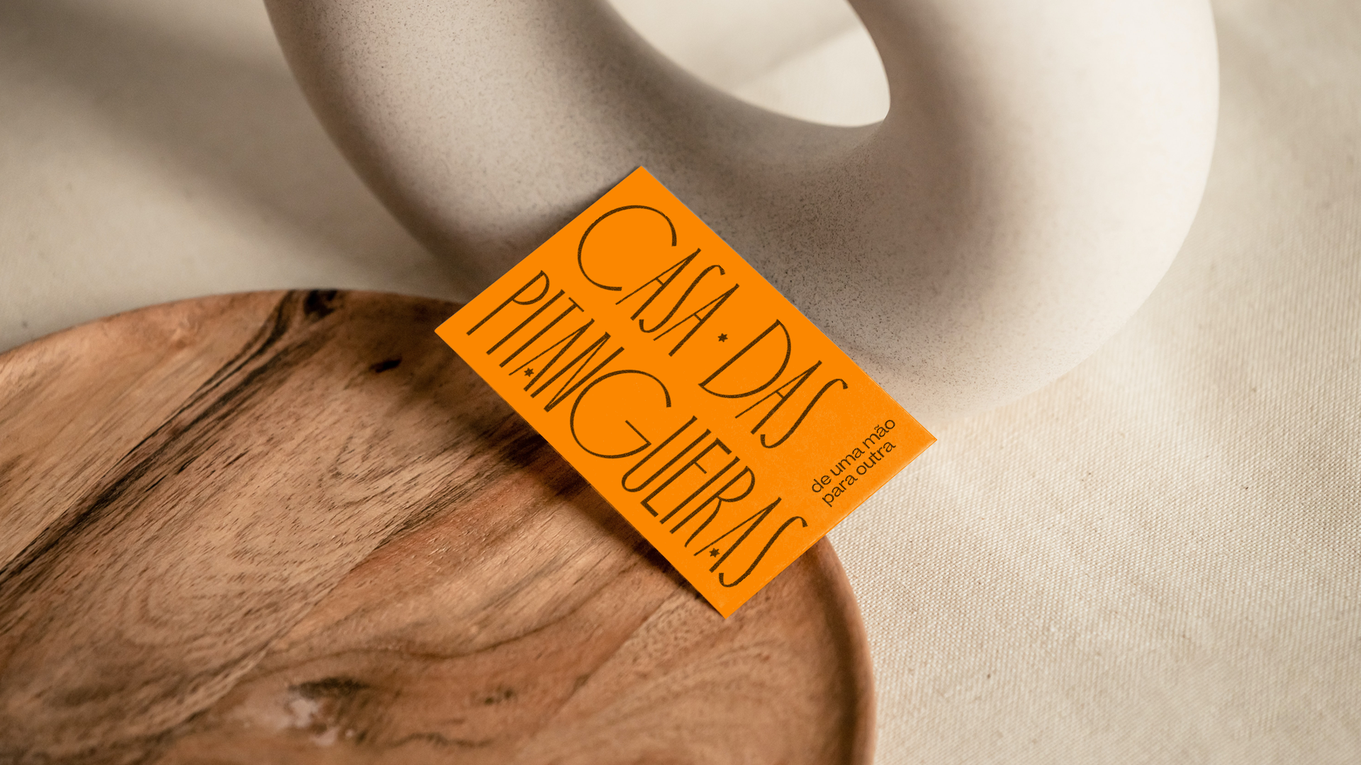
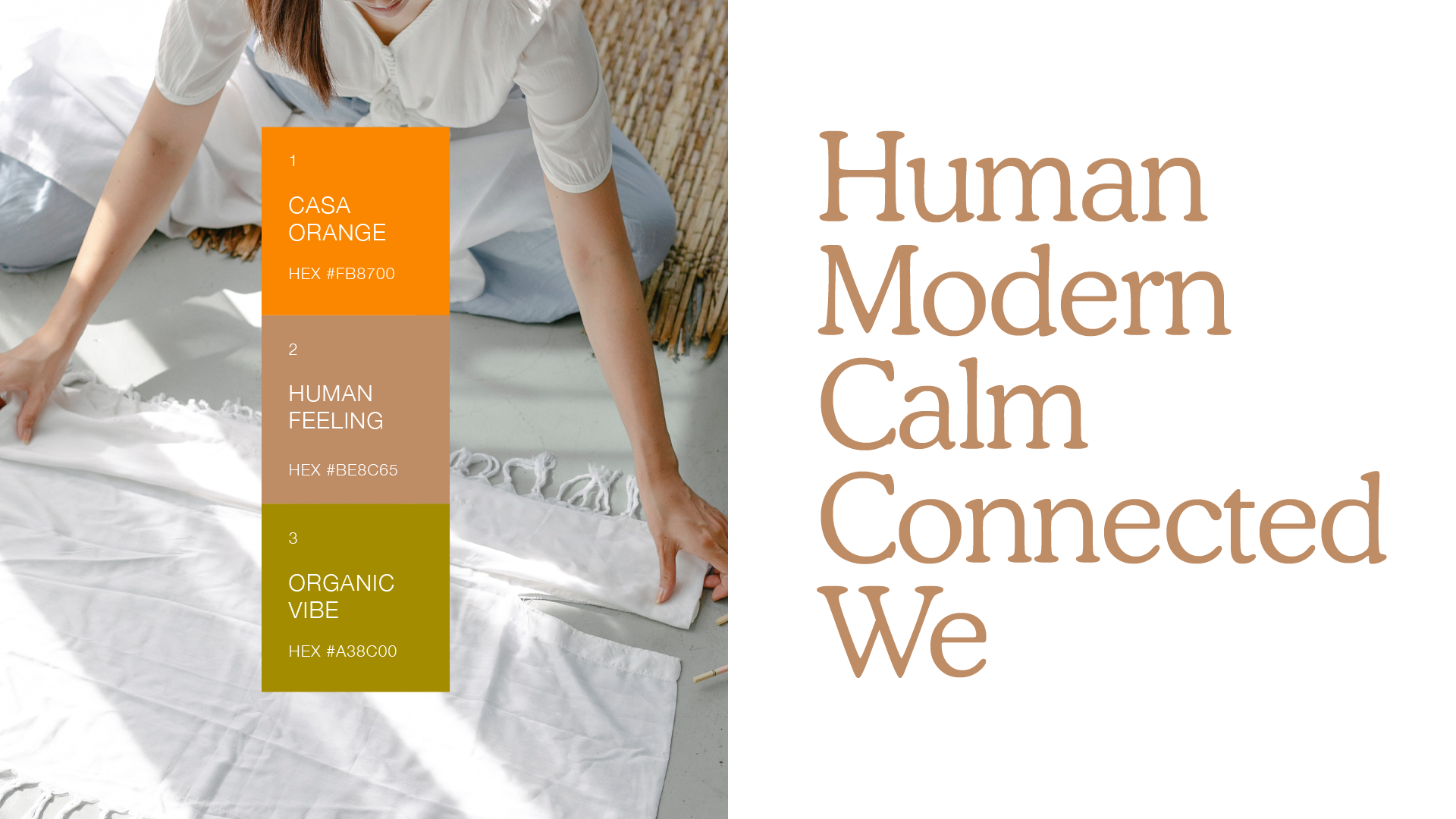
The logotype has a solid structure to communicate the acknowledgment, while the key visuals are calm using fewer elements, and combining colors that translate the beliefs.
Featured on Behance.
São Paulo
State of São Paulo
Brazil
2022
State of São Paulo
Brazil
2022
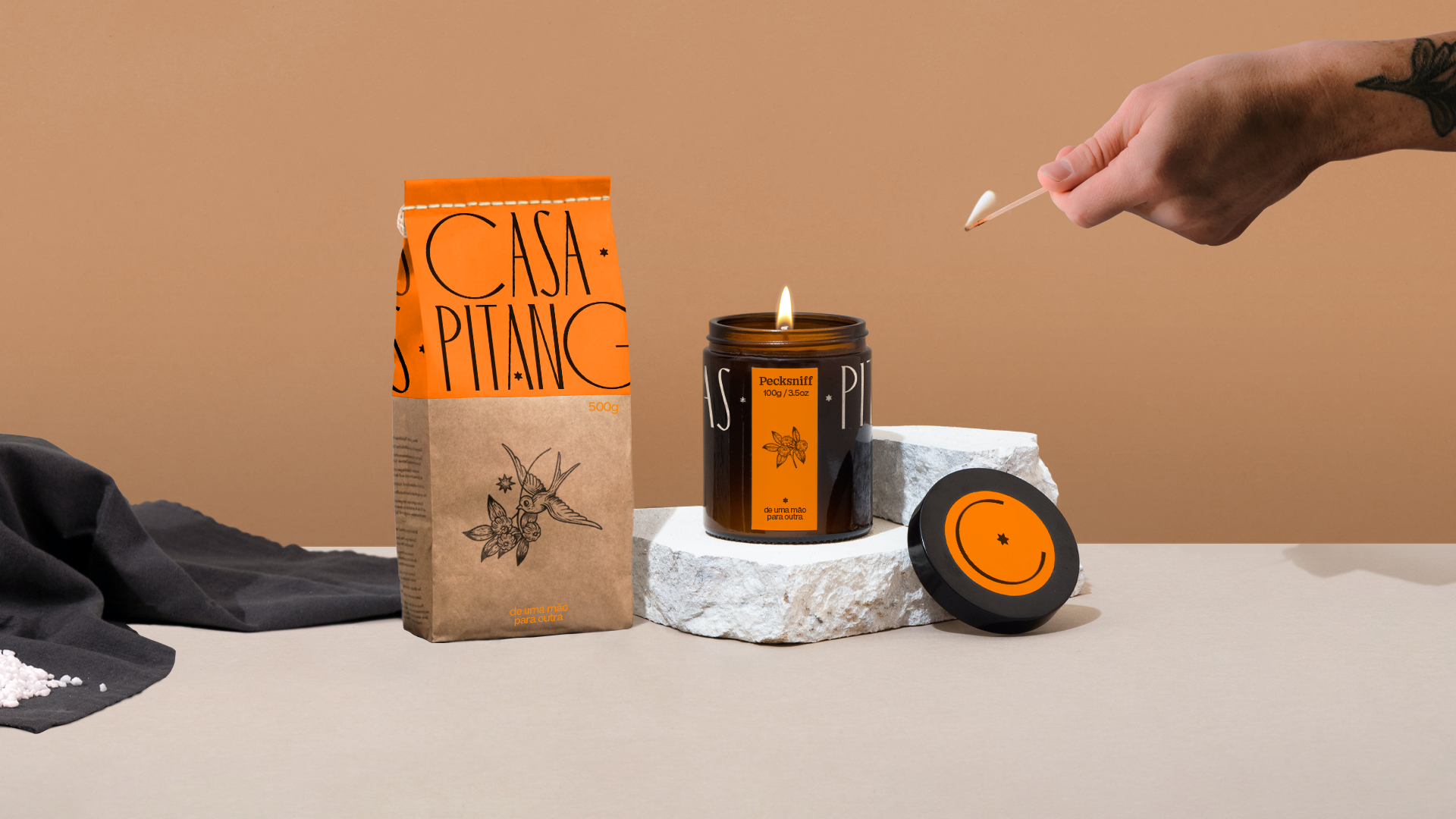
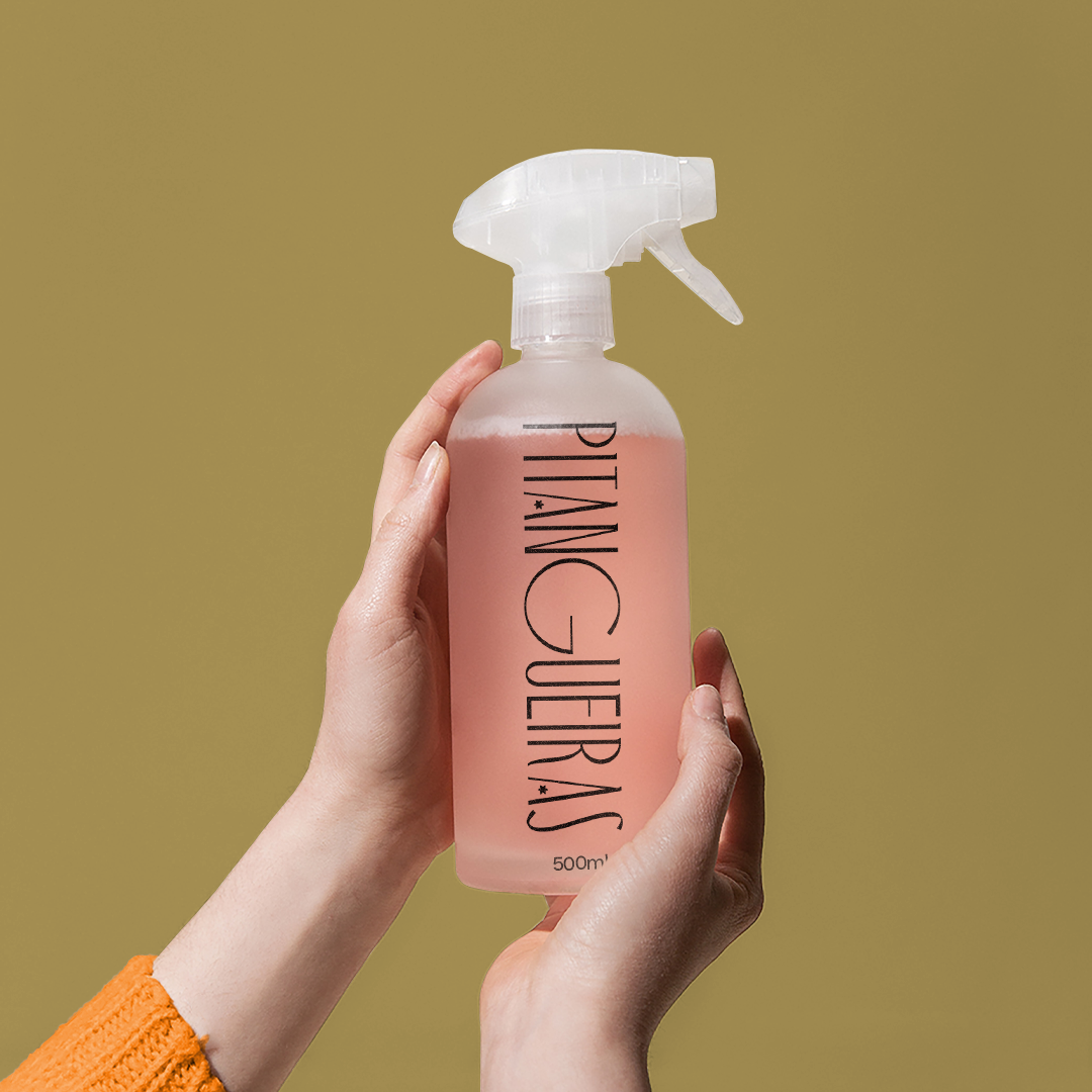
Key Visual
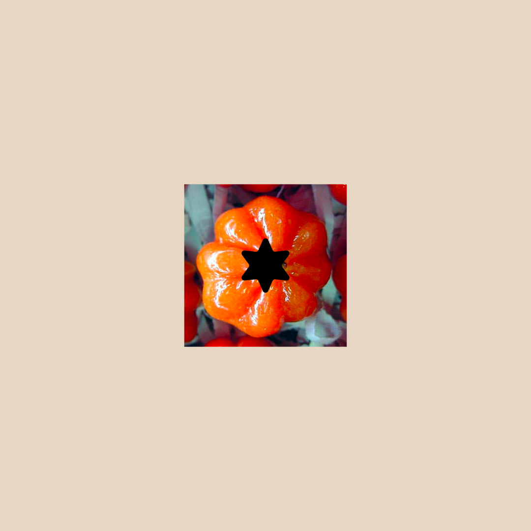
Concept
The eye-catch element is the primal form of the Brazilian cherry, used to ornament the typography and to work as a small but powerful element that will dialog with the identity.